
7 Exploratory Data Analysis - R for Data Science
This post covers the content and exercises for Ch 7: Exploratory Data Analysis from R for Data Science. The chapter teaches how to use visualisation and transformation to explore your data in a systematic way.
7.2 Questions
Goal of EDA is to understand the data, which is accomplished by asking numerous questions about the data until interesting discoveries are made.
2 general questions to study:
- What type of variation occurs within my variables?
- What type of covariation occurs between my variables?
7.3 Variation
Tendency of values to change from measurement to measurement
7.3.4 Exercises
- Explore the distribution of each of the x, y, and z variables in diamonds. What do you learn? Think about a diamond and how you might decide which dimension is the length, width, and depth.
library(tidyverse)
library(nycflights13)
diamonds %>%
ggplot(aes(x = x)) +
geom_histogram() +
ggtitle("Histogram of x") +
coord_cartesian(xlim = c(0, 10))## `stat_bin()` using `bins = 30`. Pick better value with `binwidth`.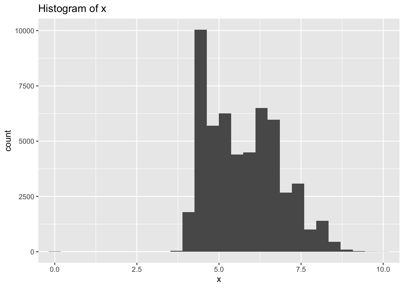
diamonds %>%
  ggplot(aes(x = y)) +
  geom_histogram(bins = 100) +
  ggtitle("Histogram of y") +
  coord_cartesian(xlim = c(0, 10))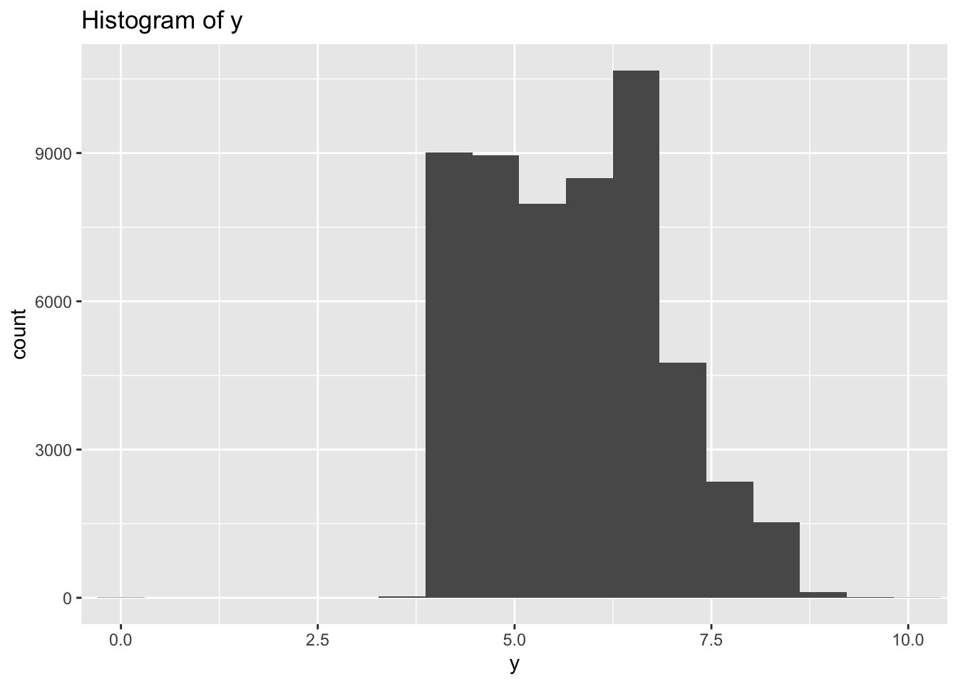
diamonds %>%
  ggplot(aes(x = z)) +
  geom_histogram(bins = 100) +
  ggtitle("Histogram of z") +
    coord_cartesian(xlim = c(0, 10))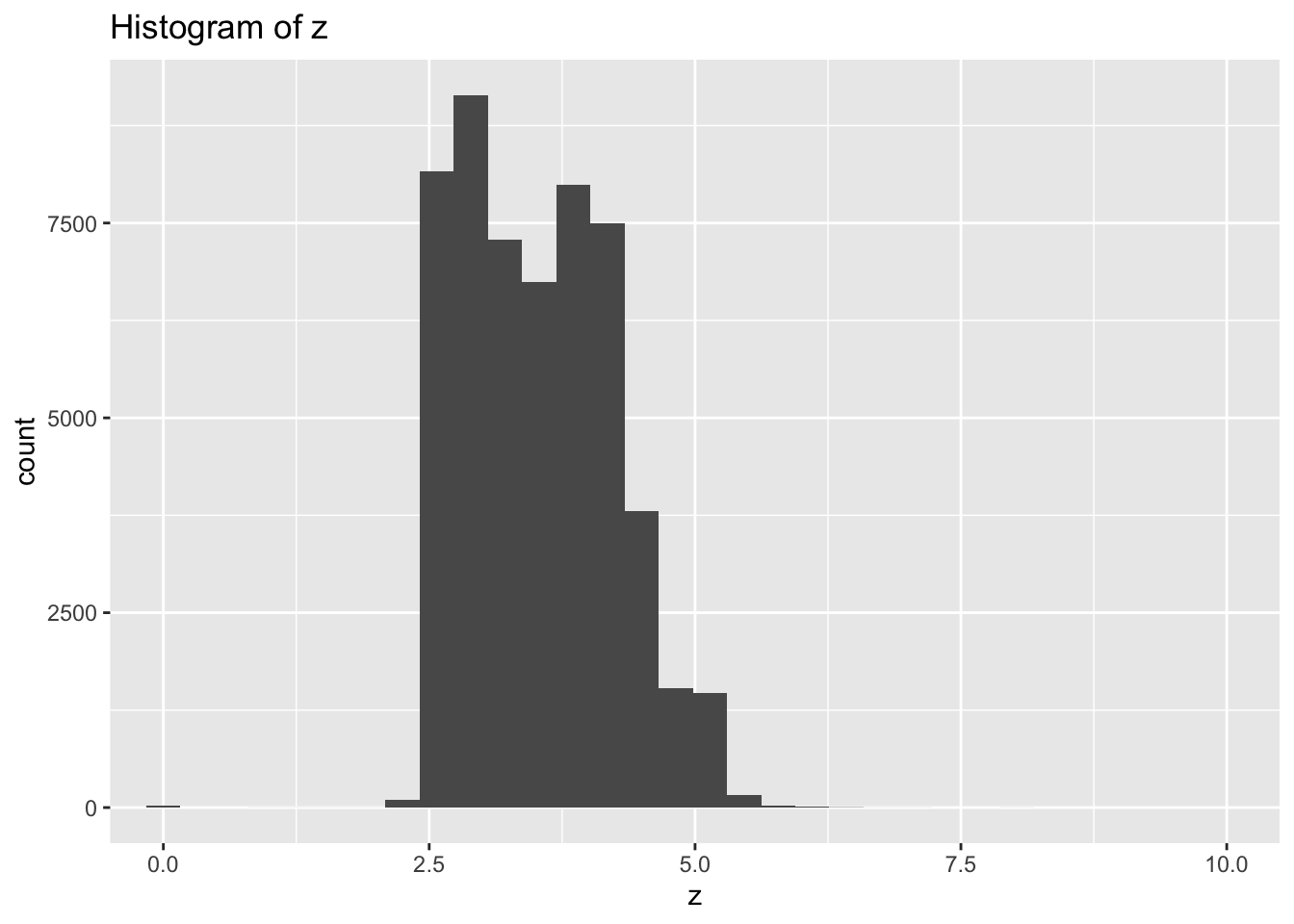
- There are large outliers in y and z indicating possible data entry errors.
- Most diamonds are symmetrical when viewed from the top so I would expect length and width to have similar ranges while the depth would be different.
- Based on that assumption x and y both vary mostly between 3-8, while z varies between 2.5-5.0 so I would assume z is depth and x & y are length and width
- Explore the distribution of price. Do you discover anything unusual or surprising? (Hint: Carefully think about the binwidth and make sure you try a wide range of values.)
diamonds %>%
  ggplot(aes(x = price)) +
  geom_histogram(bins = 15) +
  ggtitle("Histogram of Price - 15 bins")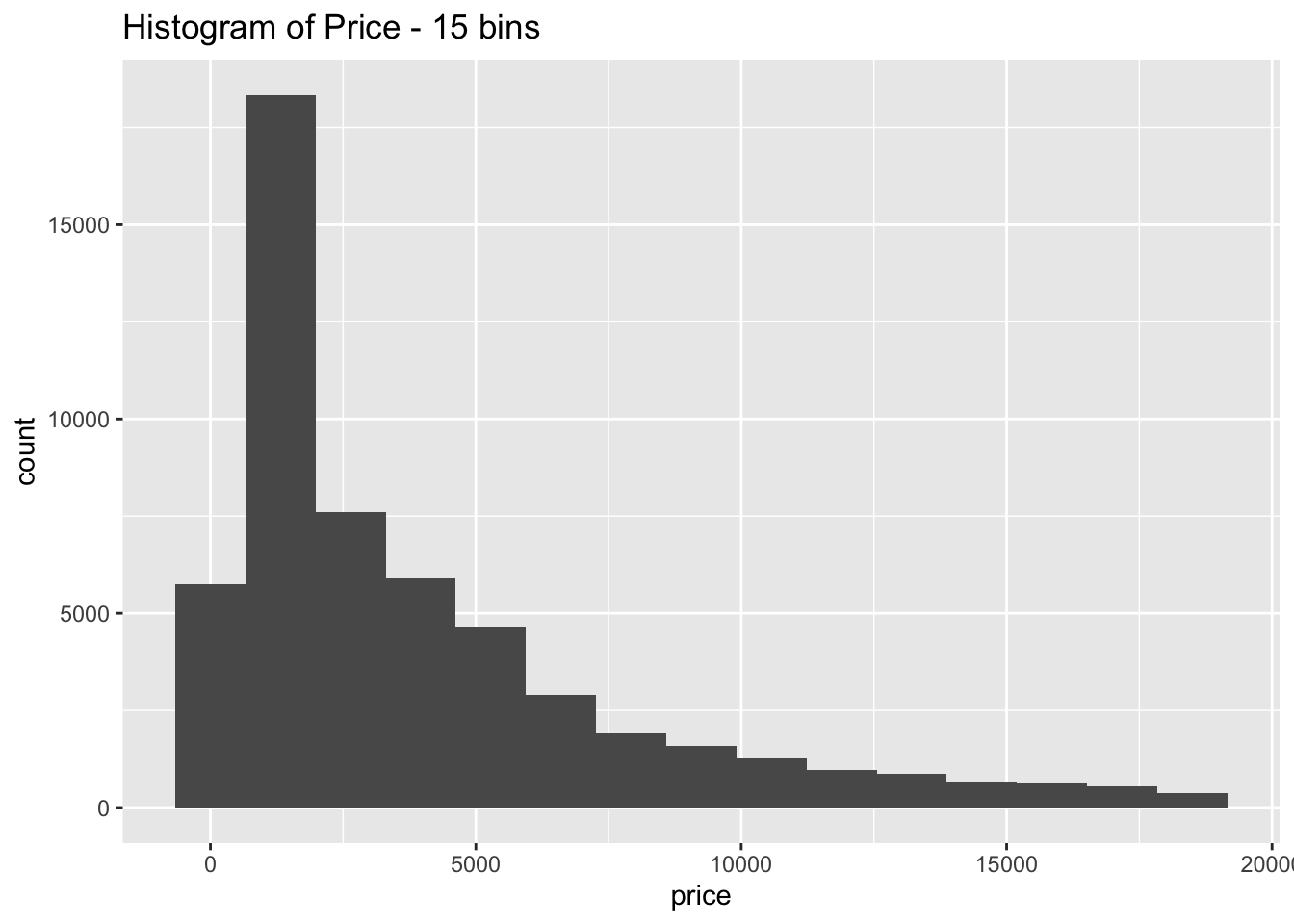
diamonds %>%
  ggplot(aes(x = price)) +
  geom_histogram(bins = 30) +
  ggtitle("Histogram of Price - 30 bins")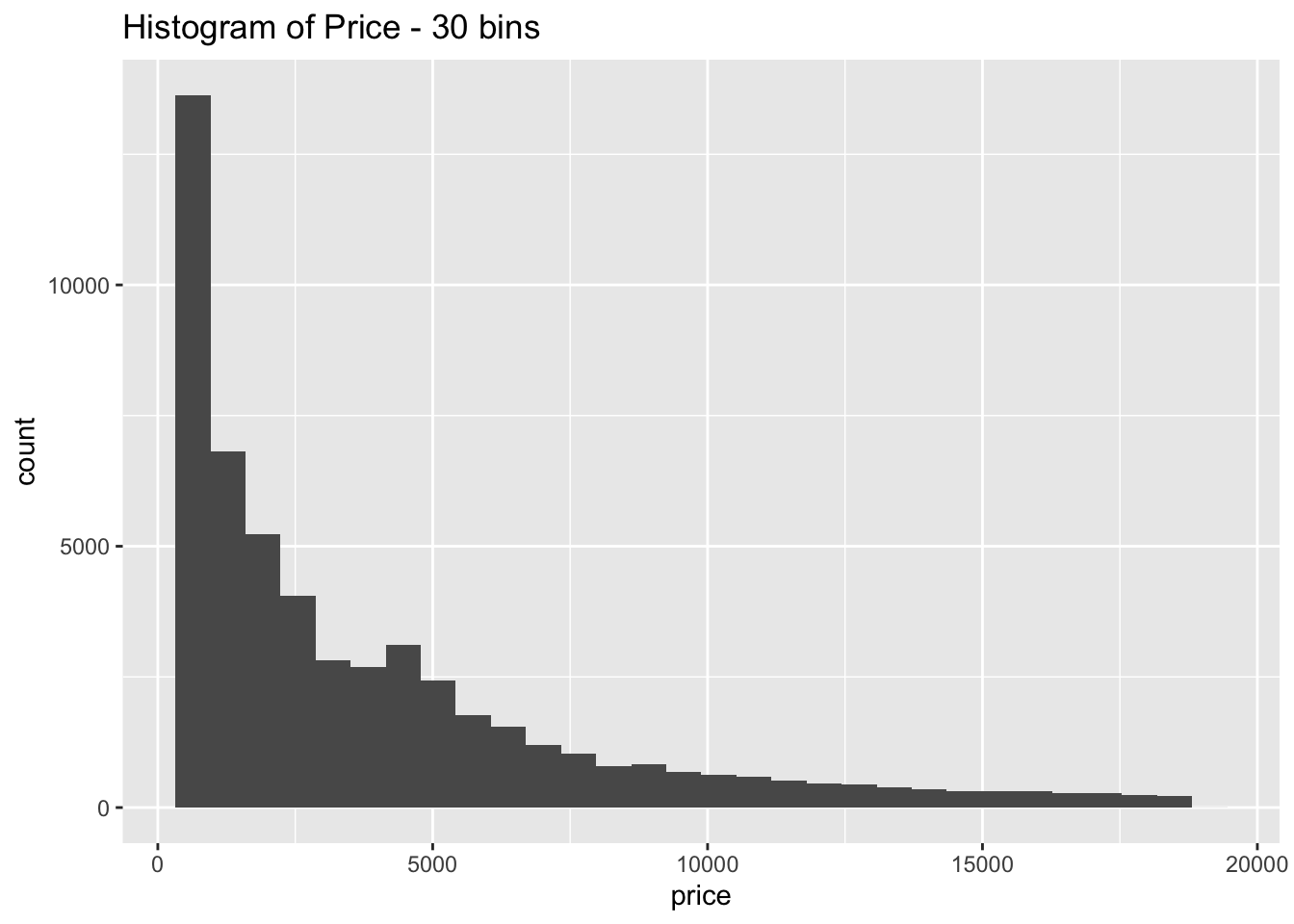
diamonds %>%
  ggplot(aes(x = price)) +
  geom_histogram(bins = 80) +
  ggtitle("Histogram of Price - 80 bins")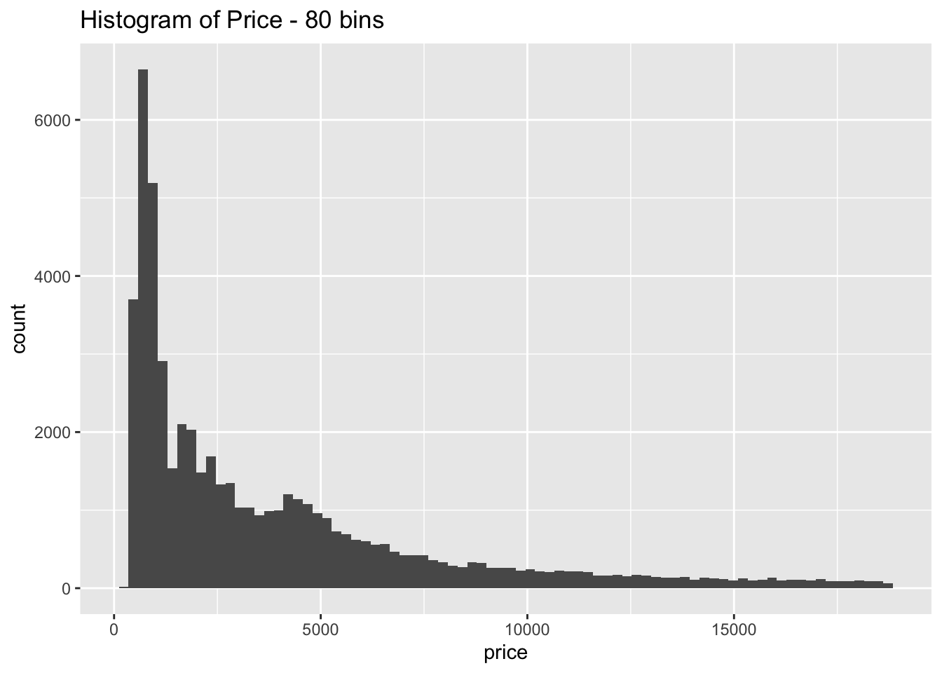
diamonds %>%
  ggplot(aes(x = price)) +
  geom_histogram(bins = 200) +
  ggtitle("Histogram of Price - 200 bins") +
  scale_x_continuous(breaks = seq(0, 20000, by = 500)) +
  theme(axis.text.x = element_text(angle = 45, hjust = 1))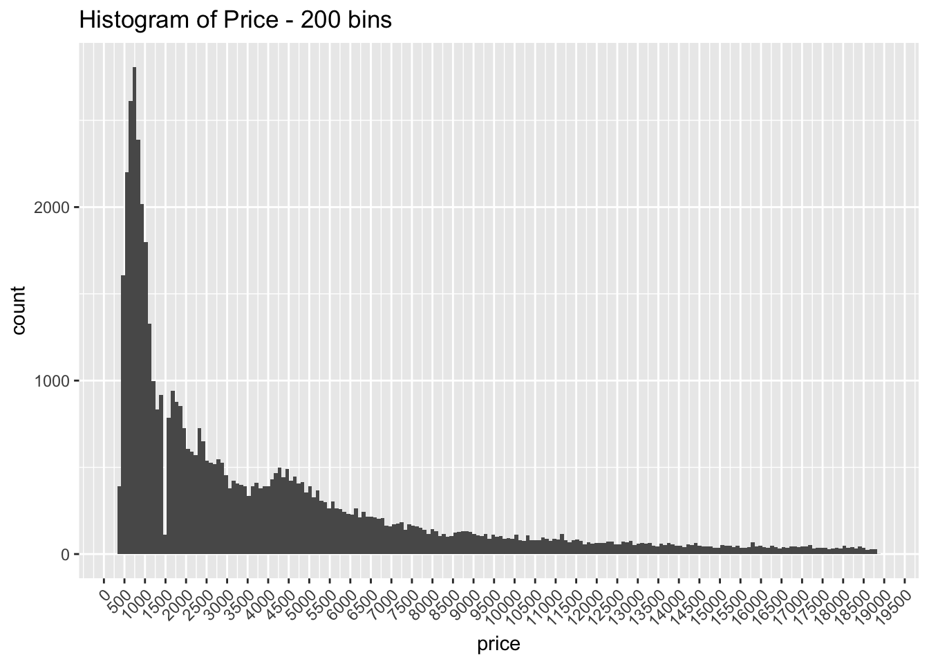
The distribution is strongly right skewed, which is unsurprising since there will be fewer diamonds in the higher price ranges
When looking at the distribution with a large number of bins it is clear there are much fewer diamonds priced at $1500 than is expected
- How many diamonds are 0.99 carat? How many are 1 carat? What do you think is the cause of the difference?
diamonds %>%
  filter(carat == 0.99) %>%
  count()
## # A tibble: 1 x 1
## n
## <int>
## 1 23diamonds %>%
filter(carat == 1) %>%
count()## # A tibble: 1 x 1
## n
## <int>
## 1 1558Only 23 diamonds are listed at .99 carats while there are 1558 diamonds at 1 carat
Most likely diamond producers are rounded up the vast majority of diamonds that land at .99 carats since that is a much more appealing number to the consumer
- Compare and contrast coord_cartesian() vs xlim() or ylim() when zooming in on a histogram. What happens if you leave binwidth unset? What happens if you try and zoom so only half a bar shows?
diamonds %>%
  ggplot(aes(x = price)) +
  geom_histogram() +
  coord_cartesian(xlim = c(4900, 10000))
## `stat_bin()` using `bins = 30`. Pick better value with `binwidth`.
diamonds %>%
  ggplot(aes(x = price)) +
  geom_histogram() +
  xlim(c(4900, 9500)) +
  ylim(c(0, 500))
## `stat_bin()` using `bins = 30`. Pick better value with `binwidth`.## Warning: Removed 44553 rows containing non-finite values (stat_bin).## Warning: Removed 4 rows containing missing values (geom_bar).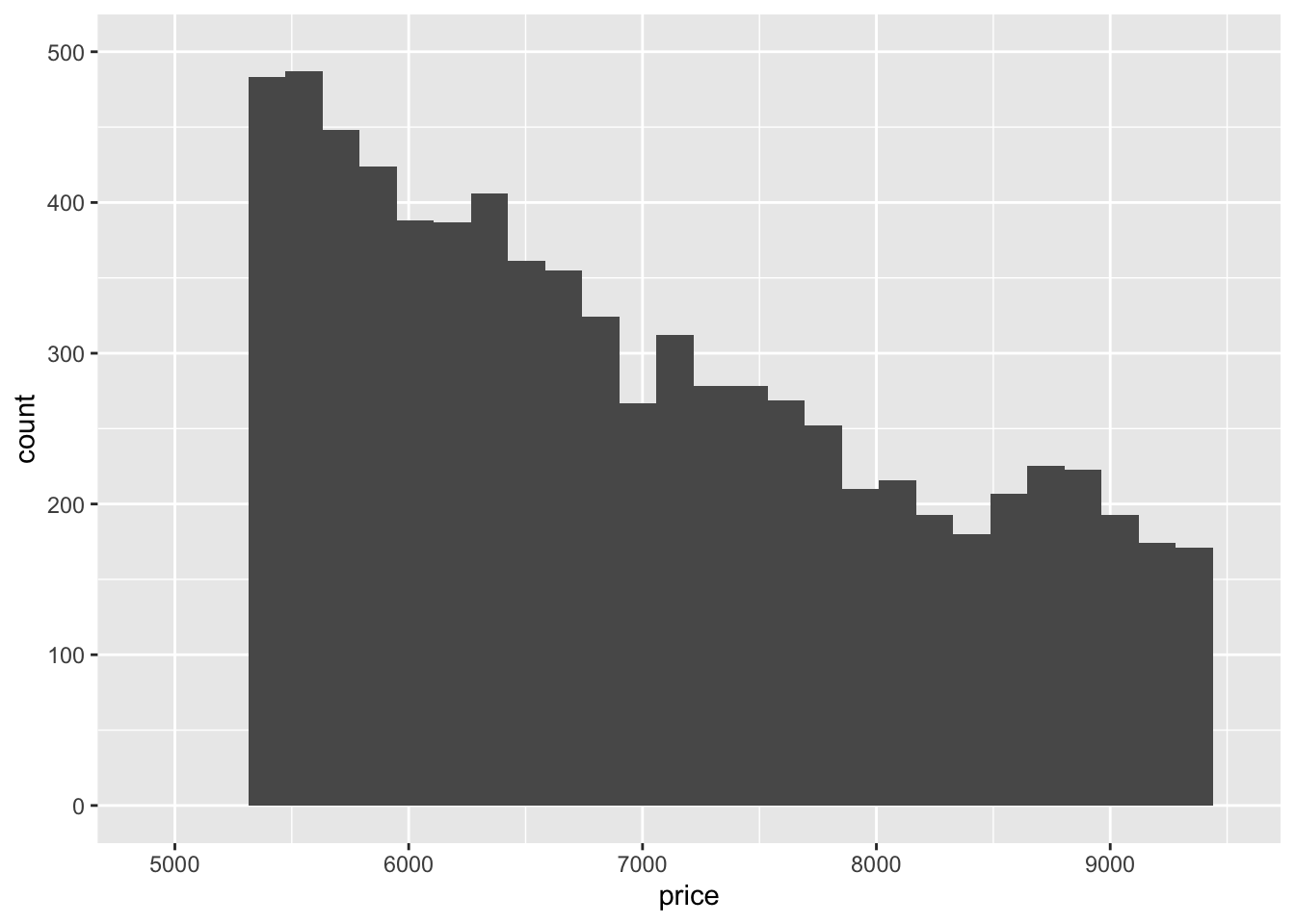
xlim()andylim()remove the values that don’t fall within the specified range whilecoord_cartesian()just clips off the parts of the graph that fall outside of the range
7.4 Missing Values
Recommended to replace unusual values (if justifiable) with NA instead of dropping the entire row
7.4.1 Exercises
- What happens to missing values in a histogram? What happens to missing values in a bar chart? Why is there a difference?
diamonds %>%
  mutate(x = ifelse(x == 0, NA, x)) %>%
  ggplot(aes(x = x)) +
  geom_histogram()
## `stat_bin()` using `bins = 30`. Pick better value with `binwidth`.## Warning: Removed 8 rows containing non-finite values (stat_bin).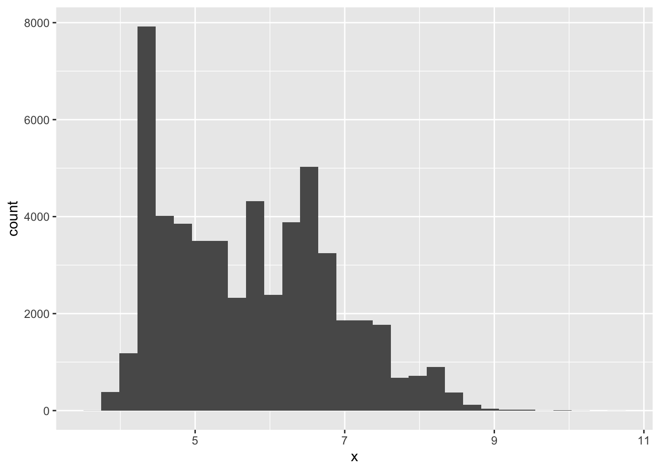
flights %>%
  mutate(carrier = ifelse(carrier == "AA", NA, carrier)) %>%
  ggplot(aes(carrier)) +
  geom_bar()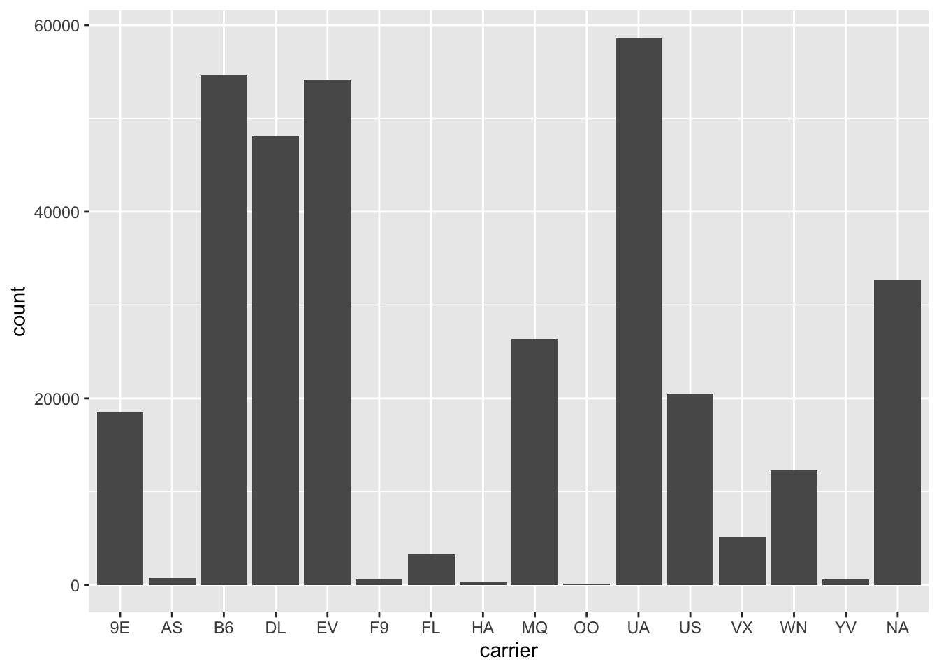
NAs are omitted from histograms since they are for continuous value and there is no natural place to put them.NAs are placed in their own category with bar plots since they can easily be separated from the other categories
- What does na.rm = TRUE do in mean() and sum()?
It ignores NA values so the calculations can be completed on the remaining values
7.5 Covariation
Covariation describes the behavior between variables
7.5.1 A categorical and continuous variable
Often visualized with frequency distributions overlaid, or boxplots
7.5.1.1 Exercises
- Use what you’ve learned to improve the visualisation of the departure times of cancelled vs. non-cancelled flights.
nycflights13::flights %>%
  mutate(
    cancelled = is.na(dep_time),
    sched_hour = sched_dep_time %/% 100,
    sched_min = sched_dep_time %% 100,
    sched_dep_time = sched_hour + sched_min / 60
  ) %>%
  ggplot(mapping = aes(x = sched_dep_time, y = ..density..)) +
    geom_freqpoly(mapping = aes(colour = cancelled), binwidth = 1/4)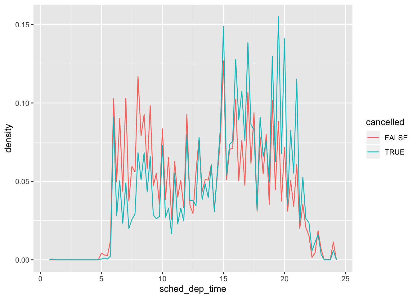
nycflights13::flights %>%
  mutate(
    cancelled = is.na(dep_time),
    sched_hour = sched_dep_time %/% 100,
    sched_min = sched_dep_time %% 100,
    sched_dep_time = sched_hour + sched_min / 60
  ) %>%
  ggplot(mapping = aes(x = cancelled, y = sched_dep_time)) +
    geom_boxplot()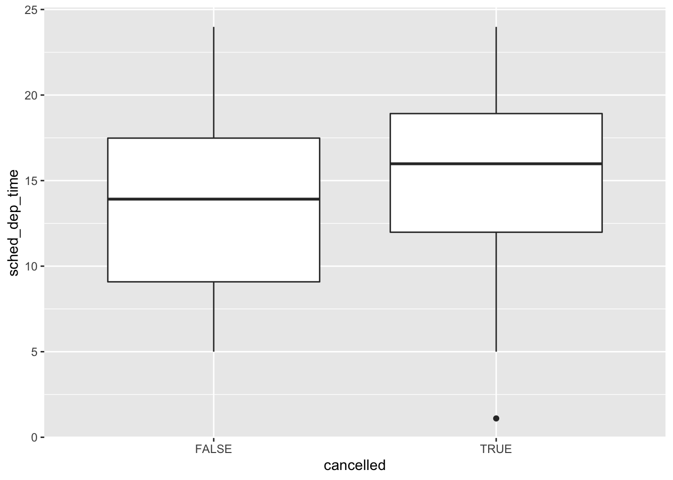
- What variable in the diamonds dataset is most important for predicting the price of a diamond? How is that variable correlated with cut? Why does the combination of those two relationships lead to lower quality diamonds being more expensive?
diamond_fit <- lm(price ~ ., data = diamonds)
summary(diamond_fit)
##
## Call:
## lm(formula = price ~ ., data = diamonds)
##
## Residuals:
## Min 1Q Median 3Q Max
## -21376.0 -592.4 -183.5 376.4 10694.2
##
## Coefficients:
## Estimate Std. Error t value Pr(>|t|)
## (Intercept) 5753.762 396.630 14.507 < 2e-16 ***
## carat 11256.978 48.628 231.494 < 2e-16 ***
## cut.L 584.457 22.478 26.001 < 2e-16 ***
## cut.Q -301.908 17.994 -16.778 < 2e-16 ***
## cut.C 148.035 15.483 9.561 < 2e-16 ***
## cut^4 -20.794 12.377 -1.680 0.09294 .
## color.L -1952.160 17.342 -112.570 < 2e-16 ***
## color.Q -672.054 15.777 -42.597 < 2e-16 ***
## color.C -165.283 14.725 -11.225 < 2e-16 ***
## color^4 38.195 13.527 2.824 0.00475 **
## color^5 -95.793 12.776 -7.498 6.59e-14 ***
## color^6 -48.466 11.614 -4.173 3.01e-05 ***
## clarity.L 4097.431 30.259 135.414 < 2e-16 ***
## clarity.Q -1925.004 28.227 -68.197 < 2e-16 ***
## clarity.C 982.205 24.152 40.668 < 2e-16 ***
## clarity^4 -364.918 19.285 -18.922 < 2e-16 ***
## clarity^5 233.563 15.752 14.828 < 2e-16 ***
## clarity^6 6.883 13.715 0.502 0.61575
## clarity^7 90.640 12.103 7.489 7.06e-14 ***
## depth -63.806 4.535 -14.071 < 2e-16 ***
## table -26.474 2.912 -9.092 < 2e-16 ***
## x -1008.261 32.898 -30.648 < 2e-16 ***
## y 9.609 19.333 0.497 0.61918
## z -50.119 33.486 -1.497 0.13448
## ---
## Signif. codes: 0 '***' 0.001 '**' 0.01 '*' 0.05 '.' 0.1 ' ' 1
##
## Residual standard error: 1130 on 53916 degrees of freedom
## Multiple R-squared: 0.9198, Adjusted R-squared: 0.9198
## F-statistic: 2.688e+04 on 23 and 53916 DF, p-value: < 2.2e-16- carat is the most important variable to predict price
diamonds %>%
  ggplot() +
  geom_boxplot(aes(x = reorder(cut, carat, FUN = median), y = carat, fill = cut)) +
  coord_flip()
- Fair diamonds on average have a higher carat than other cuts. This result explains why Fair diamonds have a higher average price than the other cuts, since carat weight is the most correlated variable with price.
- Install the ggstance package, and create a horizontal boxplot. How does this compare to using coord_flip()?
library(ggstance)##
## Attaching package: 'ggstance'## The following objects are masked from 'package:ggplot2':
##
## geom_errorbarh, GeomErrorbarhdiamonds %>%
ggplot() +
geom_boxploth(aes(y = reorder(cut, carat, FUN = median), x = carat, fill = cut))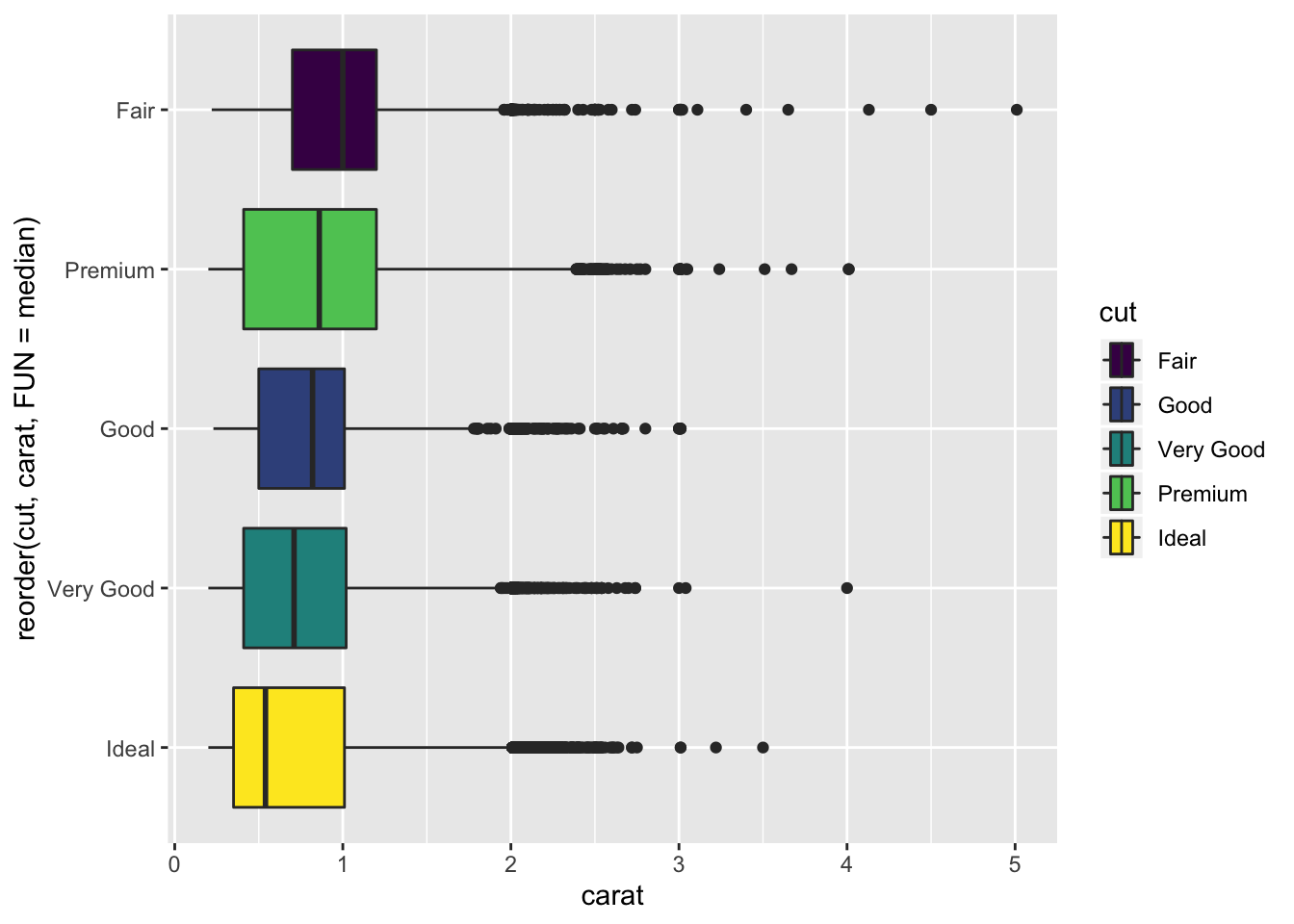
- The plot is almost identical to using
coord_flip()except the legend is also flipped for readability. Additionally the variables are supplied in the opposite order between the 2 methods.
- One problem with boxplots is that they were developed in an era of much smaller datasets and tend to display a prohibitively large number of “outlying values”. One approach to remedy this problem is the letter value plot. Install the lvplot package, and try using geom_lv() to display the distribution of price vs cut. What do you learn? How do you interpret the plots?
library(lvplot)

diamonds %>%
  ggplot(aes(x = cut, y = price, fill = cut)) +
  geom_lv()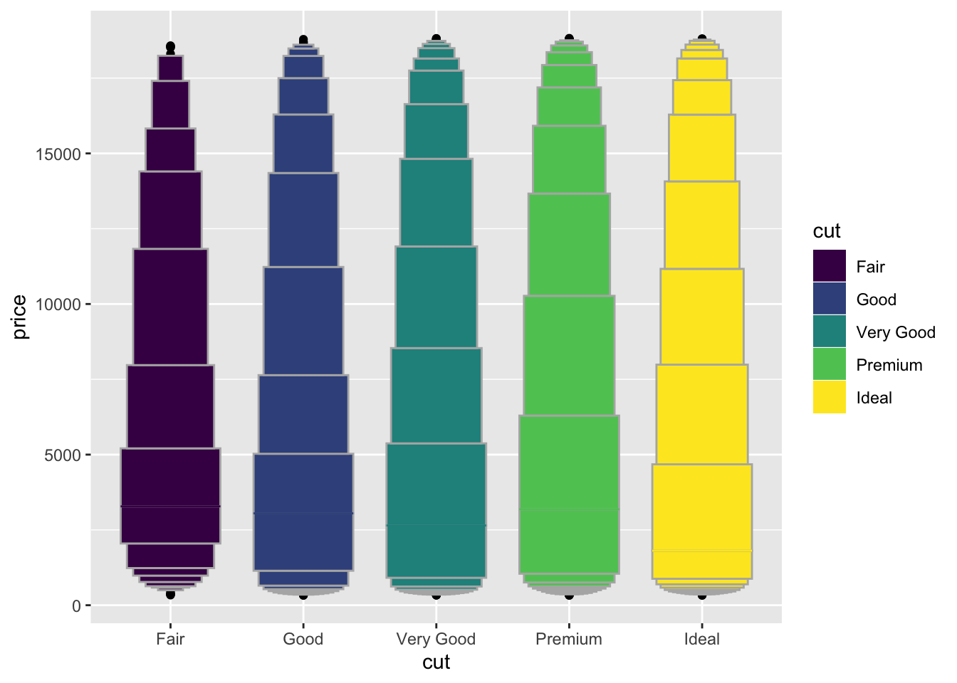
diamonds %>%
  ggplot(aes(log2(price), fill = cut)) +
  geom_histogram() +
  facet_wrap(~cut, ncol = 5, scales = "free") +
  coord_flip() +
  guides(fill=FALSE)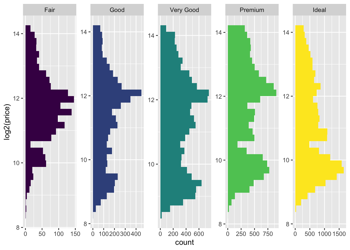
- The letter value plot shows less outliers than the boxplot identified. This is the purpose of the plot since we are dealing with much larger data than the boxplot was intended for.
- Compare and contrast geom_violin() with a facetted geom_histogram(), or a coloured geom_freqpoly(). What are the pros and cons of each method?
diamonds %>%
  ggplot(aes(x = cut, y = price, fill = cut)) +
  geom_violin() +
  guides(fill=FALSE)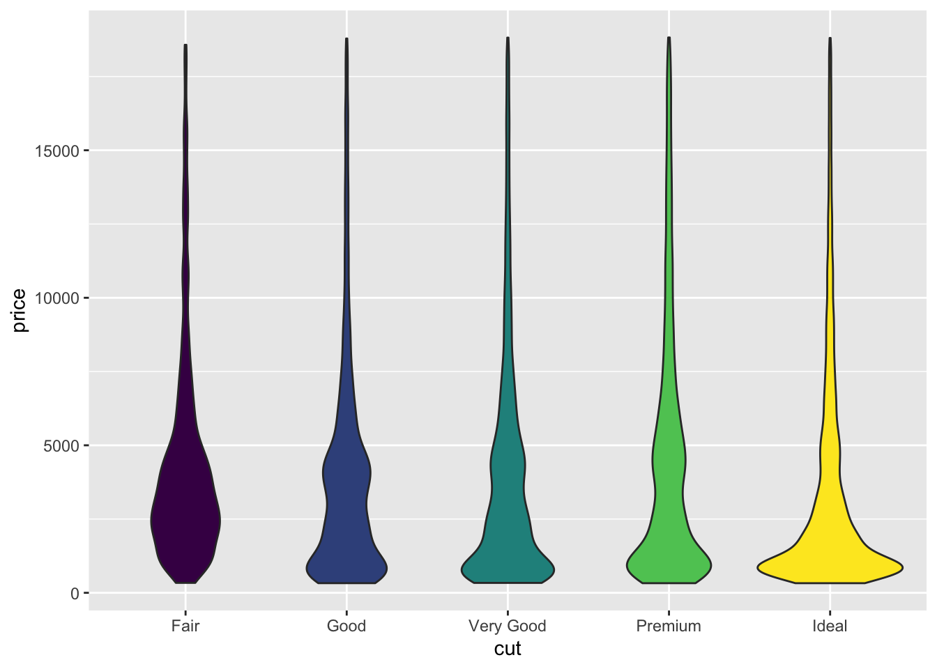
diamonds %>%
  ggplot(aes(price, fill = cut)) +
  geom_histogram() +
  facet_wrap(~cut, ncol = 3, scales = "free") +
  guides(fill=FALSE)
## `stat_bin()` using `bins = 30`. Pick better value with `binwidth`.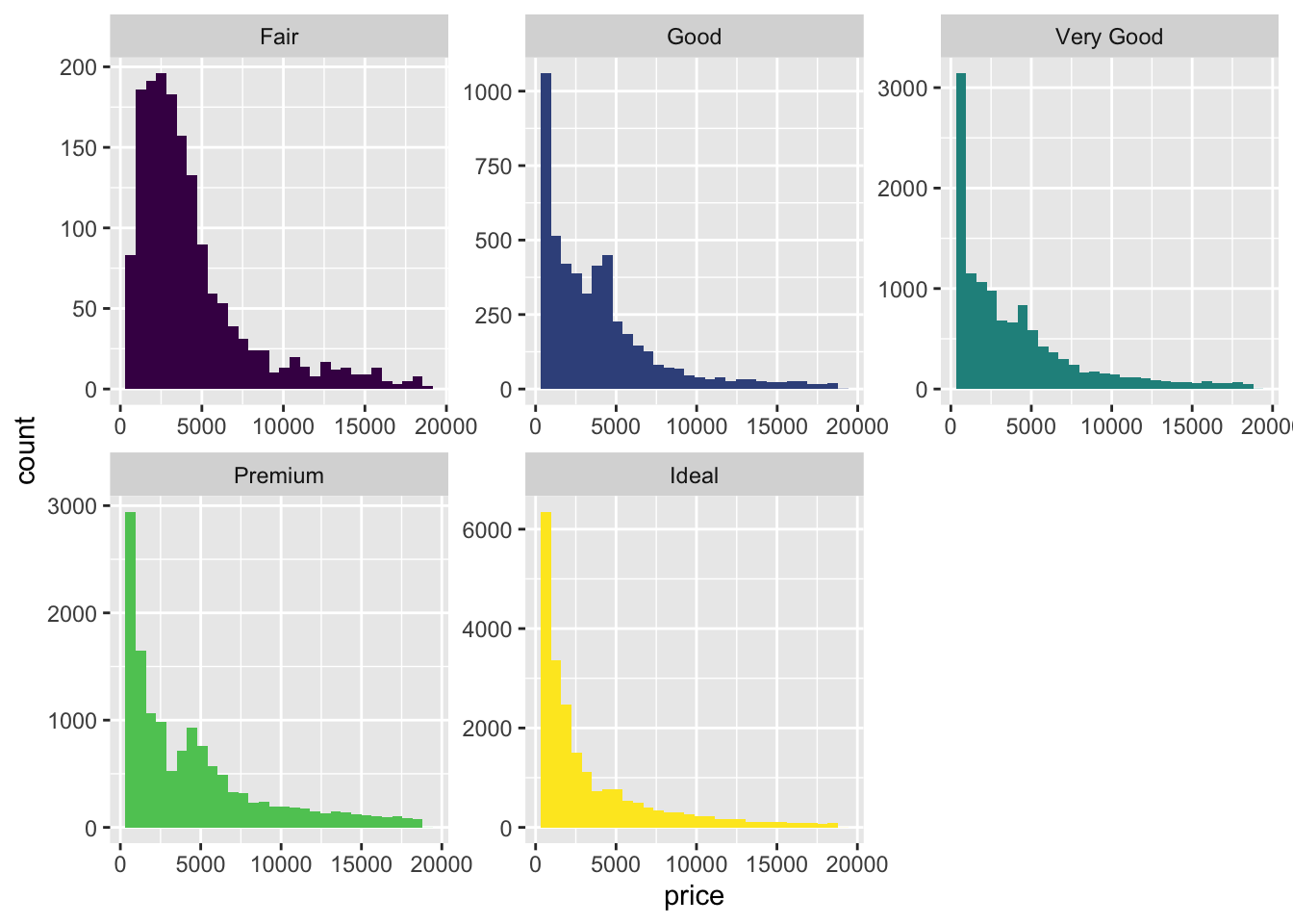
diamonds %>%
  ggplot(aes(x = price, y = ..density.., color = cut)) +
  geom_freqpoly()
## `stat_bin()` using `bins = 30`. Pick better value with `binwidth`.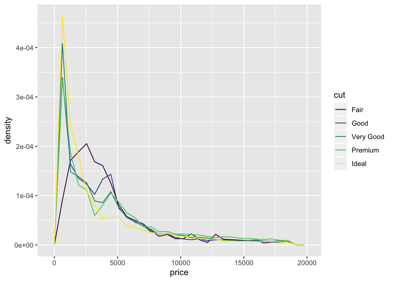
diamonds %>%
  ggplot(aes(x = price, color = cut)) +
  geom_density()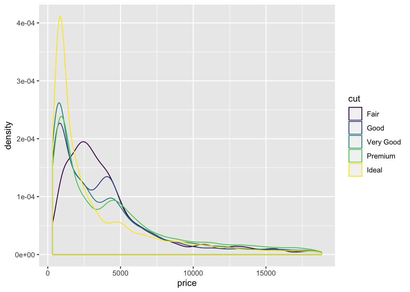
- Also included the
geom_density()function. freqpoly and density allow for easy comparison between distributions. Violin and Histogram are good for seeing the shape of individual distributions.
- If you have a small dataset, it’s sometimes useful to use geom_jitter() to see the relationship between a continuous and categorical variable. The ggbeeswarm package provides a number of methods similar to geom_jitter(). List them and briefly describe what each one does.
library(ggbeeswarm)

  ggplot2::ggplot(ggplot2::mpg,aes(class, hwy)) + geom_quasirandom()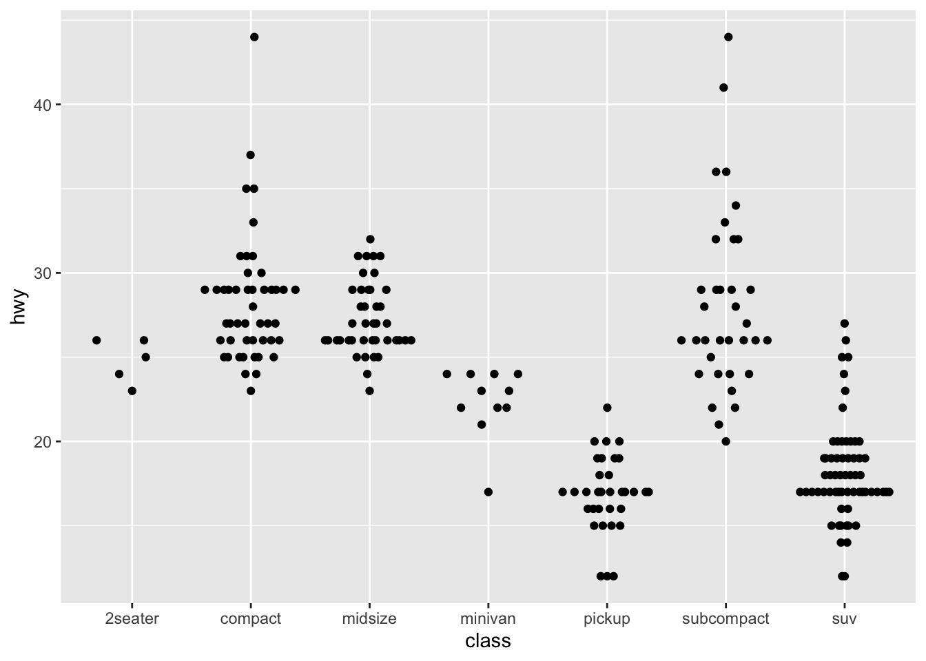
  distro <- data.frame(
    'variable'=rep(c('runif','rnorm'),each=100),
    'value'=c(runif(100, min=-3, max=3), rnorm(100))
  )
  ggplot2::ggplot(distro,aes(variable, value)) + geom_quasirandom()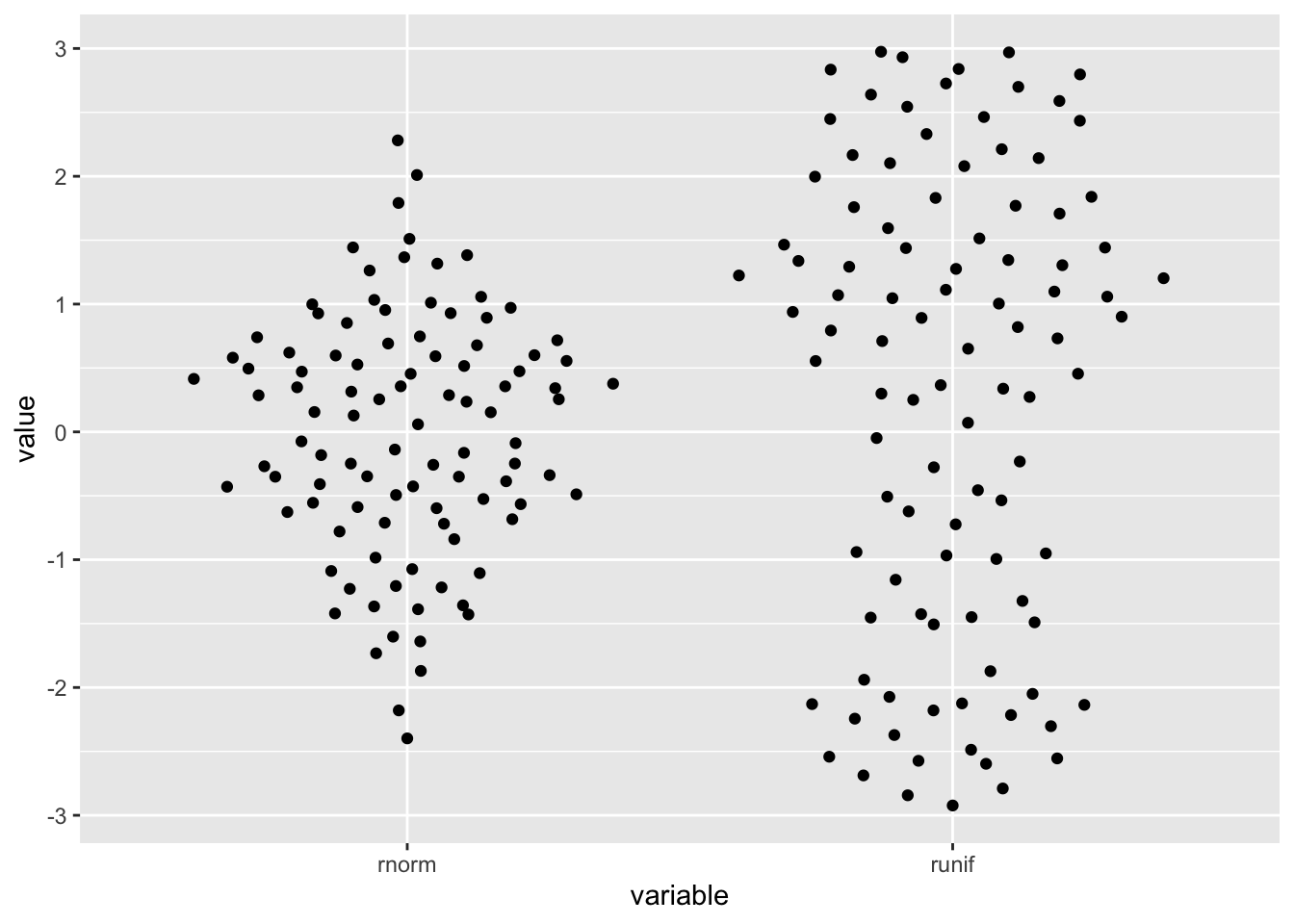
ggplot2::ggplot(distro,aes(variable, value)) + geom_quasirandom(width=.1)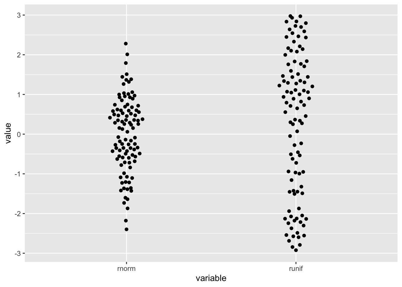
- The package allows for visualization of one dimensional data by arranging the points the resemble the distribution.
7.5.2 Two categorical variables
To visualise the covariation between categorical variables, you’ll need to count the number of observations for each combination.
7.5.2.1 Exercises
- How could you rescale the count dataset above to more clearly show the distribution of cut within colour, or colour within cut?
# cut within color
diamonds %>%
  count(color, cut) %>%
  group_by(color) %>%
  mutate(prop = n / sum(n)) %>%
  ggplot(aes(x = color, y = cut)) +
  geom_tile(aes(fill = prop))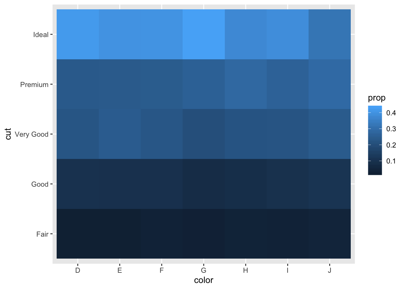
# color within cut
diamonds %>%
  count(color, cut) %>%
  group_by(cut) %>%
  mutate(prop = n / sum(n)) %>%
  ggplot(aes(x = color, y = cut)) +
  geom_tile(aes(fill = prop))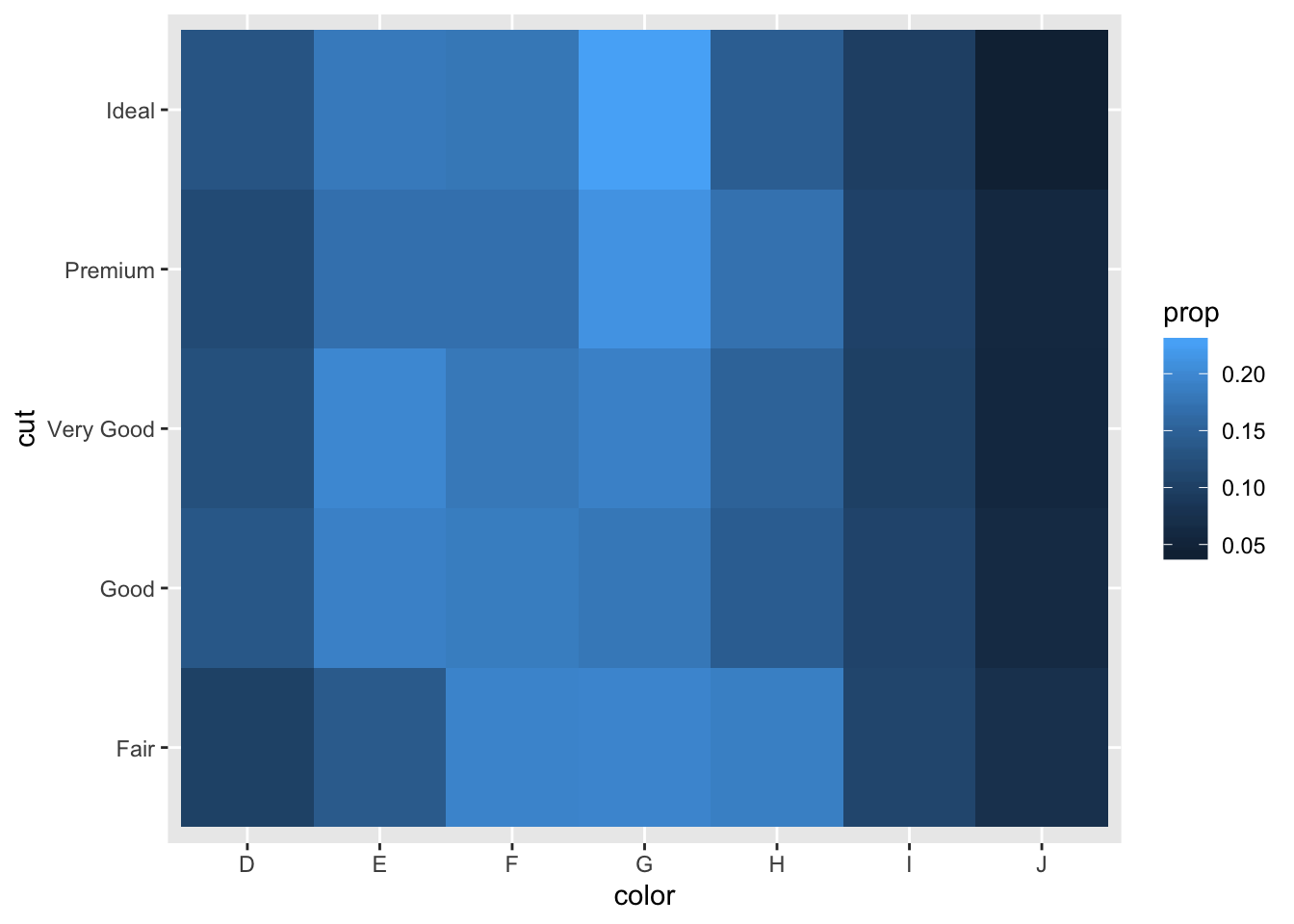
- Use geom_tile() together with dplyr to explore how average flight delays vary by destination and month of year. What makes the plot difficult to read? How could you improve it?
flights %>%
  group_by(month, dest) %>%
  summarise(avg_dep_delay = mean(dep_delay, na.rm = TRUE)) %>%
  ggplot(aes(x = factor(month), y = dest, fill = avg_dep_delay)) +
  geom_tile() +
  scale_fill_distiller(type = "div", palette = "Spectral")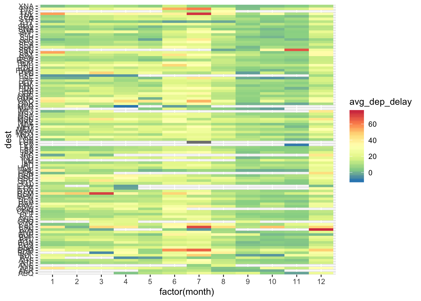
- Currently the plot is unordered so it is difficult to identify any patterns. It could be improved by sorting based on avg delay
flights %>%
  group_by(month, dest) %>%
  summarise(avg_dep_delay = mean(dep_delay, na.rm = TRUE)) %>%
   group_by(dest) %>%
  filter(n() == 12) %>%
  ungroup() %>%
  ggplot(aes(x = factor(month), y = reorder(dest, avg_dep_delay, FUN = mean), fill = avg_dep_delay)) +
  geom_tile() +
  scale_fill_distiller(type = "div", palette = "Spectral") +
  labs(x = "Month", y = "Destination", fill = "Average Delay", title = "Sorting Destinations by Average Delay")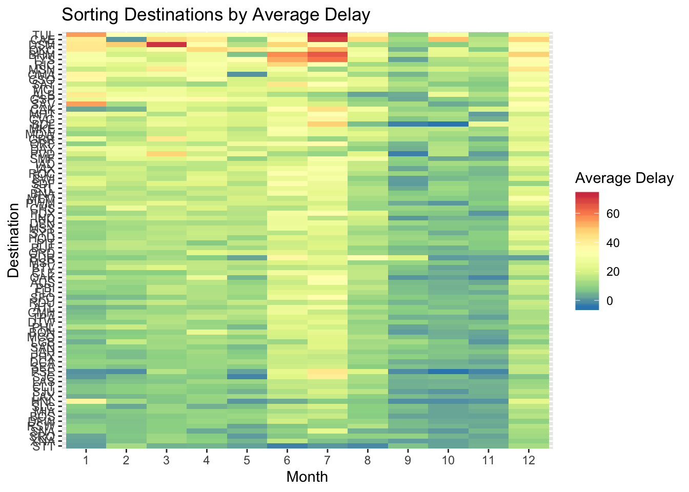
flights %>%
  group_by(month, dest) %>%
  summarise(avg_dep_delay = mean(dep_delay, na.rm = TRUE)) %>%
  group_by(dest) %>%
  filter(n() == 12) %>%
  ungroup() %>%
  ggplot(aes(x = reorder(factor(month), avg_dep_delay, FUN = mean), y = reorder(dest, avg_dep_delay, FUN = mean), fill = avg_dep_delay)) +
  geom_tile() +
  scale_fill_distiller(type = "div", palette = "Spectral") +
    labs(x = "Month", y = "Destination", fill = "Average Delay", title = "Sorting Destinations and Month by Average Delay")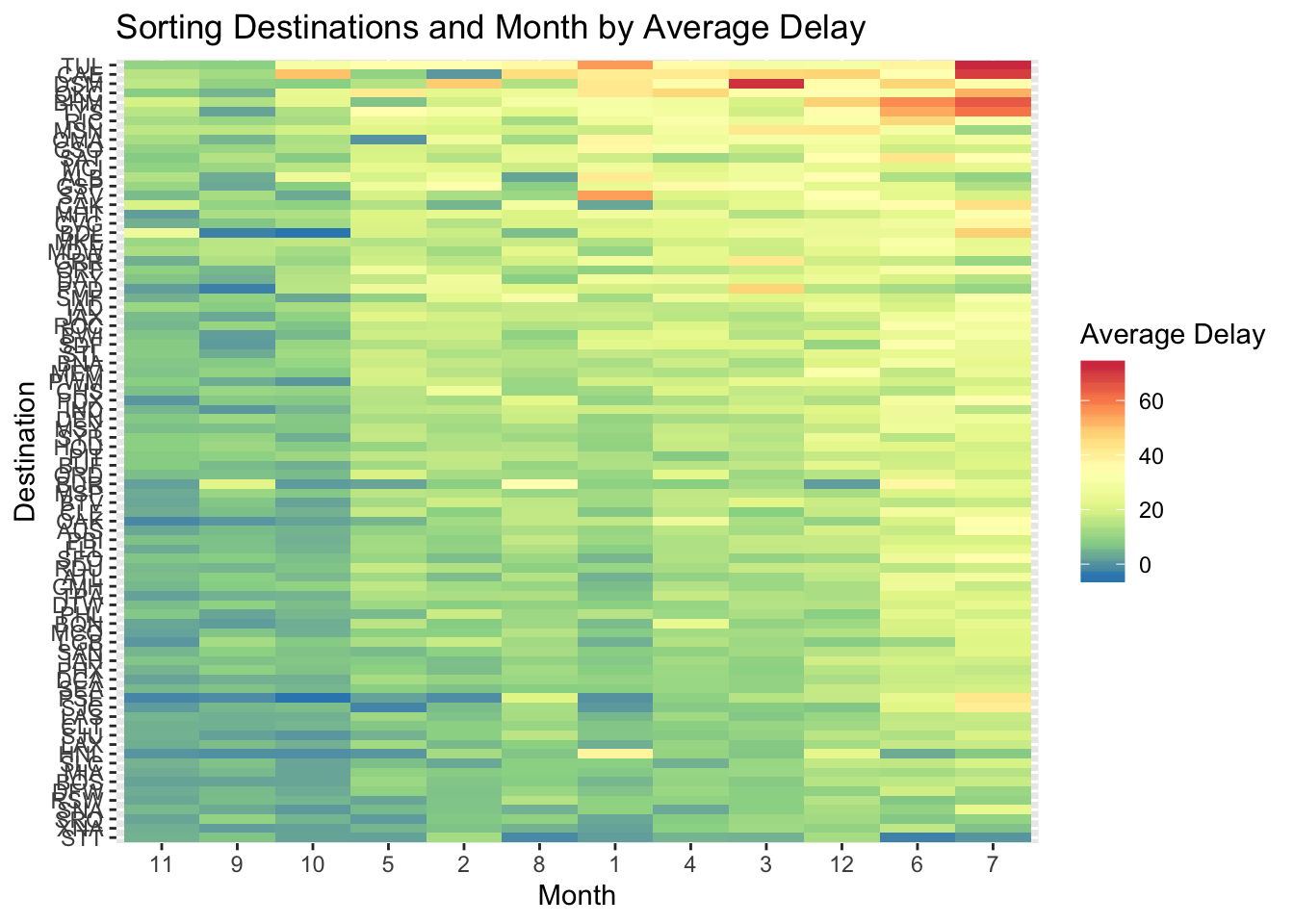
- Why is it slightly better to use aes(x = color, y = cut) rather than aes(x = cut, y = color) in the example above?
diamonds %>%
  count(color, cut) %>%
  ggplot(mapping = aes(x = color, y = cut)) +
  geom_tile(mapping = aes(fill = n)) +
  labs(title = "Better than x = cut, y = color")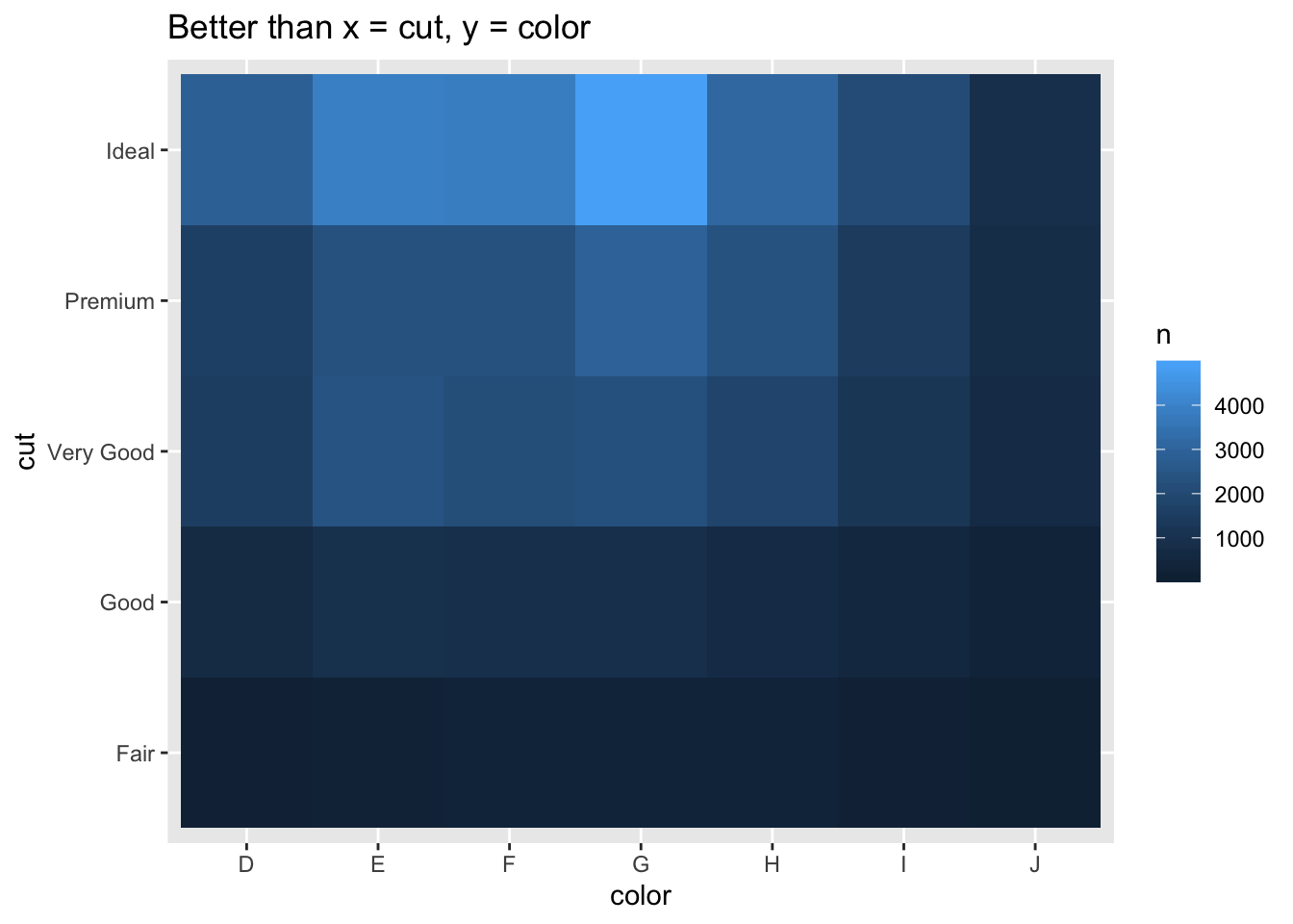
diamonds %>%
  count(color, cut) %>%
  ggplot(mapping = aes(y = color, x = cut)) +
    geom_tile(mapping = aes(fill = n)) +
  labs(title = "Worse than x = color, y = cut")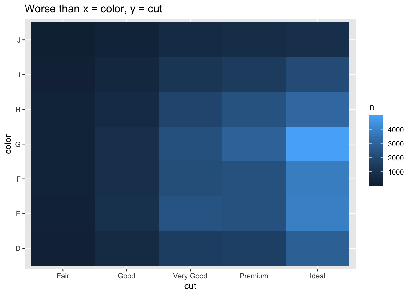
- Since there are more colors than cuts and the plot is wider than long, using x = color, y = cut gives tiles that are closer to squares, which are a little easier to compare against each other than rectangles yielded the other way around.
7.5.3 Two continuous variables
Scatterplot is most common, but is less useful as data set size increases. Options like reducing alpha, binning, and grouping for boxplots can be used.
7.5.3.1 Exercises
- Instead of summarising the conditional distribution with a boxplot, you could use a frequency polygon. What do you need to consider when using cut_width() vs cut_number()? How does that impact a visualisation of the 2d distribution of carat and price?
diamonds %>%
  filter(carat < 2.5) %>%
ggplot(aes(x = price)) +
  geom_freqpoly(aes(color = cut_width(carat, 0.25)))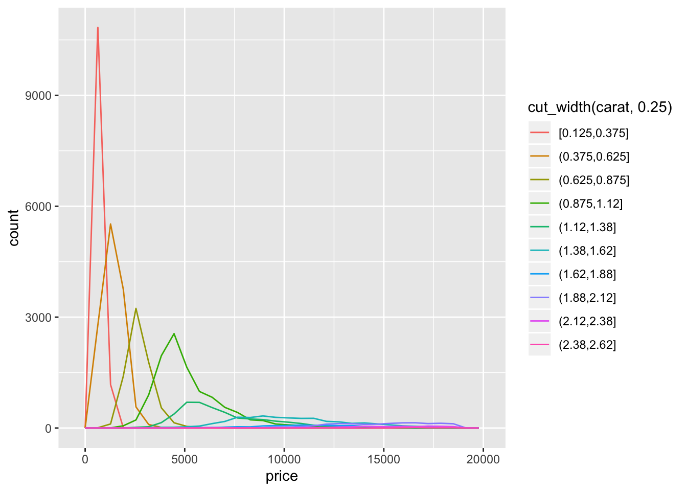
diamonds %>%
  filter(carat < 2.5) %>%
ggplot(aes(x = price)) +
  geom_freqpoly(aes(color = cut_number(carat, 10)))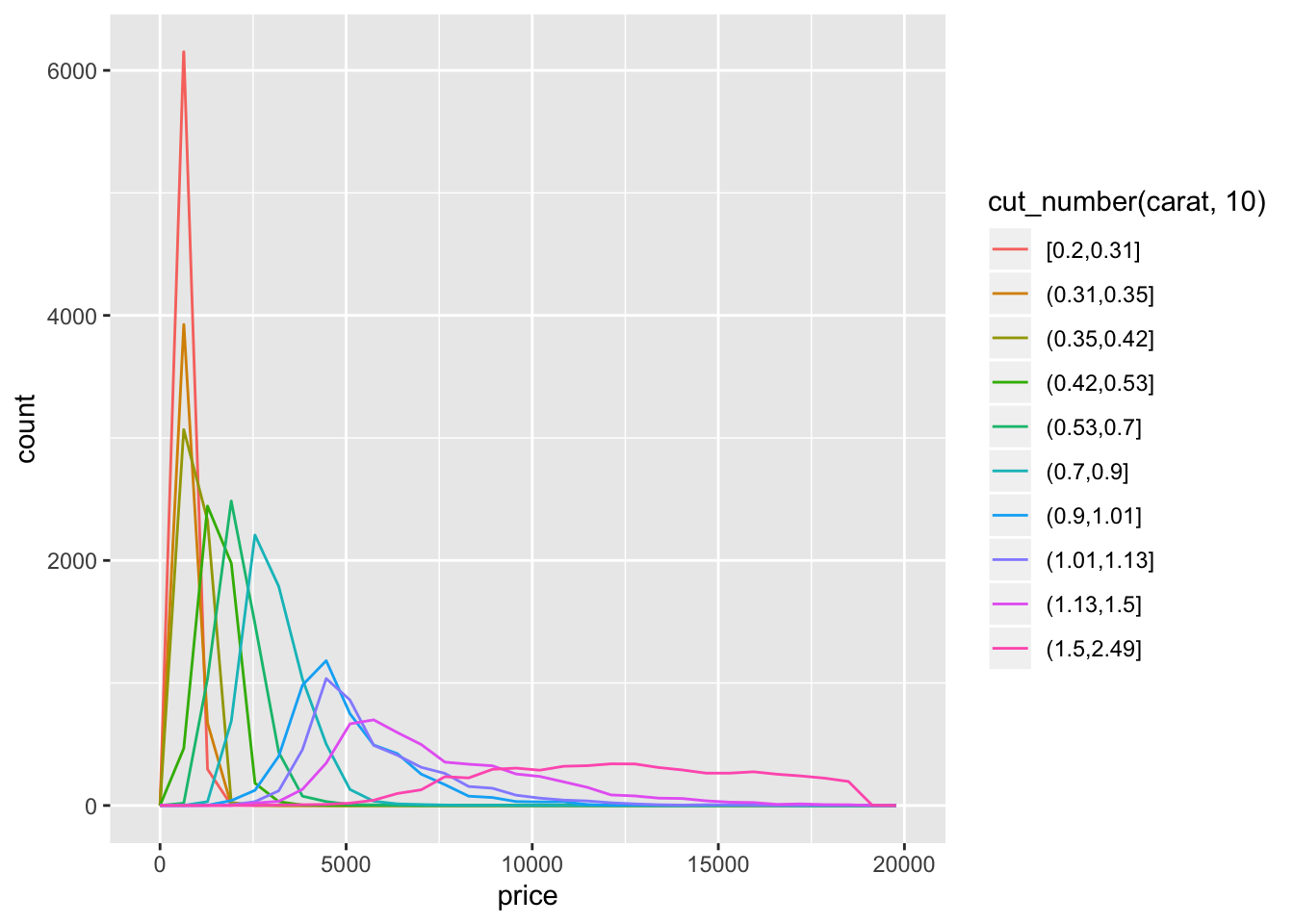
diamonds %>%
  filter(carat < 2.5) %>%
ggplot(aes(x = price)) +
  geom_density(aes(color = cut_width(carat, 0.25)))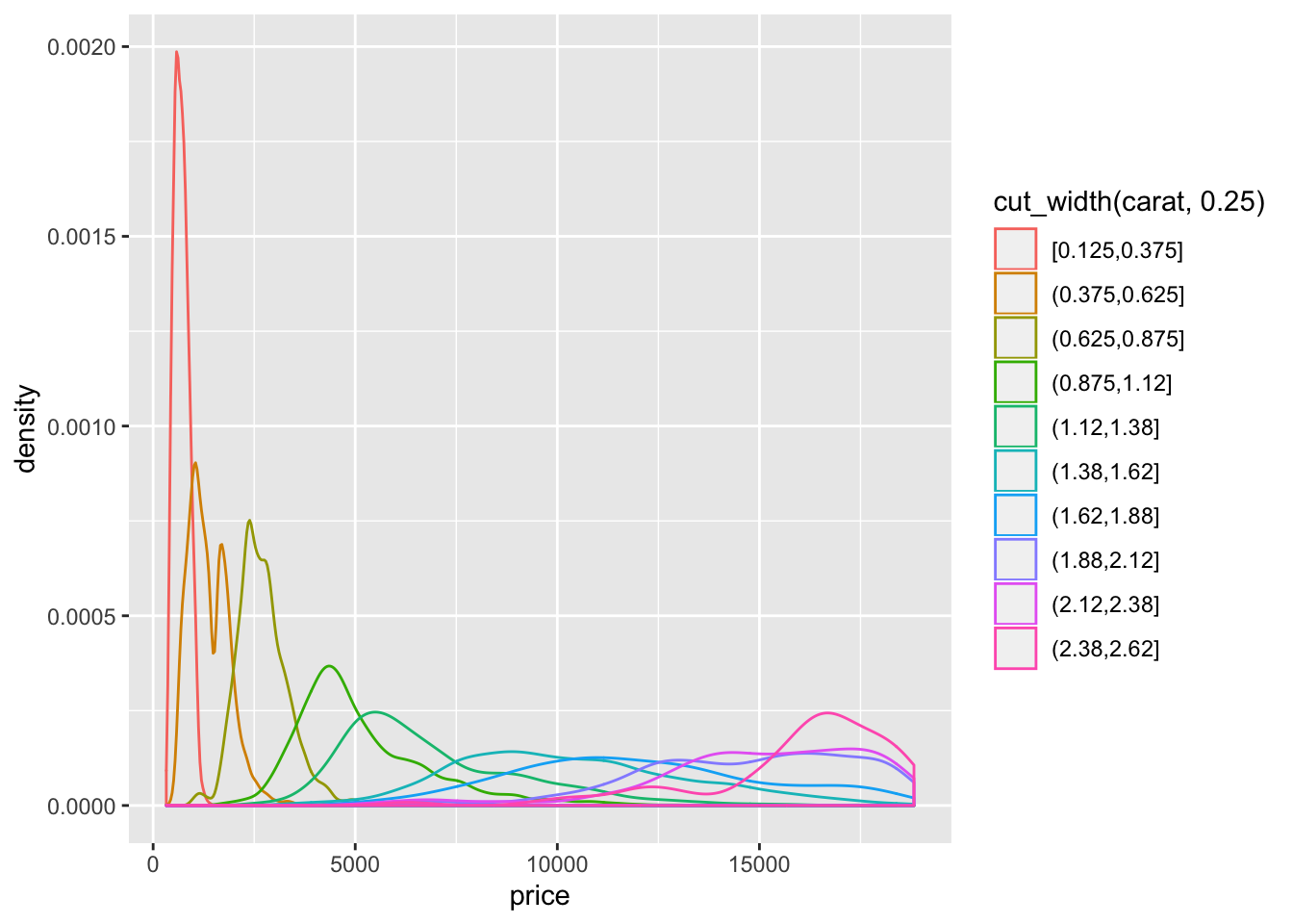
library(ggridges)

diamonds %>%
  filter(carat < 2.5) %>%
ggplot(aes(x = price)) +
  geom_density_ridges(aes(y  = cut_width(carat, 0.25), fill = cut_width(carat, 0.25))) +
  theme_ridges() +
  guides(fill = FALSE)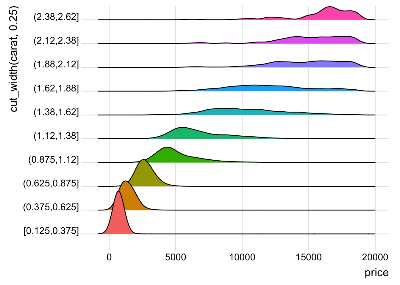
- The distribution is right skewed so using
cut_width()results in much fewer diamonds in the right most bins.cut_number()ends up putting a much larger range of diamonds in the higher bins and makes the distribution appear much flatter.geom_density()orgeom_density_ridges()seem to be the most appropriate functions to see the change in the distribution.
- Visualise the distribution of carat, partitioned by price.
diamonds %>%
  filter(carat < 3) %>%
ggplot(aes(x = carat)) +
  geom_density_ridges(aes(y  = cut_width(price, 2000), fill = cut_width(price, 2000))) +
  theme_ridges() +
  guides(fill = FALSE)
## Picking joint bandwidth of 0.0368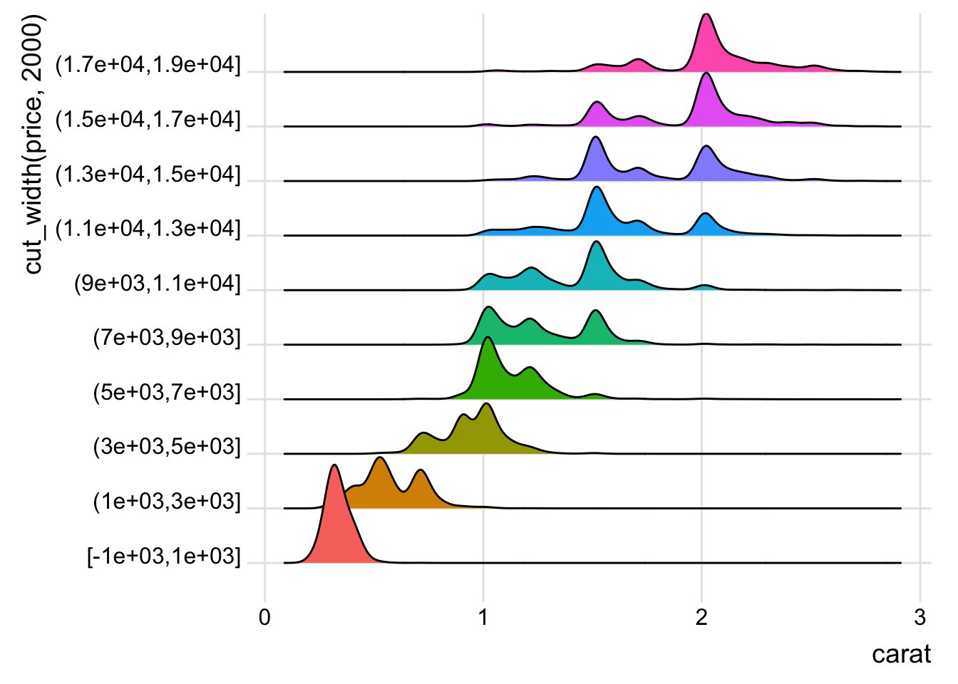
- How does the price distribution of very large diamonds compare to small diamonds. Is it as you expect, or does it surprise you?
- The distribution for larger diamonds is more spread out, which (being a married man and having done my diamond research before) is not surprising since the other factors like color, cut, and clarity become more important to pricing than they are for smaller diamonds.
- Combine two of the techniques you’ve learned to visualise the combined distribution of cut, carat, and price.
diamonds %>%
        group_by(cut, cut_number(carat, 5)) %>%
        summarise(avg_price = mean(price, na.rm = TRUE)) %>%
        ggplot() +
        geom_tile(aes(x = `cut_number(carat, 5)`, y = cut, fill = avg_price))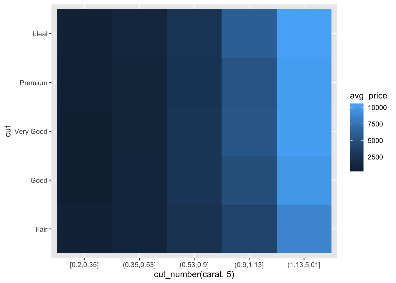
library(hexbin)
diamonds %>%
        ggplot() +
        geom_hex(aes(x = carat, y = price)) +
        facet_wrap(~cut, nrow = 3)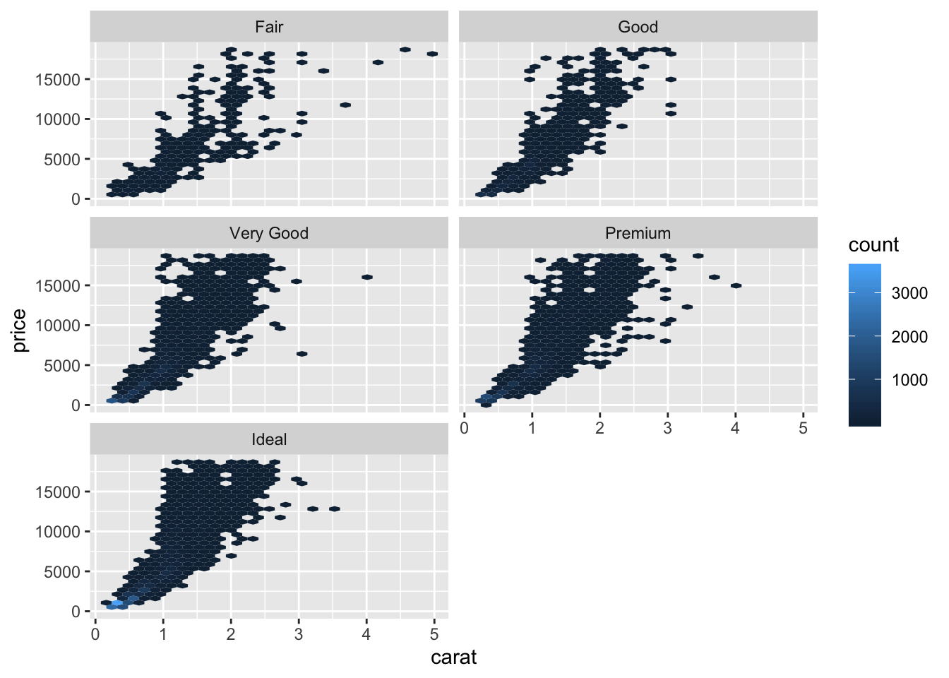
diamonds %>%
        ggplot() +
        geom_boxplot(aes(x = cut_number(carat, 5), y = price, color = cut))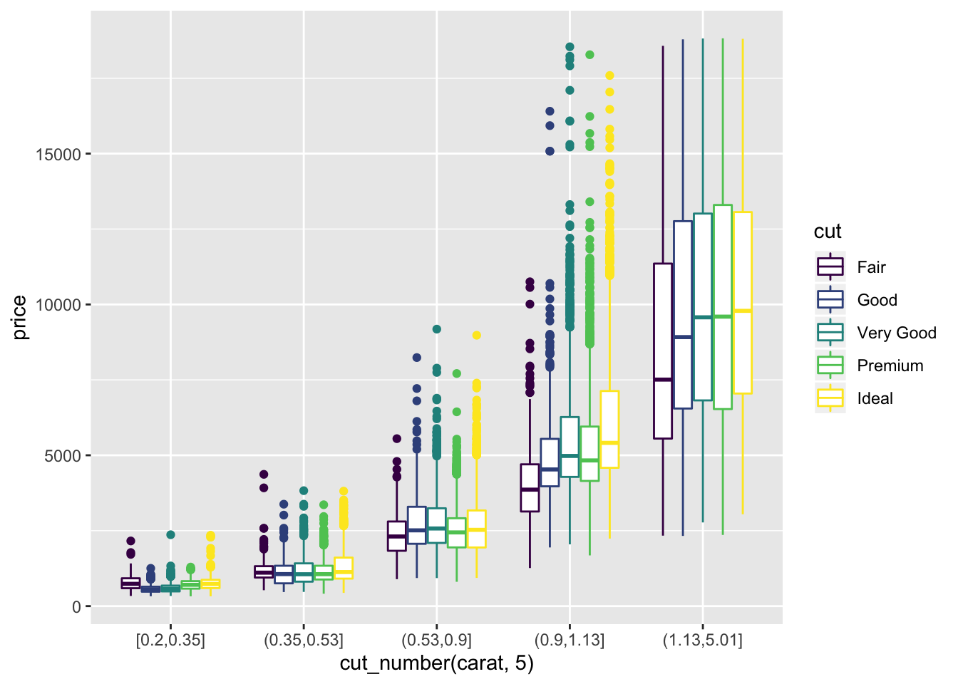
- Two dimensional plots reveal outliers that are not visible in one dimensional plots. For example, some points in the plot below have an unusual combination of x and y values, which makes the points outliers even though their x and y values appear normal when examined separately. Why is a scatterplot a better display than a binned plot for this case?
ggplot(data = diamonds) +
  geom_point(mapping = aes(x = x, y = y)) +
  coord_cartesian(xlim = c(4, 11), ylim = c(4, 11))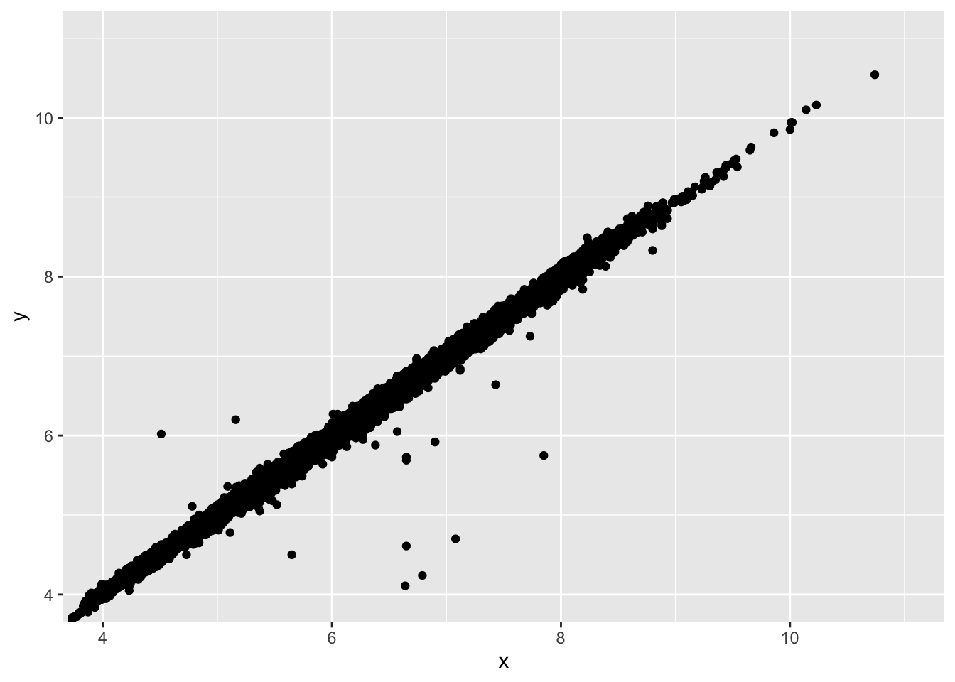
ggplot(data = diamonds) +
  geom_bin2d(mapping = aes(x = x, y = y), bins = 100) +
  coord_cartesian(xlim = c(4, 11), ylim = c(4, 11))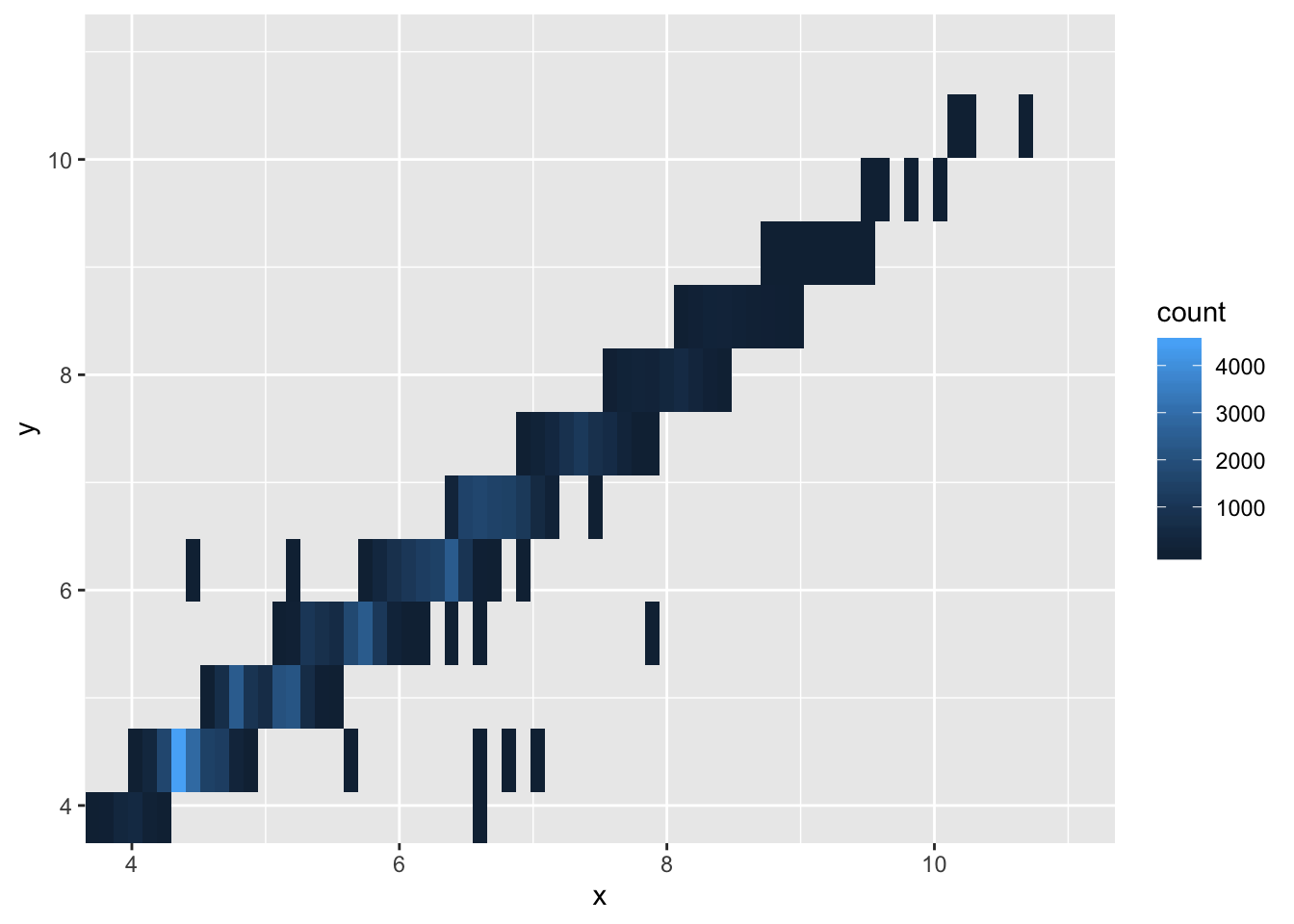
- The scatterplot allows you to see individual points, which is the goal when identifying outliers. This makes the scatterplot preferable in this scenario.
