
3 Data Visualization - R for Data Science
This post covers the content and exercises for Ch 3: Data Visualization from R for Data Science. The chapter teaches the use of the grammar of graphics with ggplot2.
3.2 First Steps
We begin by loading the tidyverse which contains ggplot2 and numerous other useful libraries.
library(tidyverse)The first plot addresses the question: Do cars with big engines use more fuel than cars with small engines?
head(mpg)## # A tibble: 6 x 11
## manufacturer model displ year cyl trans drv cty hwy fl class
## <chr> <chr> <dbl> <int> <int> <chr> <chr> <int> <int> <chr> <chr>
## 1 audi a4 1.8 1999 4 auto(l5) f 18 29 p compa…
## 2 audi a4 1.8 1999 4 manual(m5) f 21 29 p compa…
## 3 audi a4 2 2008 4 manual(m6) f 20 31 p compa…
## 4 audi a4 2 2008 4 auto(av) f 21 30 p compa…
## 5 audi a4 2.8 1999 6 auto(l5) f 16 26 p compa…
## 6 audi a4 2.8 1999 6 manual(m5) f 18 26 p compa…ggplot(data = mpg) +
geom_point(mapping = aes(x = displ, y = hwy))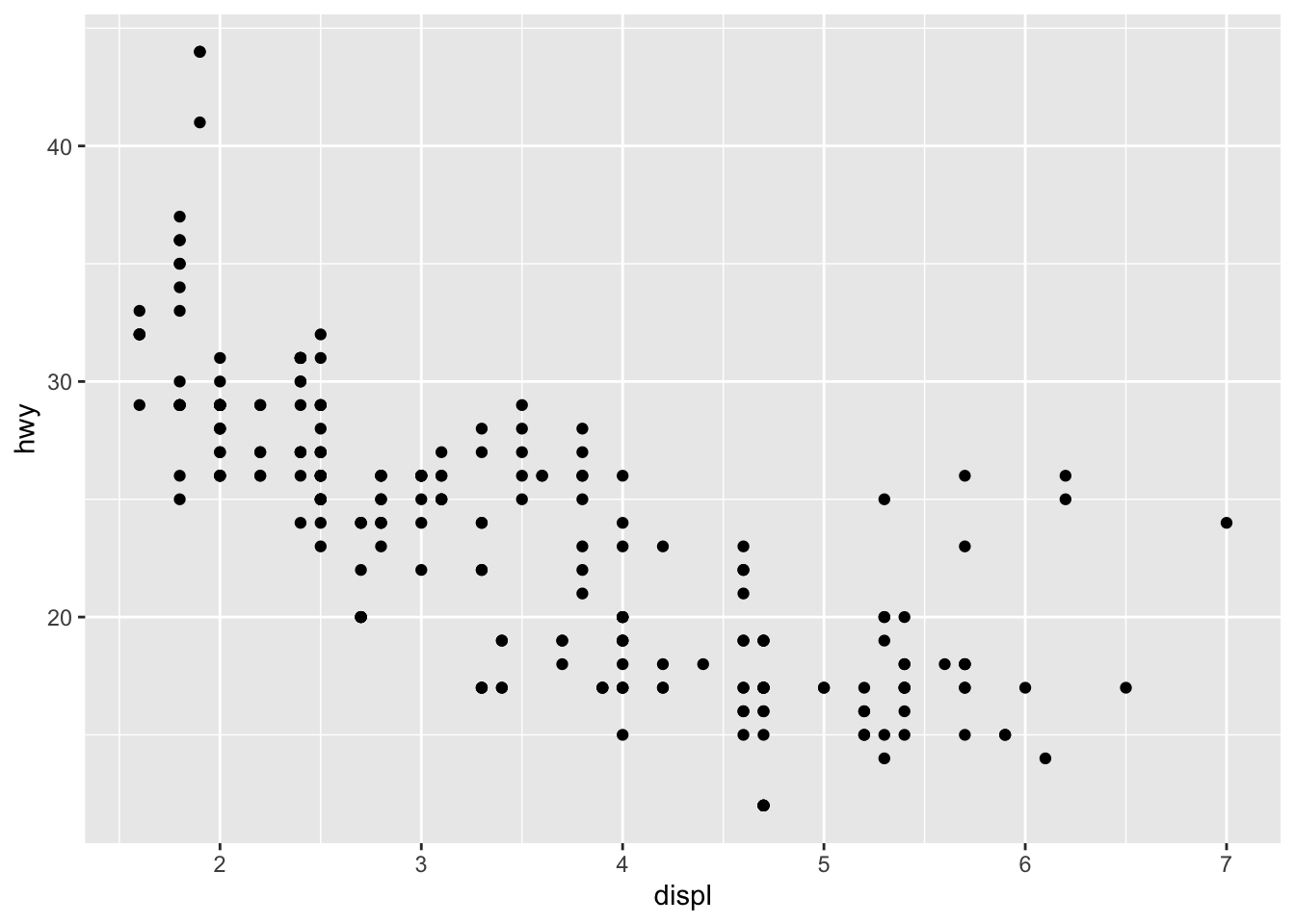
3.2.4 Exercises
- Run ggplot(data = mpg). What do you see?
ggplot(data = mpg)![]()
It’s an empty plot
- How many rows are in mpg? How many columns?
dim(mpg)## [1] 234 11234 rows and 11 columns
- What does the drv variable describe? Read the help for ?mpg to find out.
drv indicates whether its front / rear / 4 wheel drive
- Make a scatterplot of hwy vs cyl.
ggplot(data = mpg) +
geom_point(aes(x = cyl, y = hwy))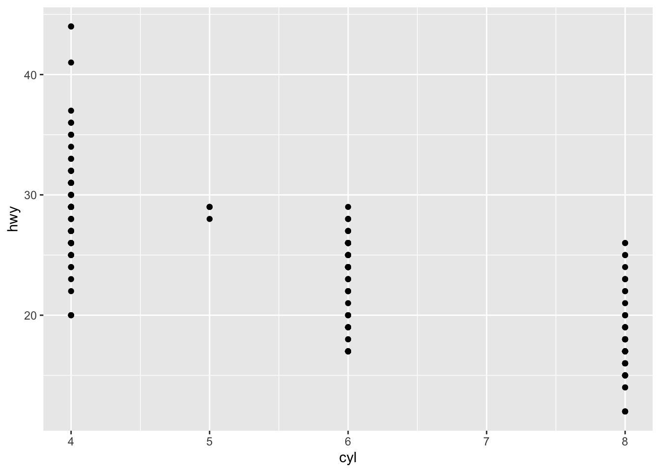
- What happens if you make a scatterplot of class vs drv? Why is the plot not useful?
ggplot(data = mpg) +
geom_point(mapping = aes(x = drv, y = class))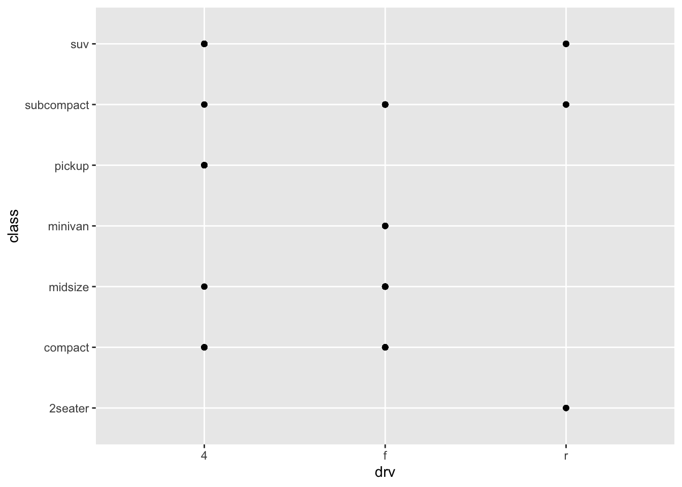
Scatterplots are not useful when looking at two categorical variables
3.3 Aesthetic Mappings
They are used to set things like color and shapes based on a variable value
ggplot(data = mpg) +
geom_point(aes(x = displ, y = hwy, color = class))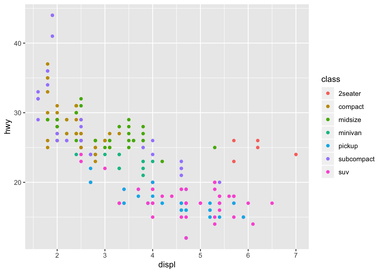
The outliers with high displacements and high mileage are 2 seaters. Since sports cars are lighter than the trucks and suvs in this displacement range it makes sense that they have higher mpg
3.3.1 Exercises
- What’s gone wrong with this code? Why are the points not blue?
ggplot(data = mpg) +
geom_point(mapping = aes(x = displ, y = hwy, color = "blue"))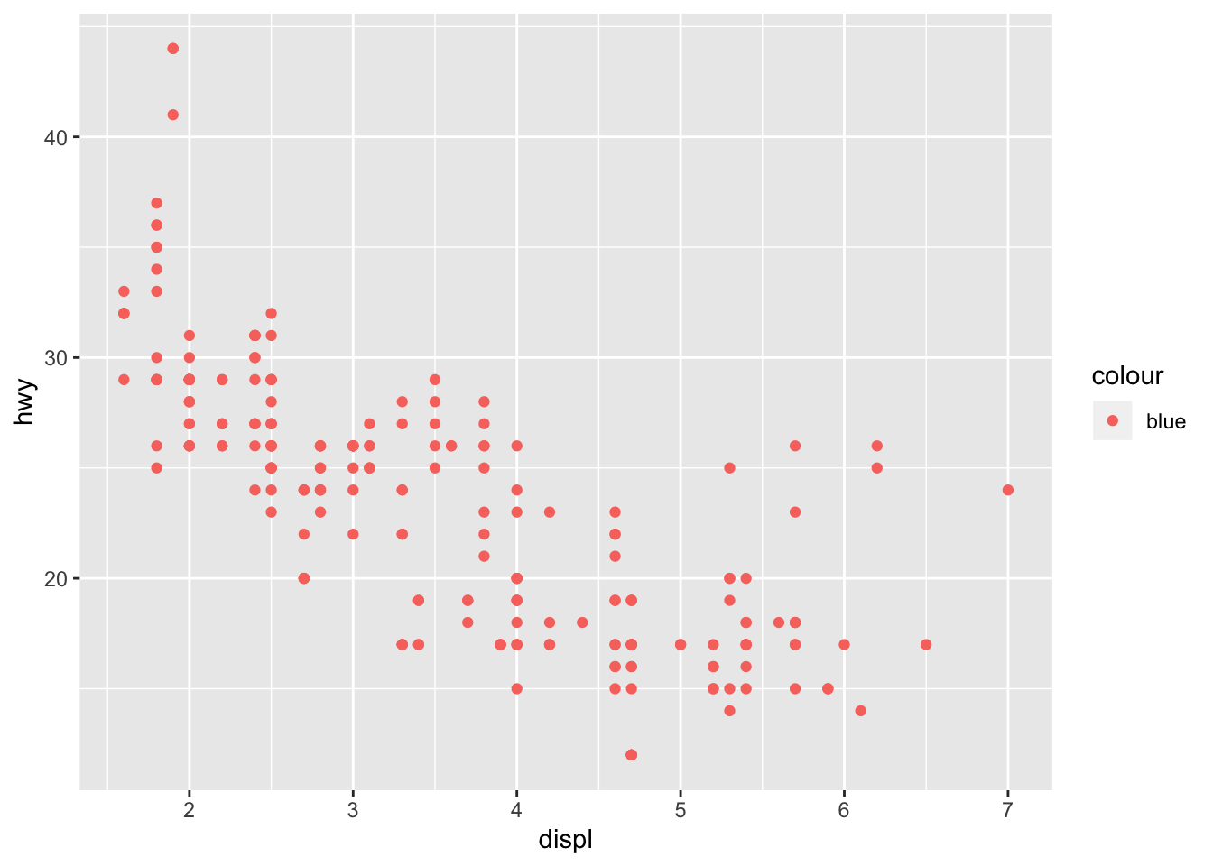
The color should have been set outside of the aes
- Which variables in mpg are categorical? Which variables are continuous? (Hint: type ?mpg to read the documentation for the dataset). How can you see this information when you run mpg?
summary(mpg)## manufacturer model displ year
## Length:234 Length:234 Min. :1.600 Min. :1999
## Class :character Class :character 1st Qu.:2.400 1st Qu.:1999
## Mode :character Mode :character Median :3.300 Median :2004
## Mean :3.472 Mean :2004
## 3rd Qu.:4.600 3rd Qu.:2008
## Max. :7.000 Max. :2008
## cyl trans drv cty
## Min. :4.000 Length:234 Length:234 Min. : 9.00
## 1st Qu.:4.000 Class :character Class :character 1st Qu.:14.00
## Median :6.000 Mode :character Mode :character Median :17.00
## Mean :5.889 Mean :16.86
## 3rd Qu.:8.000 3rd Qu.:19.00
## Max. :8.000 Max. :35.00
## hwy fl class
## Min. :12.00 Length:234 Length:234
## 1st Qu.:18.00 Class :character Class :character
## Median :24.00 Mode :character Mode :character
## Mean :23.44
## 3rd Qu.:27.00
## Max. :44.00cyt and hwy are the only continuous variables
- Map a continuous variable to color, size, and shape. How do these aesthetics behave differently for categorical vs. continuous variables?
ggplot(data = mpg) +
geom_point(mapping = aes(x = displ, y = hwy, color = cty))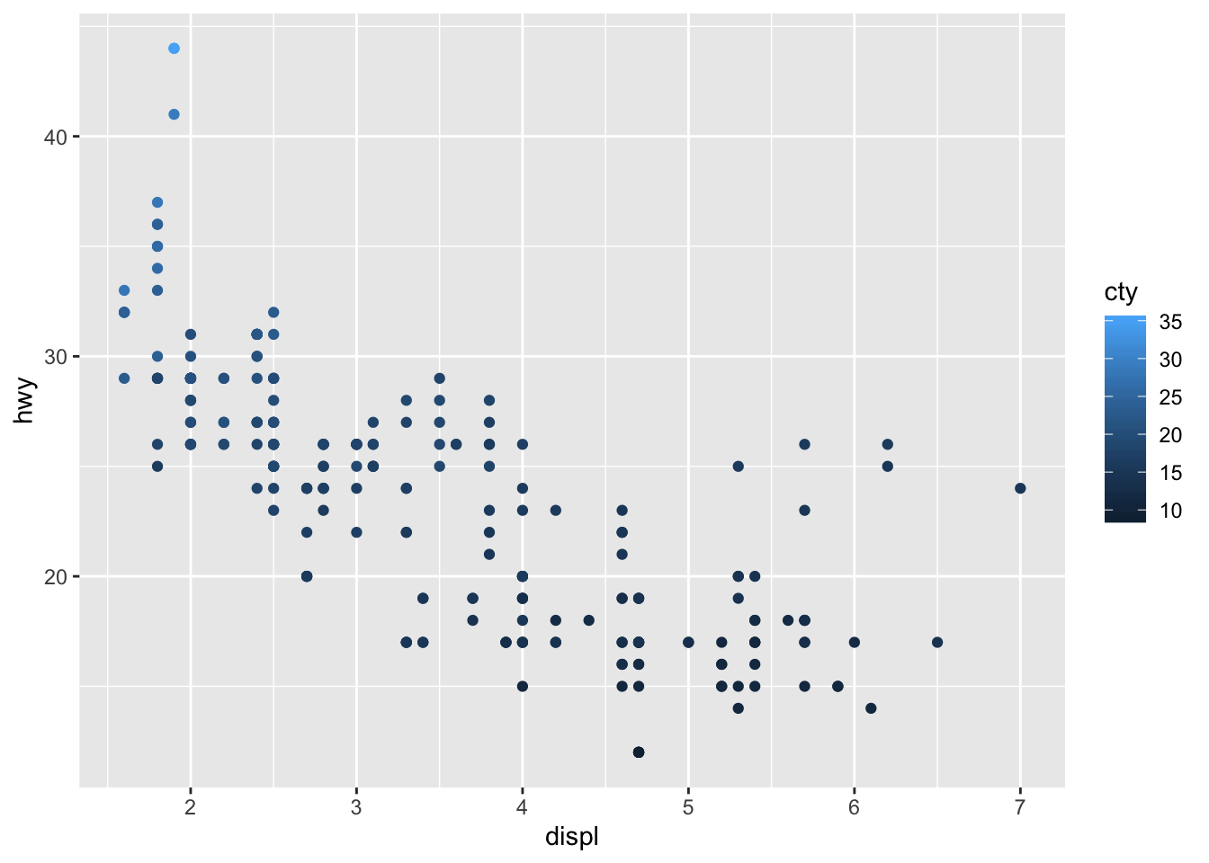
ggplot(data = mpg) +
geom_point(mapping = aes(x = displ, y = hwy, size = cty))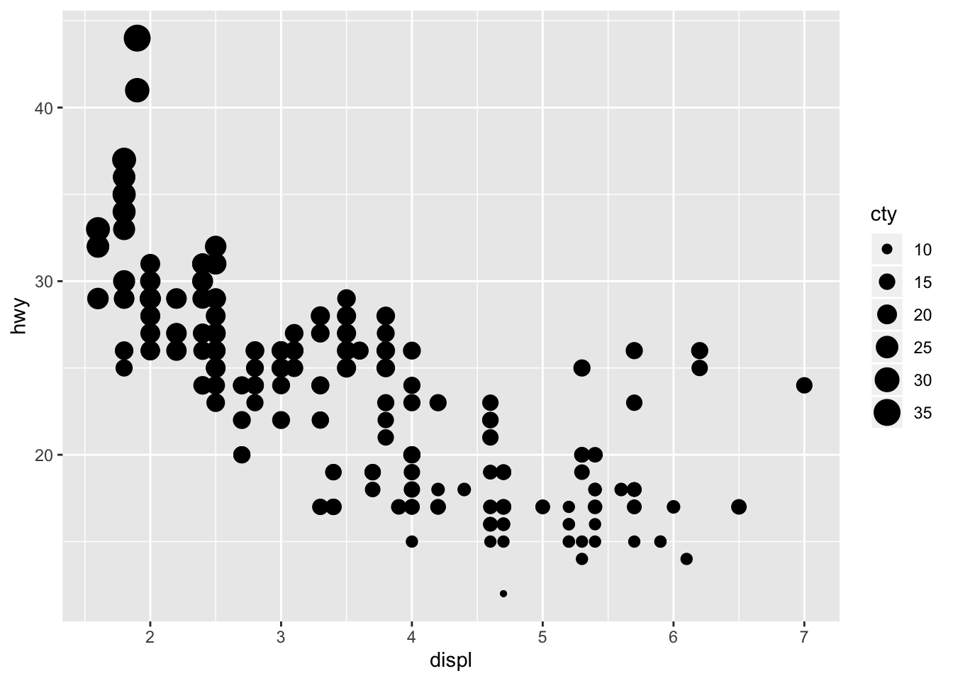
ggplot(data = mpg) +
geom_point(mapping = aes(x = displ, y = hwy, shape = cty))## Error: A continuous variable can not be mapped to shape
Size and color work with continuous variables, they just display a gradient. Shape does not work with continuous variables however.
- What happens if you map the same variable to multiple aesthetics?
ggplot(data = mpg) +
geom_point(mapping = aes(x = displ, y = hwy, size = cty, color = cty, alpha = cty))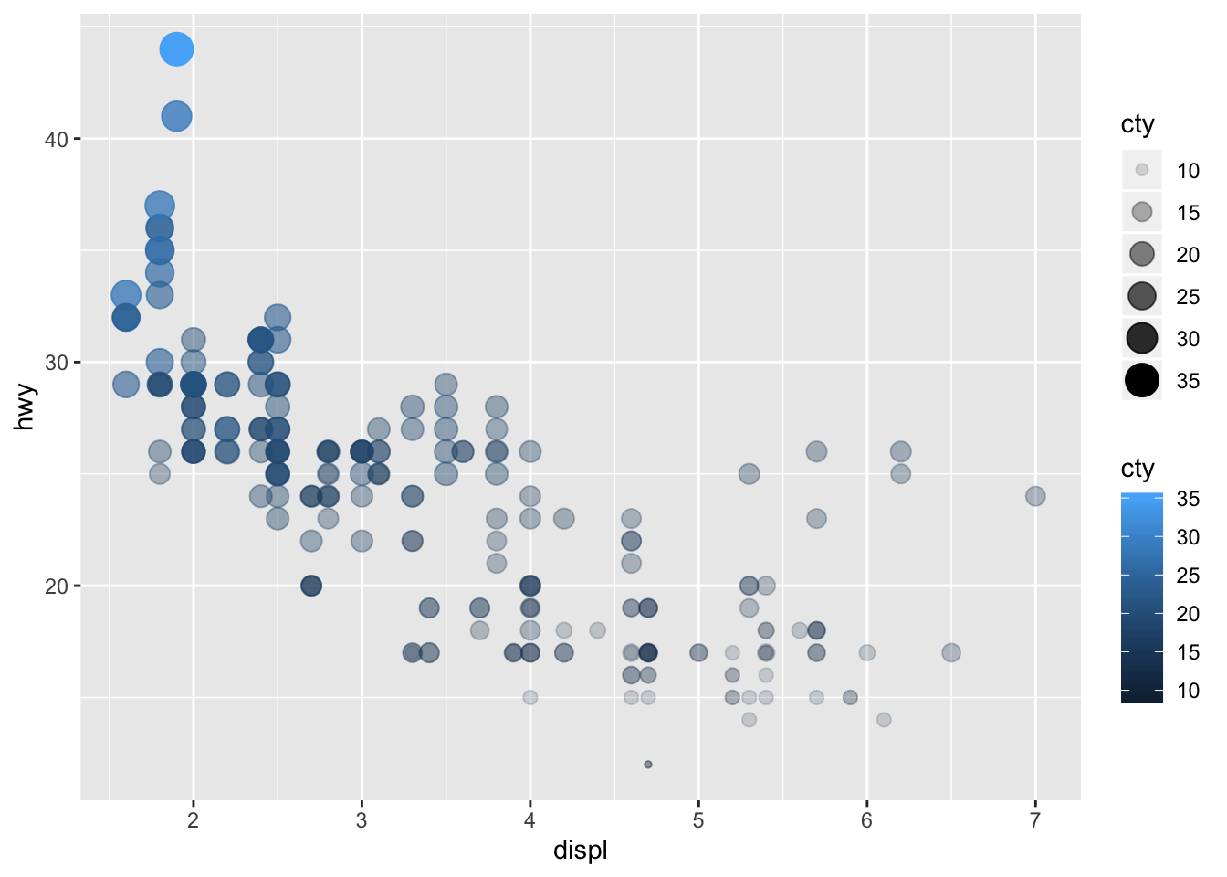
It’s not very helpful to use multiple aes on a single variable
- What does the stroke aesthetic do? What shapes does it work with? (Hint: use ?geom_point)
ggplot(data = mpg) +
geom_point(mapping = aes(x = displ, y = hwy), shape = 21, stroke = 4)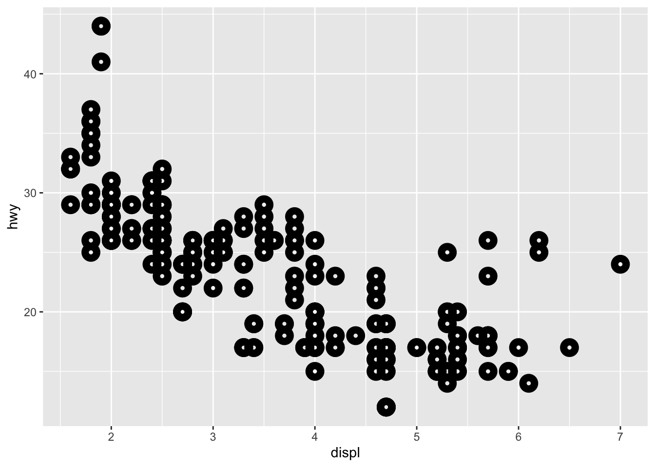
stroke modifies the width of the shape border
- What happens if you map an aesthetic to something other than a variable name, like aes(colour = displ < 5)?
ggplot(data = mpg) +
geom_point(mapping = aes(x = displ, y = hwy, color = displ < 5))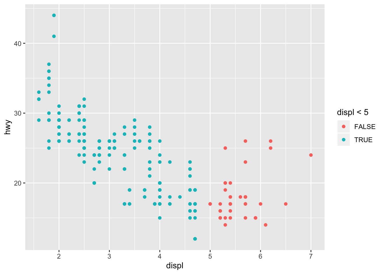
It segments the aes based on the criteria specified
3.5 Facets
Facets can be used to split plots on categorical variable levels
facet_wrap() is used for splitting on a single variable
ggplot(data = mpg) +
geom_point(mapping = aes(x = displ, y = hwy)) +
facet_wrap(~ class, nrow = 2)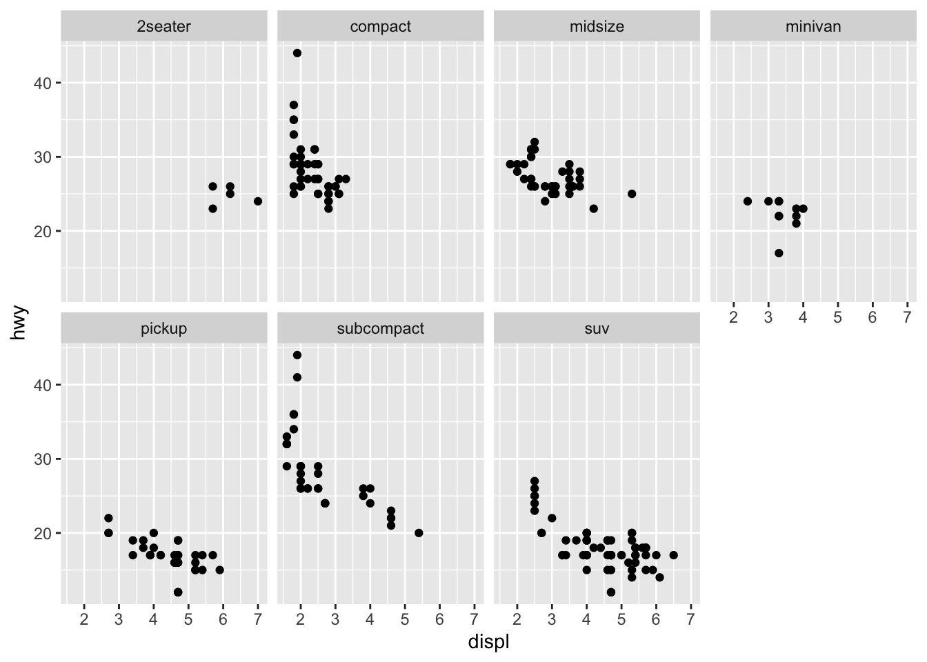
facet_grid() is used for splitting on two variables
ggplot(data = mpg) +
geom_point(mapping = aes(x = displ, y = hwy)) +
facet_grid(drv ~ cyl)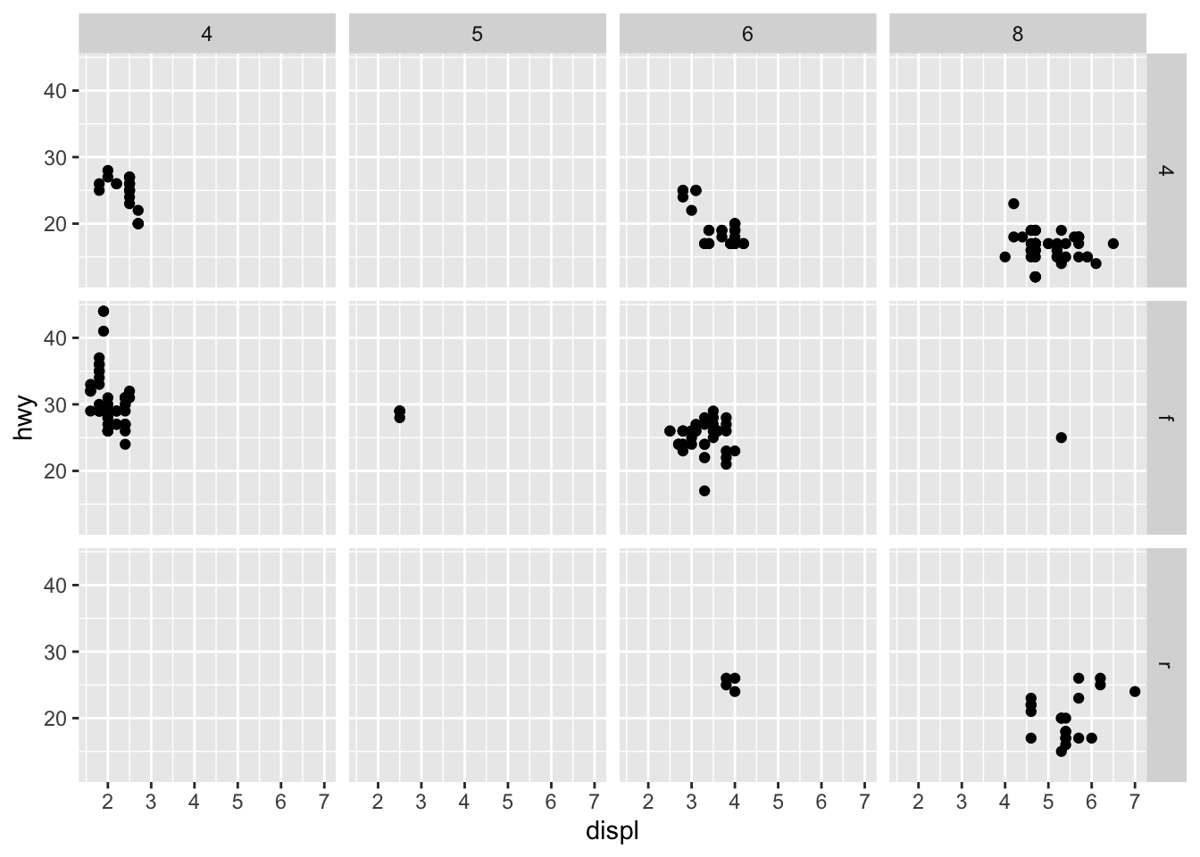
facet_grid(.~cyl) can be used to only facet by 1 variable
3.5.1 Exercises
- What happens if you facet on a continuous variable?
ggplot(data = mpg) +
geom_point(mapping = aes(x = displ, y = hwy)) +
facet_wrap(~ cty, nrow = 3)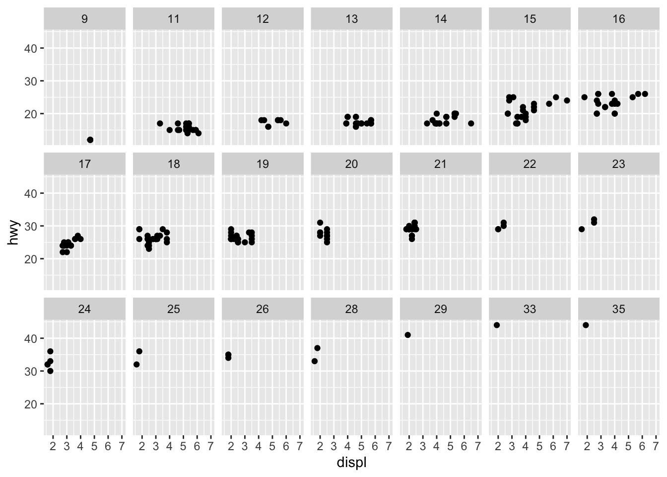
A facet is created for each value
- What do the empty cells in plot with facet_grid(drv ~ cyl) mean? How do they relate to this plot?
ggplot(data = mpg) +
geom_point(mapping = aes(x = drv, y = cyl))![]()
The empty cells indicate there are no data for that combination of variables
- What plots does the following code make? What does . do?
ggplot(data = mpg) +
geom_point(mapping = aes(x = displ, y = hwy)) +
facet_grid(drv ~ .)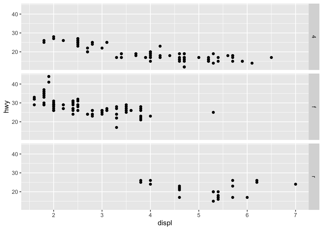
ggplot(data = mpg) +
geom_point(mapping = aes(x = displ, y = hwy)) +
facet_grid(. ~ cyl)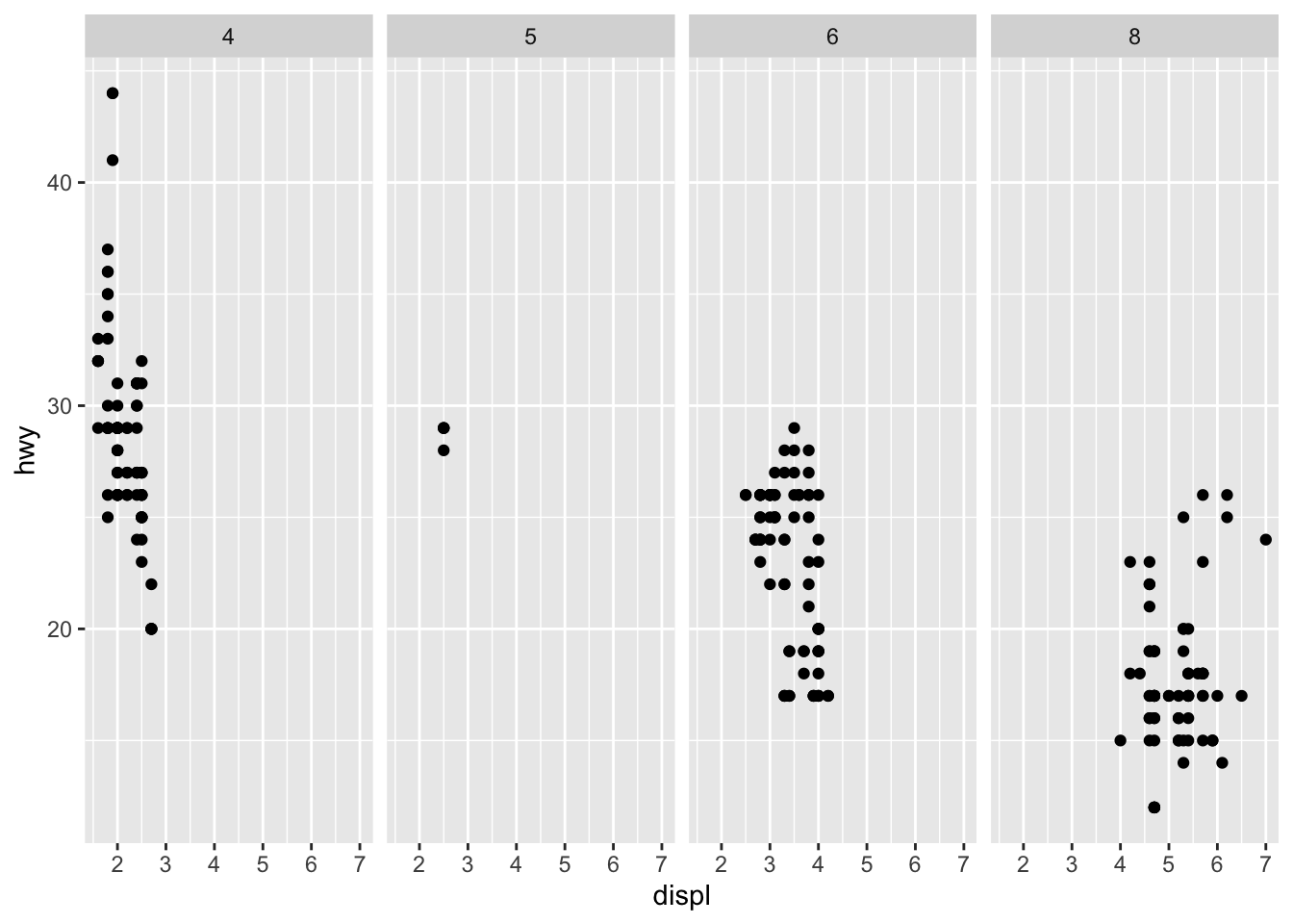
drv is displayed in a single column and cyl is displayed in a single row
- Take the first faceted plot in this section: What are the advantages to using faceting instead of the colour aesthetic? What are the disadvantages? How might the balance change if you had a larger dataset?
ggplot(data = mpg) +
  geom_point(mapping = aes(x = displ, y = hwy)) +
  facet_wrap(~ class, nrow = 2)
Faceting allows you to quickly distinguish the pattern for each level, however using color allows easier comparison between the levels. When working with larger data it may become difficult to clearly distinguish points based on color.
- Read ?facet_wrap. What does nrow do? What does ncol do? What other options control the layout of the individual panels? Why doesn’t facet_grid() have nrow and ncol argument?
nrow and ncol specify the number of rows and columns for the facets to occupy respectively. Other options include:
* switch - change location of labels
* drop - removes unused factor levels
* dir - direction
* strip.position - change location of labels
facet_grid() doesn’t use nrow and ncol since they are determined by the number of levels of the variables
- When using
facet_grid()you should usually put the variable with more unique levels in the columns. Why?
ggplot(data = mpg) +
  geom_point(mapping = aes(x = displ, y = hwy)) +
  facet_grid(drv ~ class)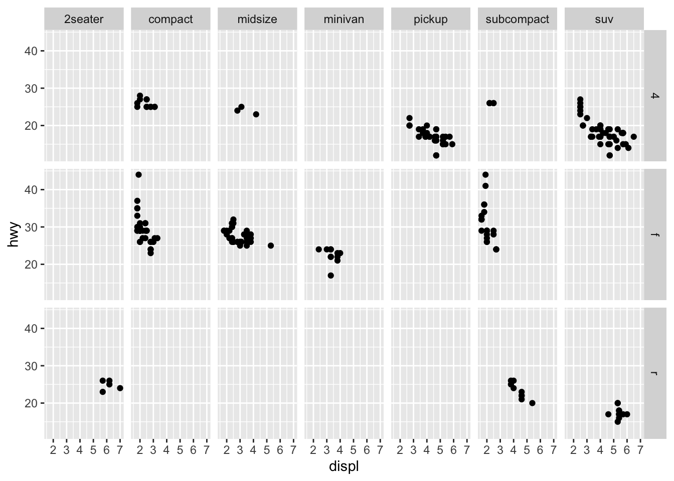
Plots are typically wider than they are tall
3.6 Geometric Objects
These are the objects that are used to plot the data
# left
ggplot(data = mpg) +
  geom_point(mapping = aes(x = displ, y = hwy))
# right
ggplot(data = mpg) +
  geom_smooth(mapping = aes(x = displ, y = hwy))
## `geom_smooth()` using method = 'loess' and formula 'y ~ x'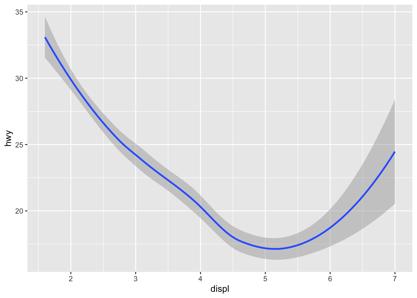
Not every aes is available for every geom type
ggplot(data = mpg) +
  geom_smooth(mapping = aes(x = displ, y = hwy, linetype = drv))
## `geom_smooth()` using method = 'loess' and formula 'y ~ x'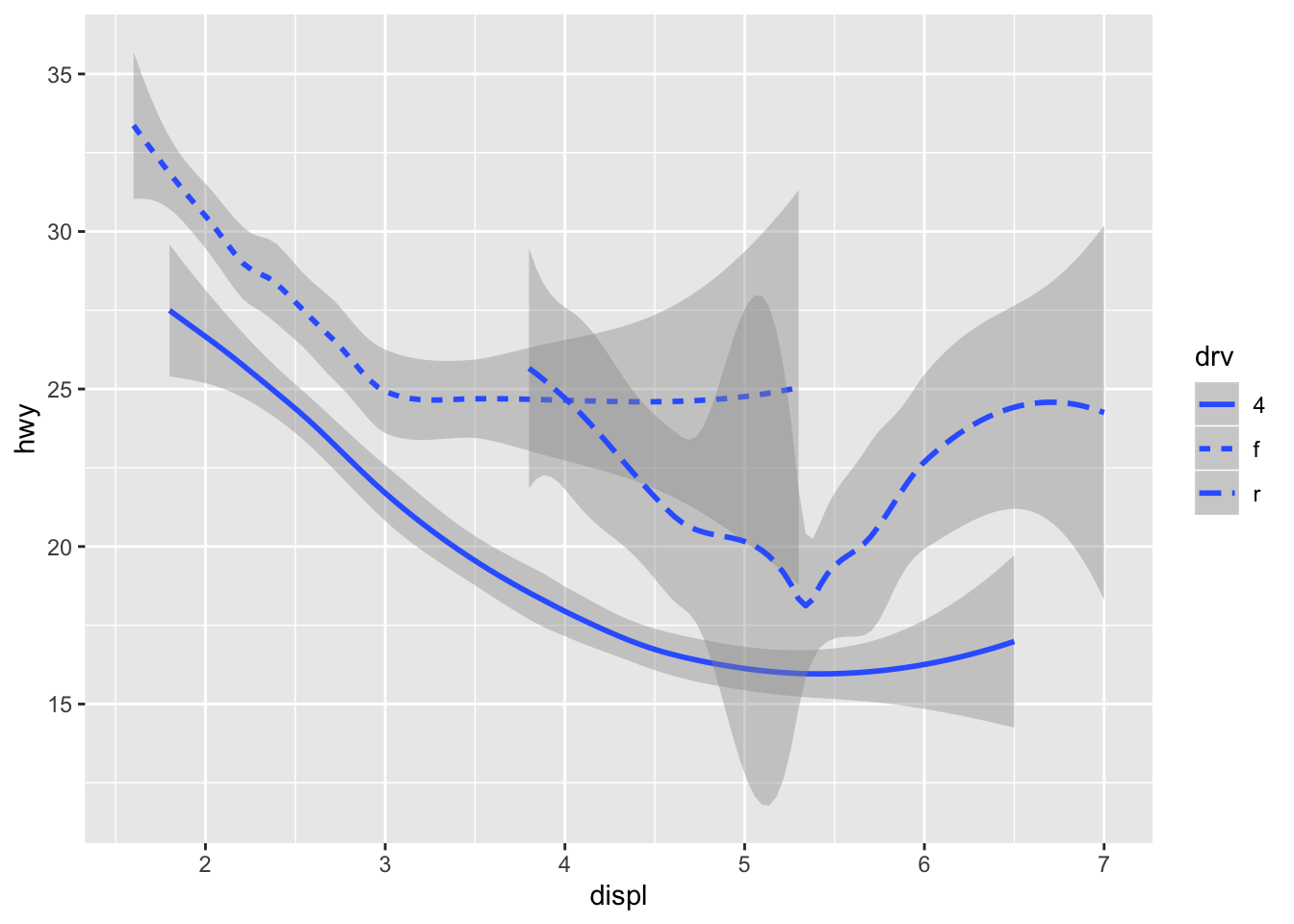
It helps to use aes when splitting by groups since grouping alone doesn’t provide any legend
ggplot(data = mpg) +
  geom_smooth(mapping = aes(x = displ, y = hwy))
## `geom_smooth()` using method = 'loess' and formula 'y ~ x'
ggplot(data = mpg) +
  geom_smooth(mapping = aes(x = displ, y = hwy, group = drv))
## `geom_smooth()` using method = 'loess' and formula 'y ~ x'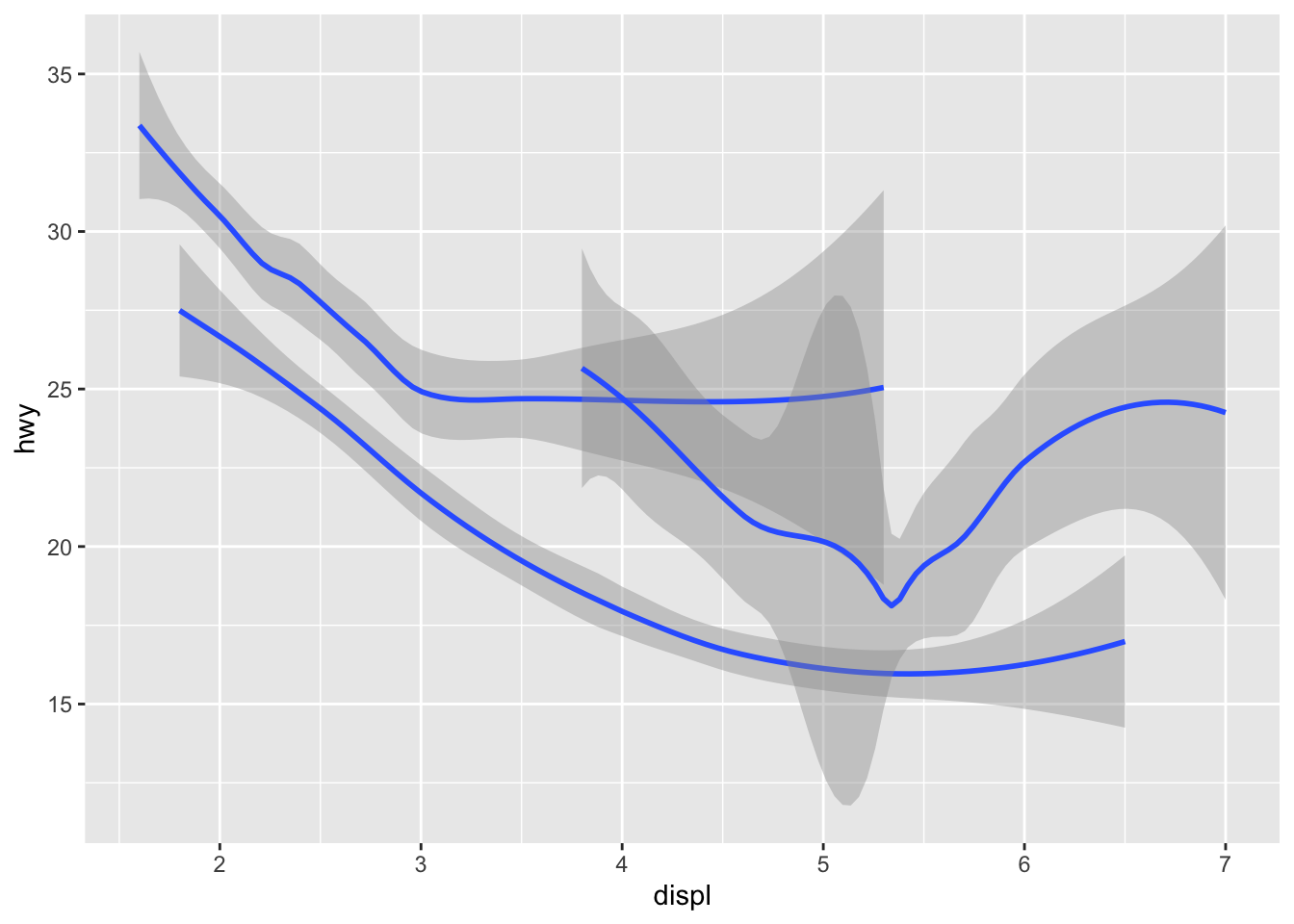
ggplot(data = mpg) +
  geom_smooth(
    mapping = aes(x = displ, y = hwy, color = drv),
    show.legend = FALSE
  )
## `geom_smooth()` using method = 'loess' and formula 'y ~ x'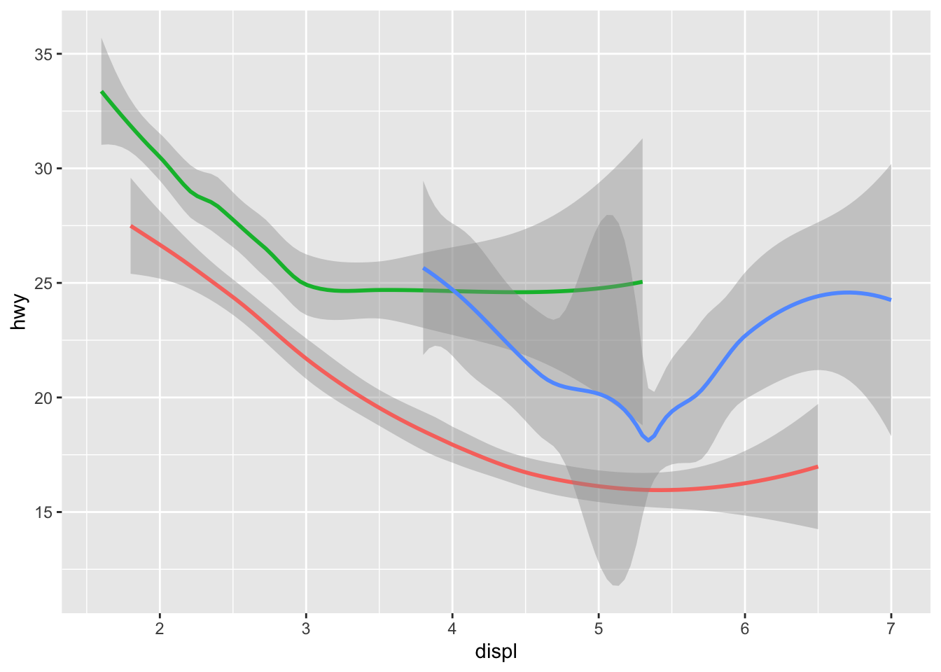
To display multiple geoms in a plot
ggplot(data = mpg) +
  geom_point(mapping = aes(x = displ, y = hwy)) +
  geom_smooth(mapping = aes(x = displ, y = hwy))
## `geom_smooth()` using method = 'loess' and formula 'y ~ x'
# and more compactly
ggplot(data = mpg, mapping = aes(x = displ, y = hwy)) +
  geom_point() +
  geom_smooth()
## `geom_smooth()` using method = 'loess' and formula 'y ~ x'
To use different aesthetics in different layers
ggplot(data = mpg, mapping = aes(x = displ, y = hwy)) +
  geom_point(mapping = aes(color = class)) +
  geom_smooth()
## `geom_smooth()` using method = 'loess' and formula 'y ~ x'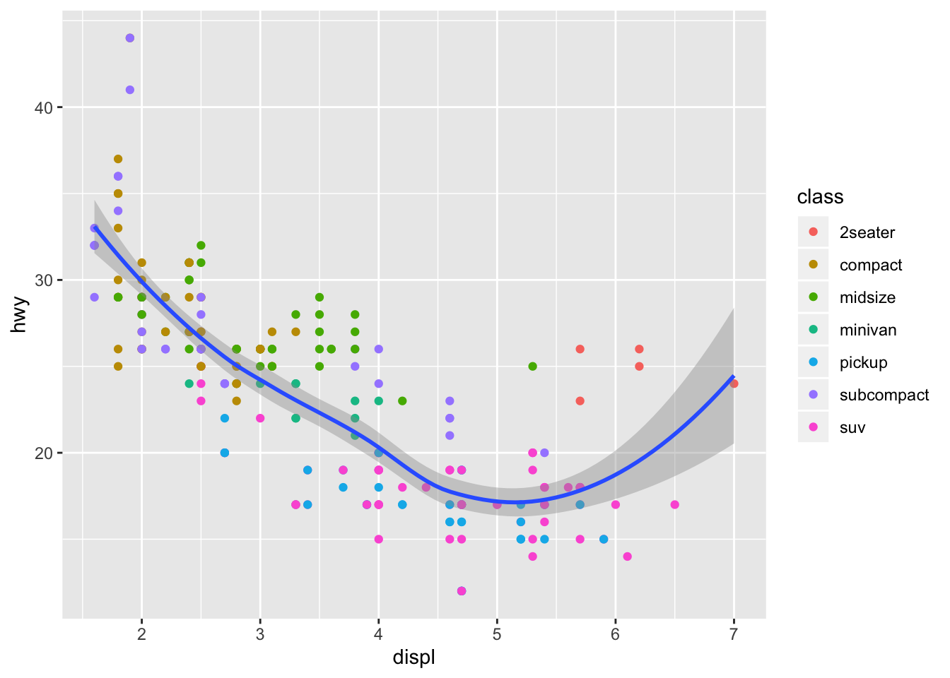
Also able to specifiy a different data within geoms
ggplot(data = mpg, mapping = aes(x = displ, y = hwy)) +
  geom_point(mapping = aes(color = class)) +
  geom_smooth(data = filter(mpg, class == "subcompact"), se = FALSE)
## `geom_smooth()` using method = 'loess' and formula 'y ~ x'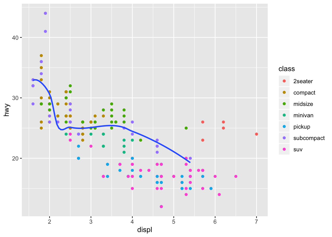
3.6.1 Exercises
- What geom would you use to draw a line chart? A boxplot? A histogram? An area chart?
# line
ggplot(data = mpg, mapping = aes(x = displ, y = hwy)) +
  geom_line()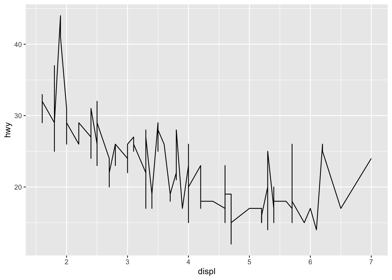
# boxplot
ggplot(data = mpg, mapping = aes(x = class, y = hwy)) +
  geom_boxplot()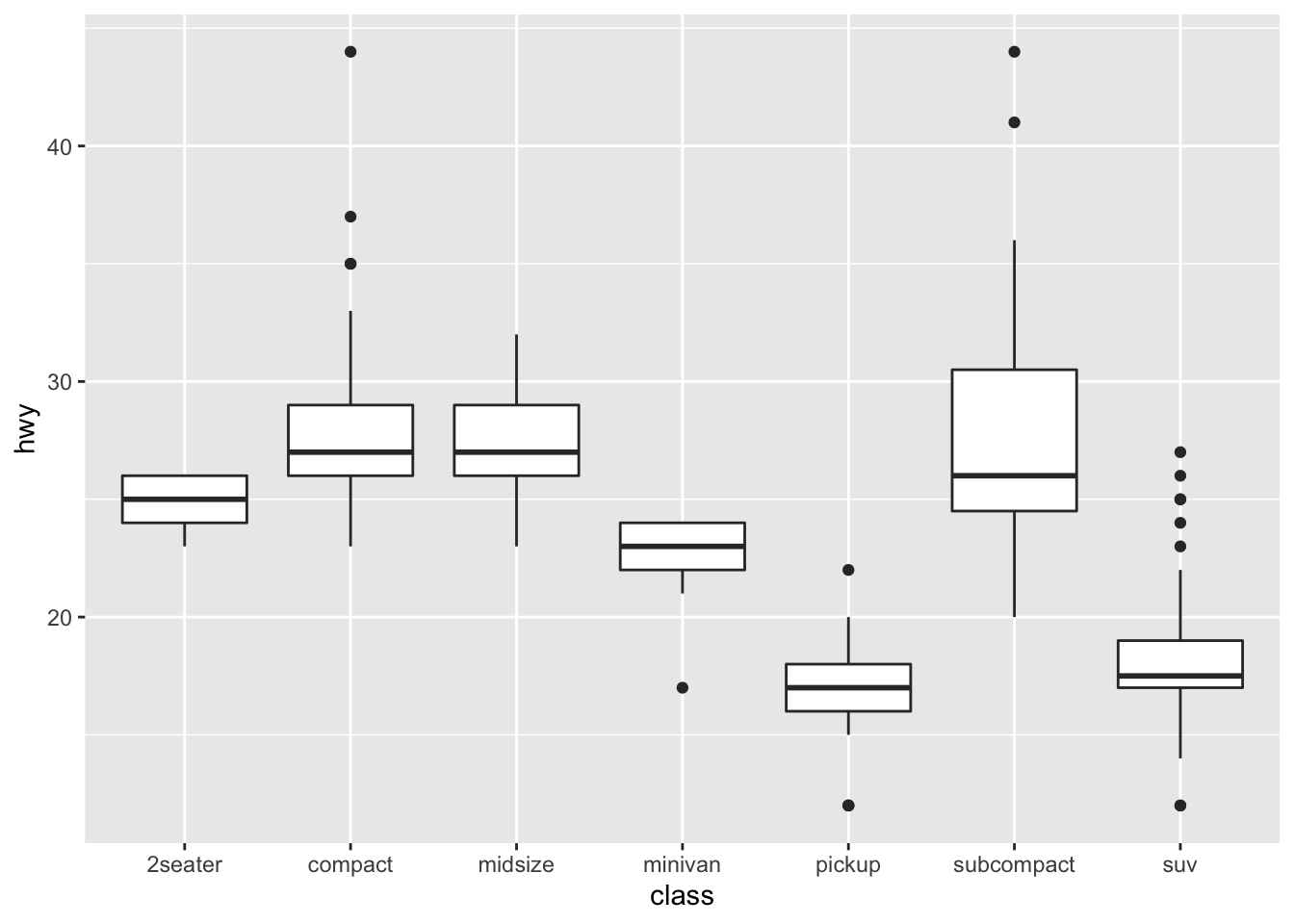
# histogram
ggplot(data = mpg, mapping = aes(x = hwy)) +
  geom_histogram()
## `stat_bin()` using `bins = 30`. Pick better value with `binwidth`.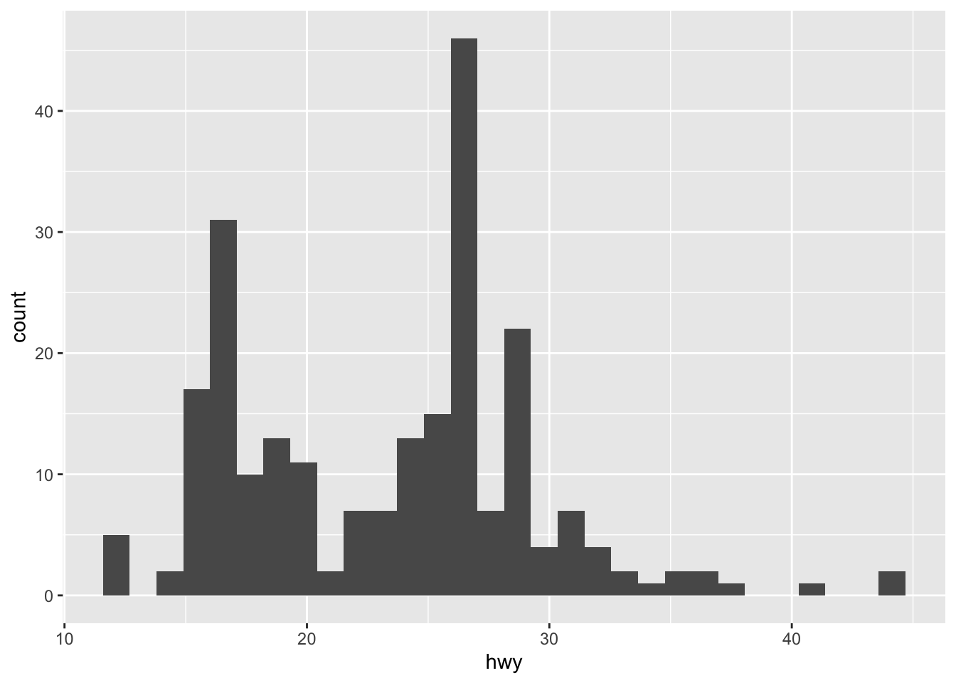
# area chart
ggplot(data = mpg) +
  geom_ribbon(aes(displ, ymin = 0, ymax = hwy, fill = drv, color = drv))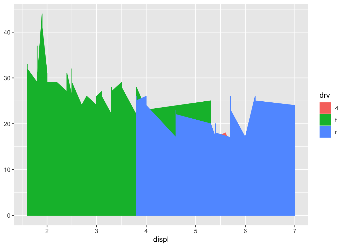
- Run this code in your head and predict what the output will look like. Then, run the code in R and check your predictions.
ggplot(data = mpg, mapping = aes(x = displ, y = hwy, color = drv)) +
  geom_point() +
  geom_smooth(se = FALSE)
## `geom_smooth()` using method = 'loess' and formula 'y ~ x'
- What does show.legend = FALSE do? What happens if you remove it? Why do you think I used it earlier in the chapter?
ggplot(data = mpg, mapping = aes(x = displ, y = hwy, color = drv)) +
  geom_point(show.legend = FALSE) +
  geom_smooth(se = FALSE, show.legend = FALSE)
## `geom_smooth()` using method = 'loess' and formula 'y ~ x'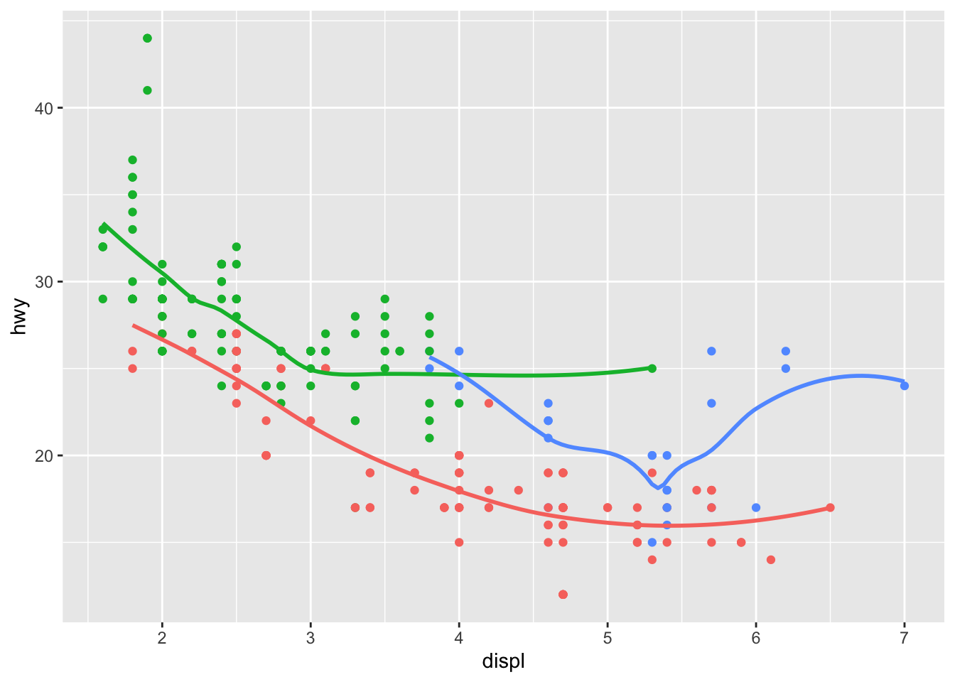
- What does the se argument to geom_smooth() do?
Shows / hides the confidence interval
- Will these two graphs look different? Why/why not?
ggplot(data = mpg, mapping = aes(x = displ, y = hwy)) +
  geom_point() +
  geom_smooth()
## `geom_smooth()` using method = 'loess' and formula 'y ~ x'
ggplot() +
  geom_point(data = mpg, mapping = aes(x = displ, y = hwy)) +
  geom_smooth(data = mpg, mapping = aes(x = displ, y = hwy))
## `geom_smooth()` using method = 'loess' and formula 'y ~ x'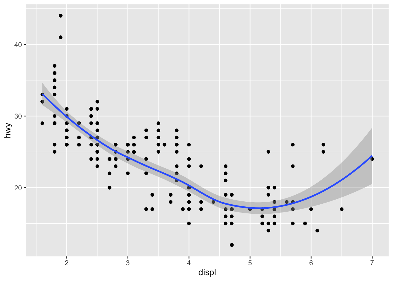
They are both graphing the same data
- Recreate the R code necessary to generate the following graphs.
ggplot(data = mpg, mapping = aes(x = displ, y = hwy)) +
  geom_point() +
  geom_smooth(se = FALSE)
## `geom_smooth()` using method = 'loess' and formula 'y ~ x'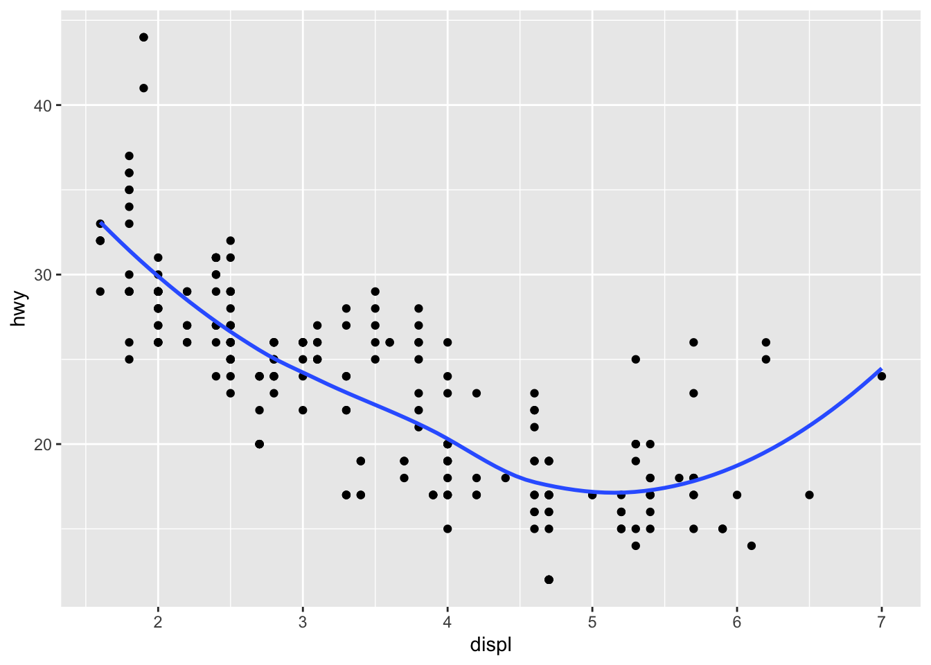
ggplot(data = mpg, mapping = aes(x = displ, y = hwy)) +
  geom_point() +
  geom_smooth(aes(group = drv), se = FALSE)
## `geom_smooth()` using method = 'loess' and formula 'y ~ x'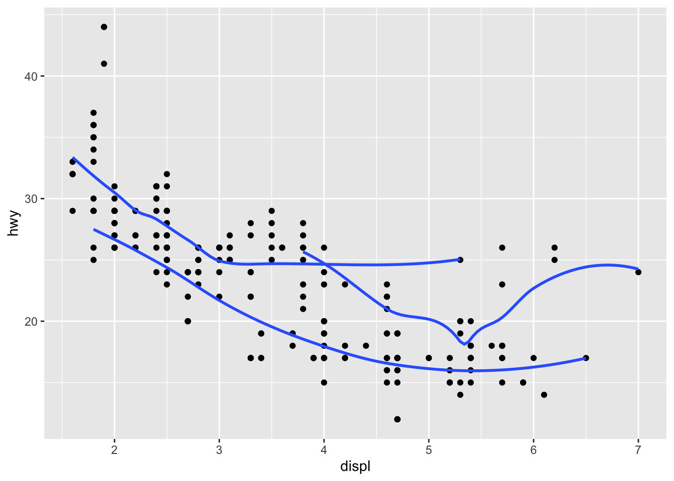
ggplot(data = mpg, mapping = aes(x = displ, y = hwy, color = drv)) +
  geom_point() +
  geom_smooth(se = FALSE)
## `geom_smooth()` using method = 'loess' and formula 'y ~ x'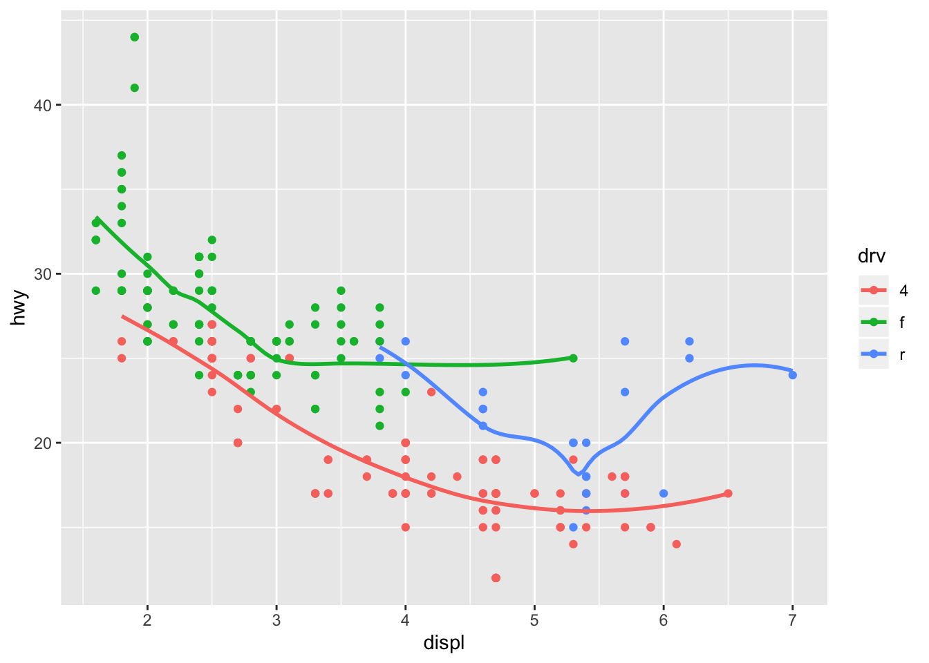
ggplot(data = mpg, mapping = aes(x = displ, y = hwy)) +
  geom_point(aes(color = drv)) +
  geom_smooth(se = FALSE)
## `geom_smooth()` using method = 'loess' and formula 'y ~ x'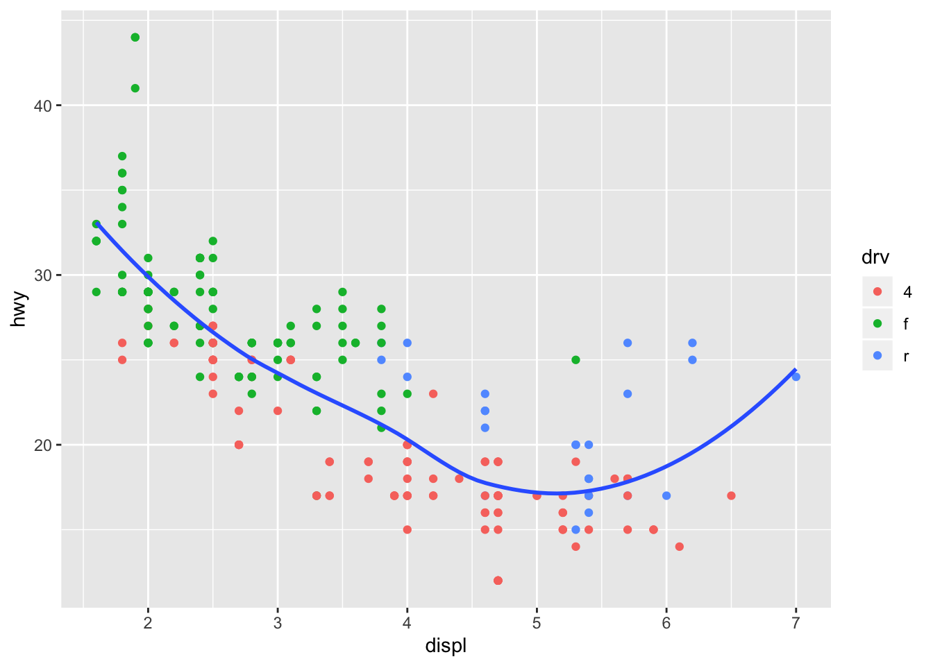
ggplot(data = mpg, mapping = aes(x = displ, y = hwy)) +
  geom_point(aes(color = drv)) +
  geom_smooth(aes(linetype = drv), se = FALSE)
## `geom_smooth()` using method = 'loess' and formula 'y ~ x'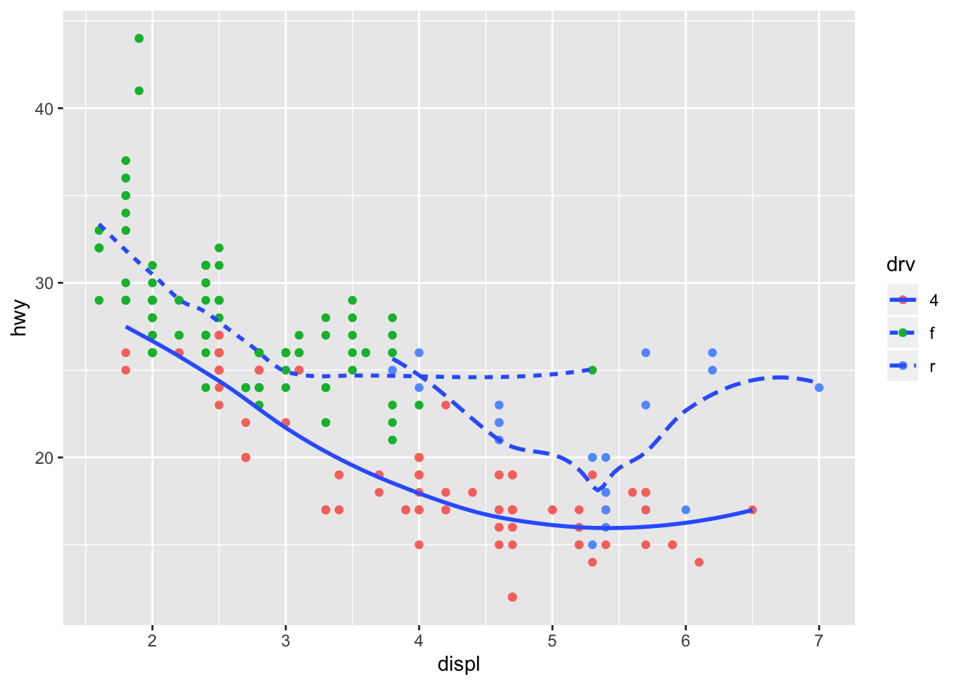
ggplot(data = mpg, mapping = aes(x = displ, y = hwy)) +
geom_point(aes(fill = drv), shape = 21, stroke = 2, color = "white") 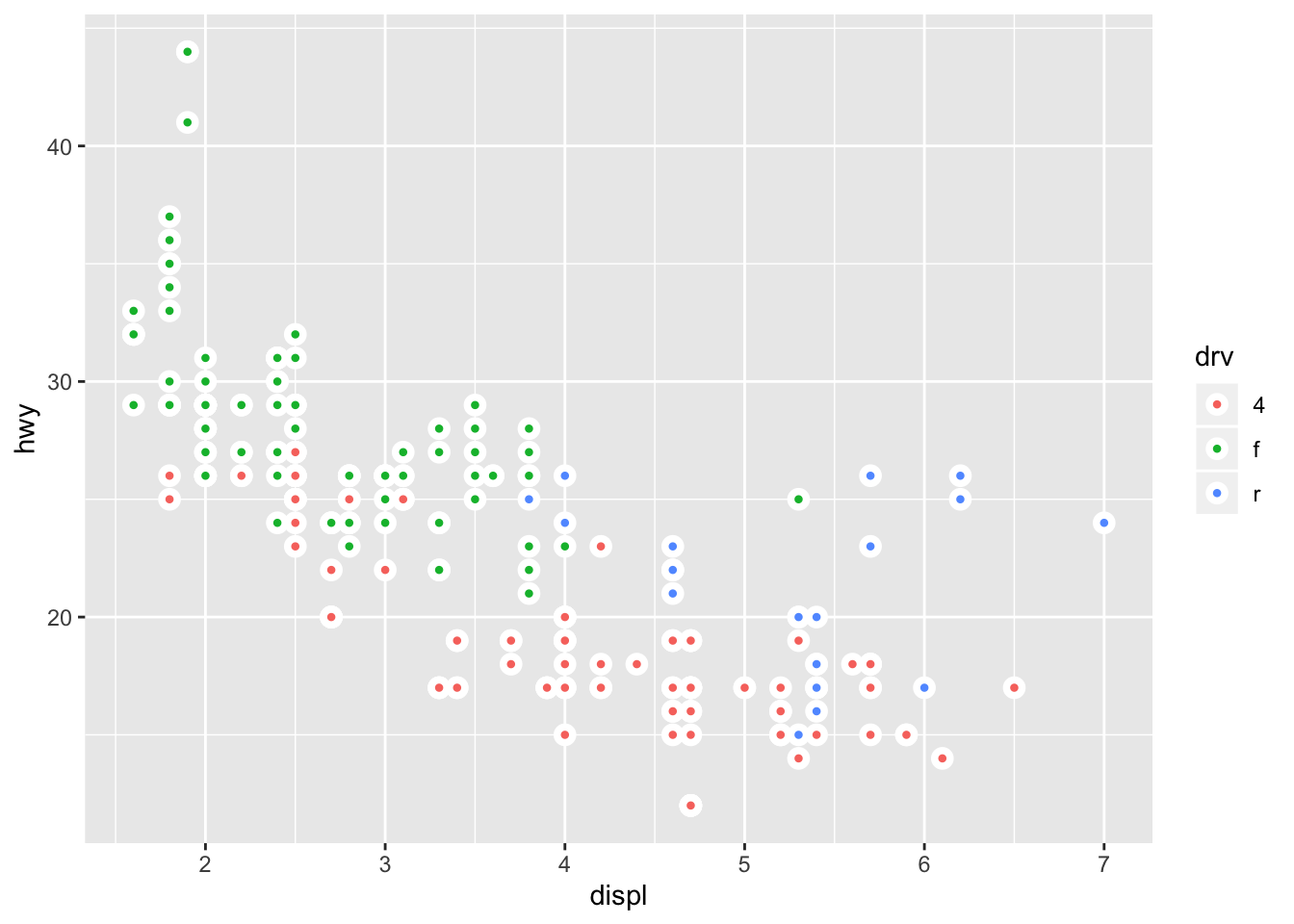
3.7 Statistical Transformations
Several graphs plot the raw output of values in the dataset, however some graphs calculate new values for the plot, and the algorithm to produce these calculations is called the stat
ggplot(data = diamonds) +
  geom_bar(mapping = aes(x = cut))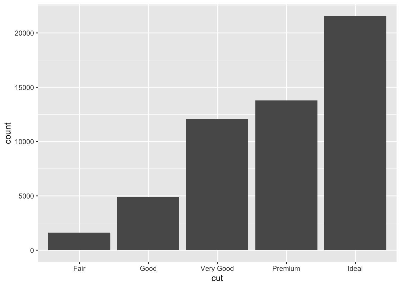
Different stats can be specified in the geom
demo <- tribble(
  ~cut,         ~freq,
  "Fair",       1610,
  "Good",       4906,
  "Very Good",  12082,
  "Premium",    13791,
  "Ideal",      21551
)

ggplot(data = demo) +
  geom_bar(mapping = aes(x = cut, y = freq), stat = "identity")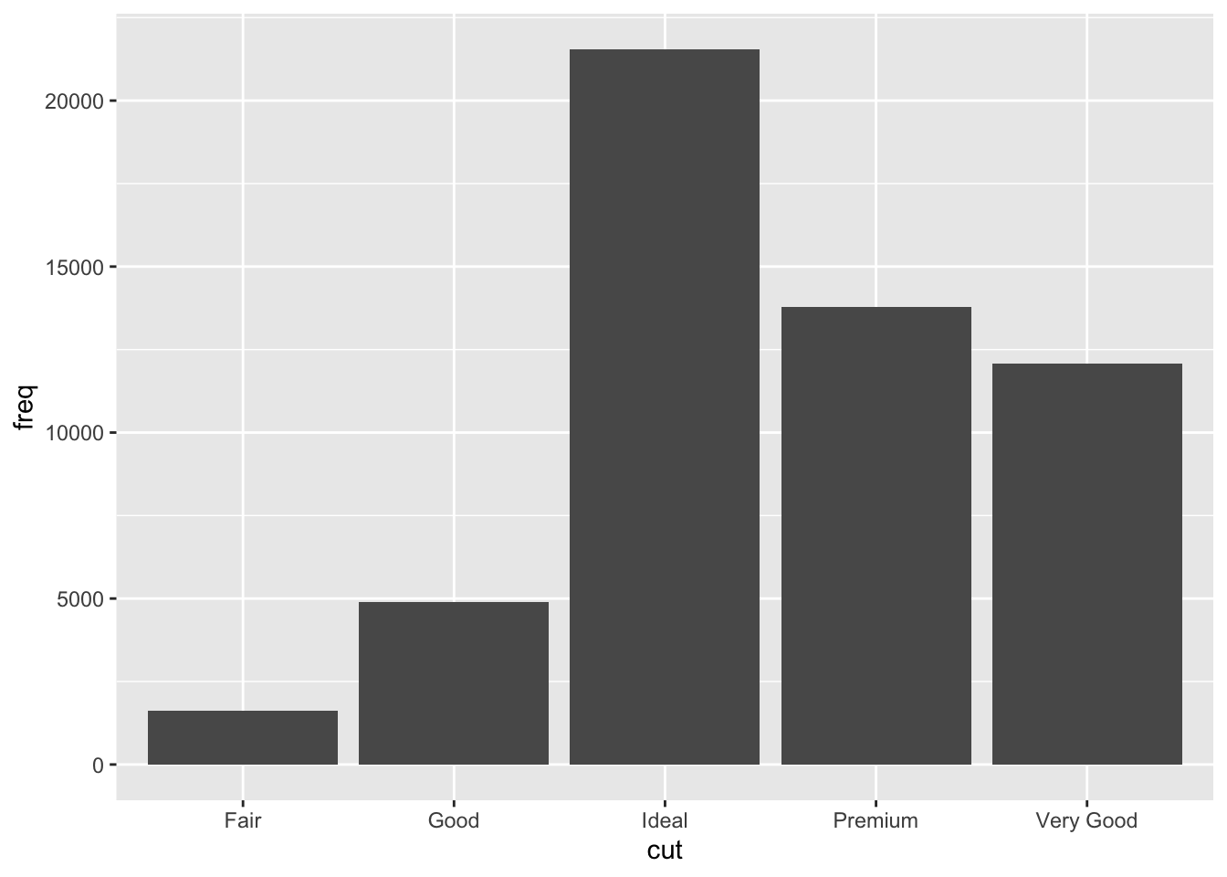
Additionally you can override default mapping, ex display a bar chart as proportions
ggplot(data = diamonds) +
  geom_bar(mapping = aes(x = cut, y = ..prop.., group = 1))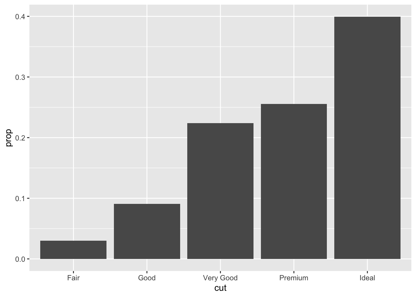
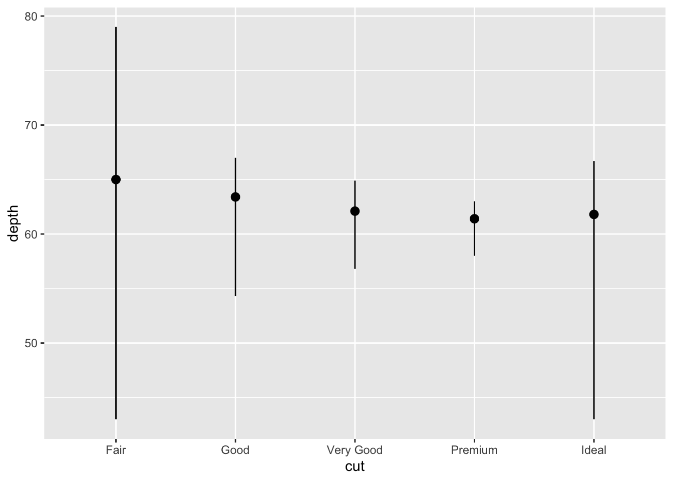
Can also focus on the summary for the statistical transformation with stat_summary()
ggplot(data = diamonds) +
  stat_summary(
    mapping = aes(x = cut, y = depth),
    fun.ymin = min,
    fun.ymax = max,
    fun.y = median
  )
3.7.1 Exercises
- What is the default geom associated with stat_summary()? How could you rewrite the previous plot to use that geom function instead of the stat function?
pointrange
ggplot(data = diamonds) +
  geom_pointrange(
    mapping = aes(x = cut, y = depth),
    stat = "summary",
    fun.ymin = min,
    fun.ymax = max,
    fun.y = median
  )
- What does geom_col() do? How is it different to geom_bar()?
geom_col() uses the stat identity by default so if the values that are to be used for column heights are already in the data then it should be used
- Most geoms and stats come in pairs that are almost always used in concert. Read through the documentation and make a list of all the pairs. What do they have in common?
| geom | stat |
|---|---|
| area | identity |
| ribbon | identity |
| bar | count |
| col | identity |
| bin2d | bind2d |
| blank | identity |
| boxplot | boxplot |
| contour | contour |
| count | sum |
| crossbar | identity |
| errorbar | identity |
| errorbarh | identity |
| linerange | identity |
| pointrange | identity |
| curve | identity |
| segment | identity |
| density | density |
| density_2d | density2d |
| freqpoly | bin |
| histogram | bin |
| hex | binhex |
| jitter | identity |
| label | identity |
| path | identity |
| line | identity |
| map | identity |
| point | identity |
| polygon | identity |
| quantile | quantile |
| raster | identity |
| rect | identity |
| rug | identity |
| smooth | smooth |
| spoke | spoke |
| step | identity |
| text | identity |
| tile | identity |
| violin | ydensity |
The majority of geoms use the identity stat so they require the data to contain the mapping values, while the remaining geoms are paired with the the stat that creates the specific shape of the plot from the data
- What variables does stat_smooth() compute? What parameters control its behaviour?
it computes the formula y ~ x, and is controlled by method which determines the type of line to fit, and se which shows / hides the confidence interval
- In our proportion bar chart, we need to set group = 1. Why? In other words what is the problem with these two graphs?
ggplot(data = diamonds) +
  geom_bar(mapping = aes(x = cut, y = ..prop..))
ggplot(data = diamonds) +
  geom_bar(mapping = aes(x = cut, fill = color, y = ..prop..))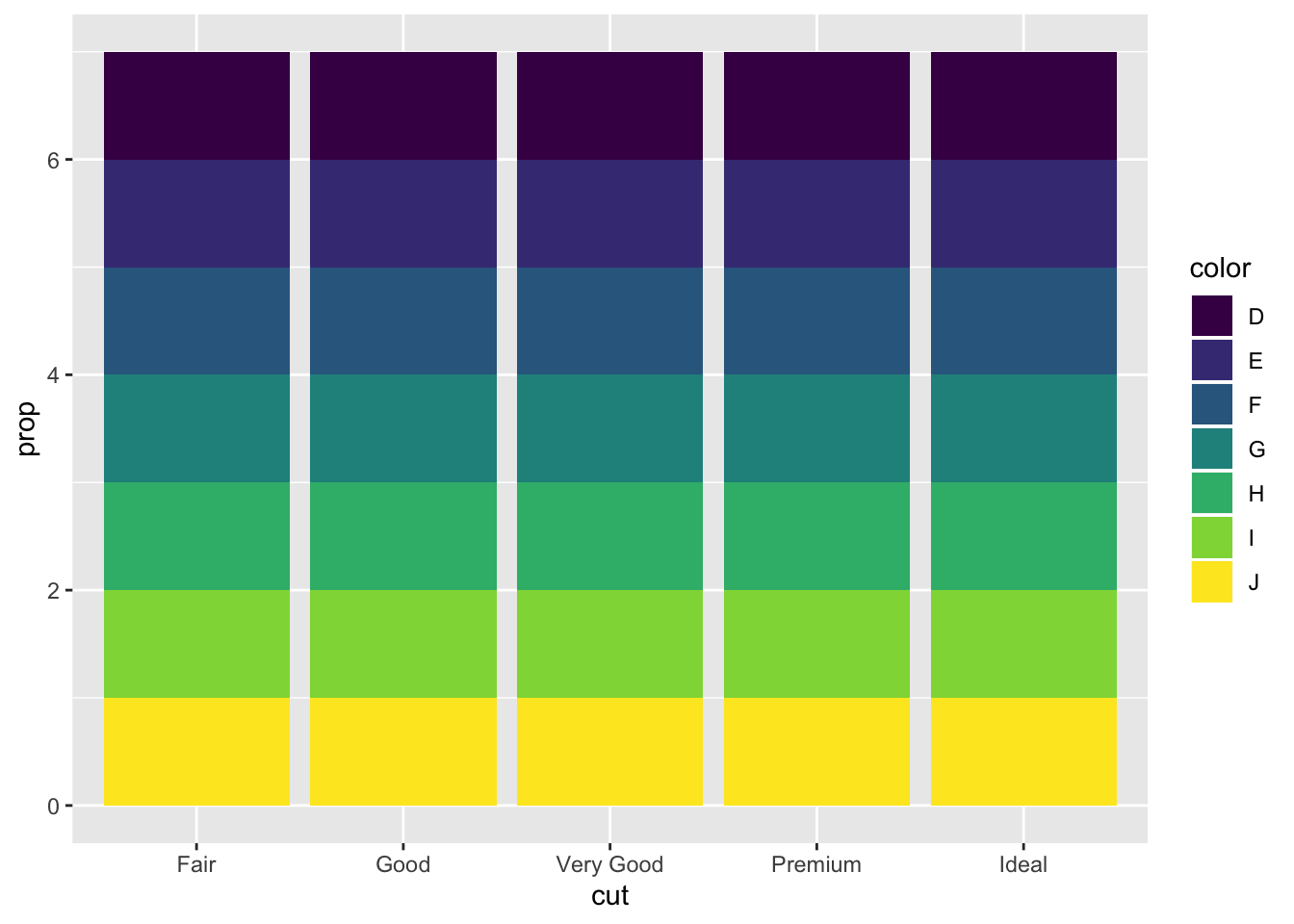
Each cut category proportion is calculated separately rather than as a proportion of the overall number of diamonds. Adding group = 1 ensures that the proportions are calculated from the total count of diamonds. In the second plot the fill = color is getting the color proportion for the overall data set, while it should be pulling from each color category
ggplot(data = diamonds) +
  geom_bar(mapping = aes(x = cut, y = ..prop.., group = 1))
ggplot(data = diamonds) +
  geom_bar(mapping = aes(x = cut, y = ..count../sum(..count..), fill = color)) +
        ylab("prop")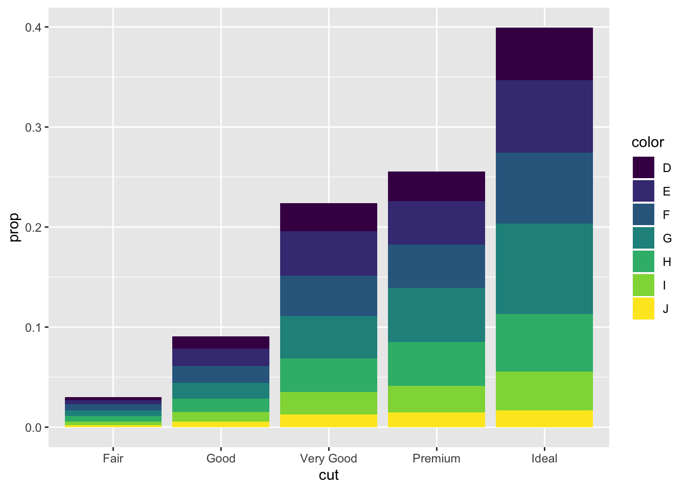
3.8 Position Adjustments
There are several position options for a bar chart, by default they are stacked
ggplot(data = diamonds) +
  geom_bar(mapping = aes(x = cut, fill = clarity))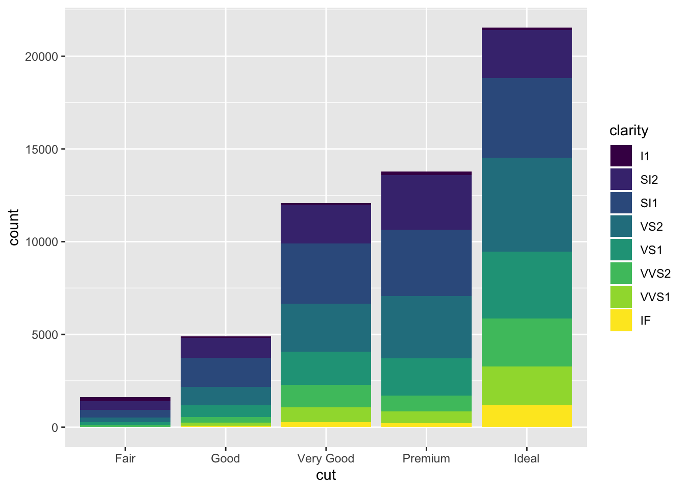
Another option is identity which is not as useful for bars since they wil overlap
ggplot(data = diamonds, mapping = aes(x = cut, fill = clarity)) +
  geom_bar(alpha = 1/5, position = "identity")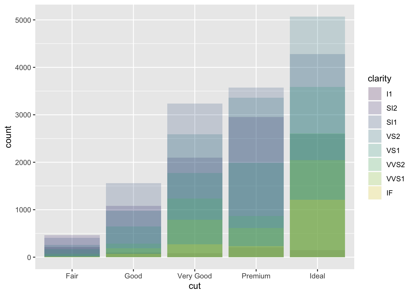
ggplot(data = diamonds, mapping = aes(x = cut, colour = clarity)) +
  geom_bar(fill = NA, position = "identity")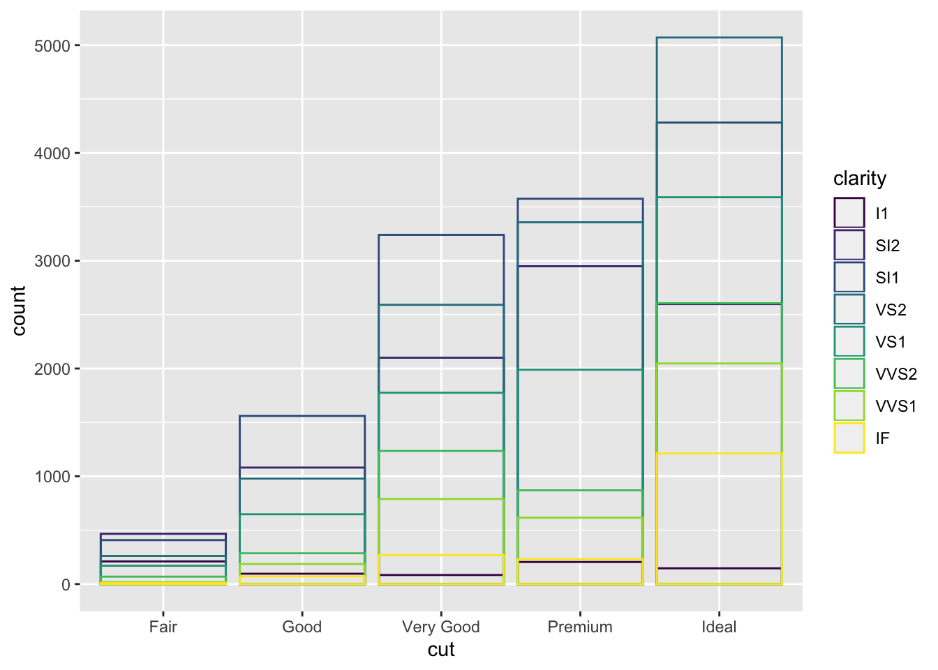
fill is similar to stacking but makes all bars the same height
ggplot(data = diamonds) +
  geom_bar(mapping = aes(x = cut, fill = clarity), position = "fill")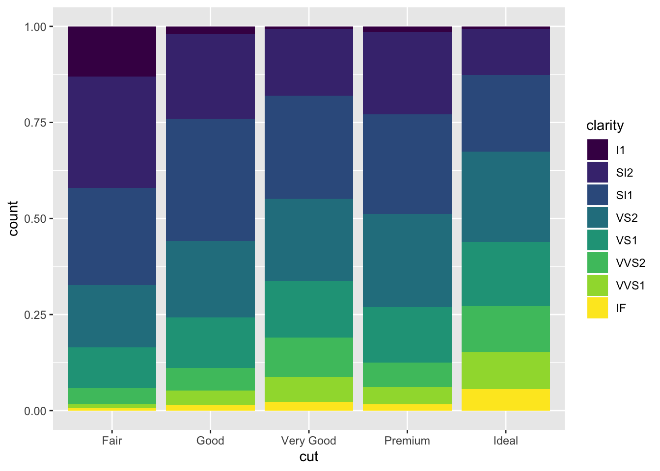
dodge places the bars next to eachother so they are easy to compare
ggplot(data = diamonds) +
  geom_bar(mapping = aes(x = cut, fill = clarity), position = "dodge")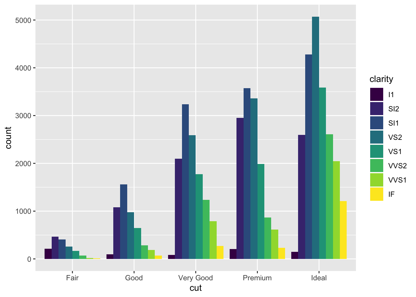
jitter is not useful for bars but helpul to avoid overplotting with scatterplots
ggplot(data = mpg) +
  geom_point(mapping = aes(x = displ, y = hwy), position = "jitter")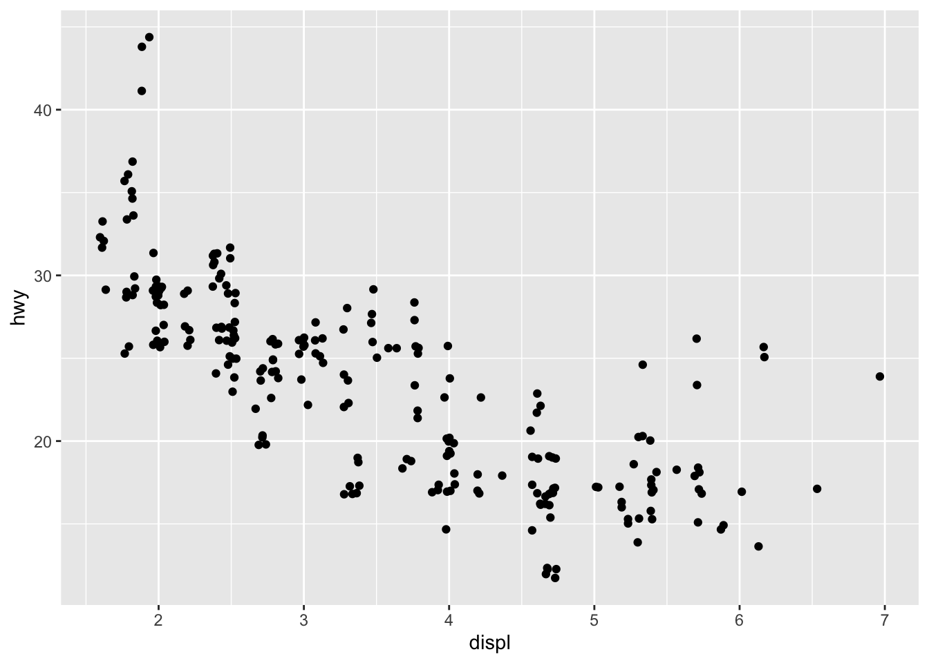
3.8.1 Exercises
- What is the problem with this plot? How could you improve it?
ggplot(data = mpg, mapping = aes(x = cty, y = hwy)) +
  geom_point()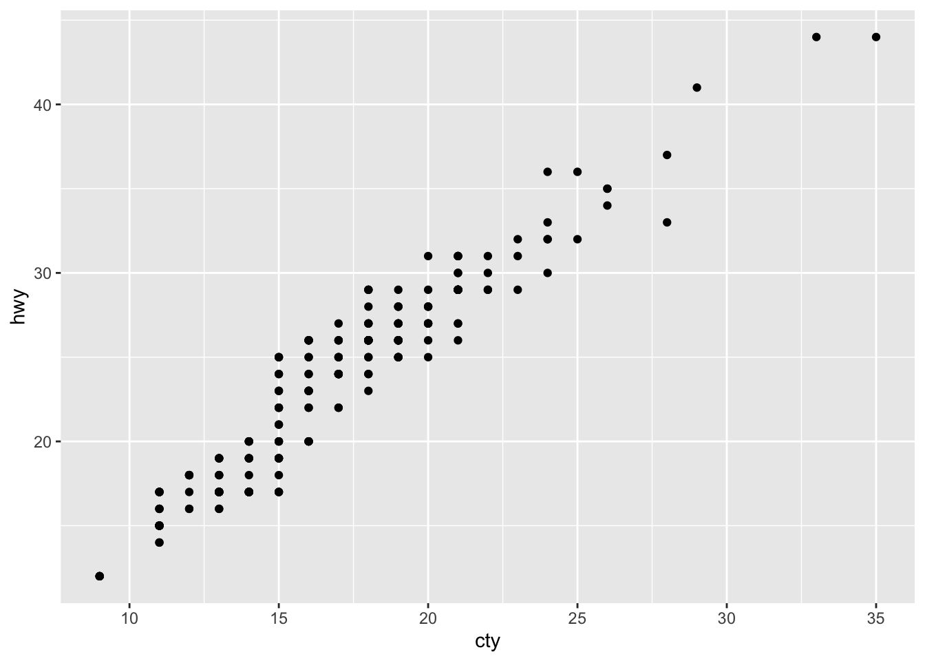
The plot likely suffers from overplotting and could be improved by using jitter
ggplot(data = mpg, mapping = aes(x = cty, y = hwy)) +
  geom_jitter()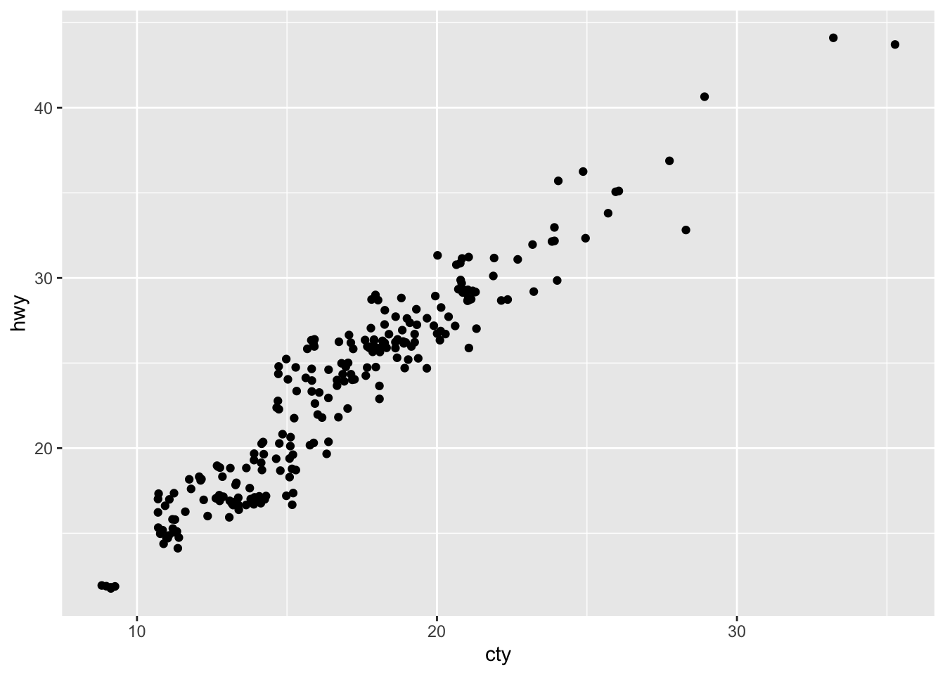
- What parameters to geom_jitter() control the amount of jittering?
width and height control the amount of jittering
- Compare and contrast geom_jitter() with geom_count()
jitter adds random noise to separate values they may be plotted on top of eachother
count tallies the amount of points in an area and then adjusts the size of the point to represent that amount
ggplot(data = mpg, mapping = aes(x = cty, y = hwy)) +
  geom_count()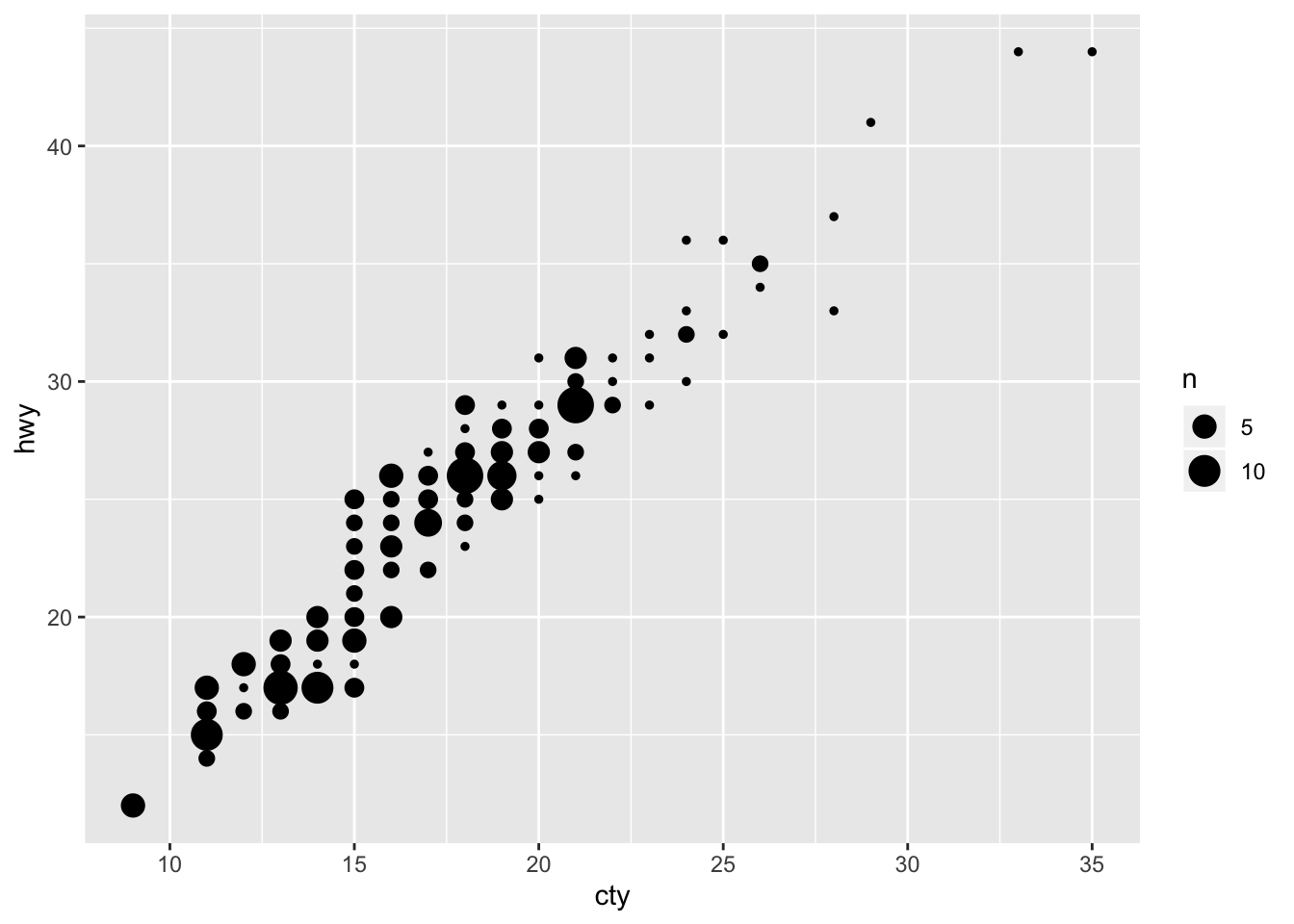
- What’s the default position adjustment for geom_boxplot()? Create a visualisation of the mpg dataset that demonstrates it.
default position is "dodge"
ggplot(data = mpg, mapping = aes(x = drv, y = hwy)) +
  geom_boxplot()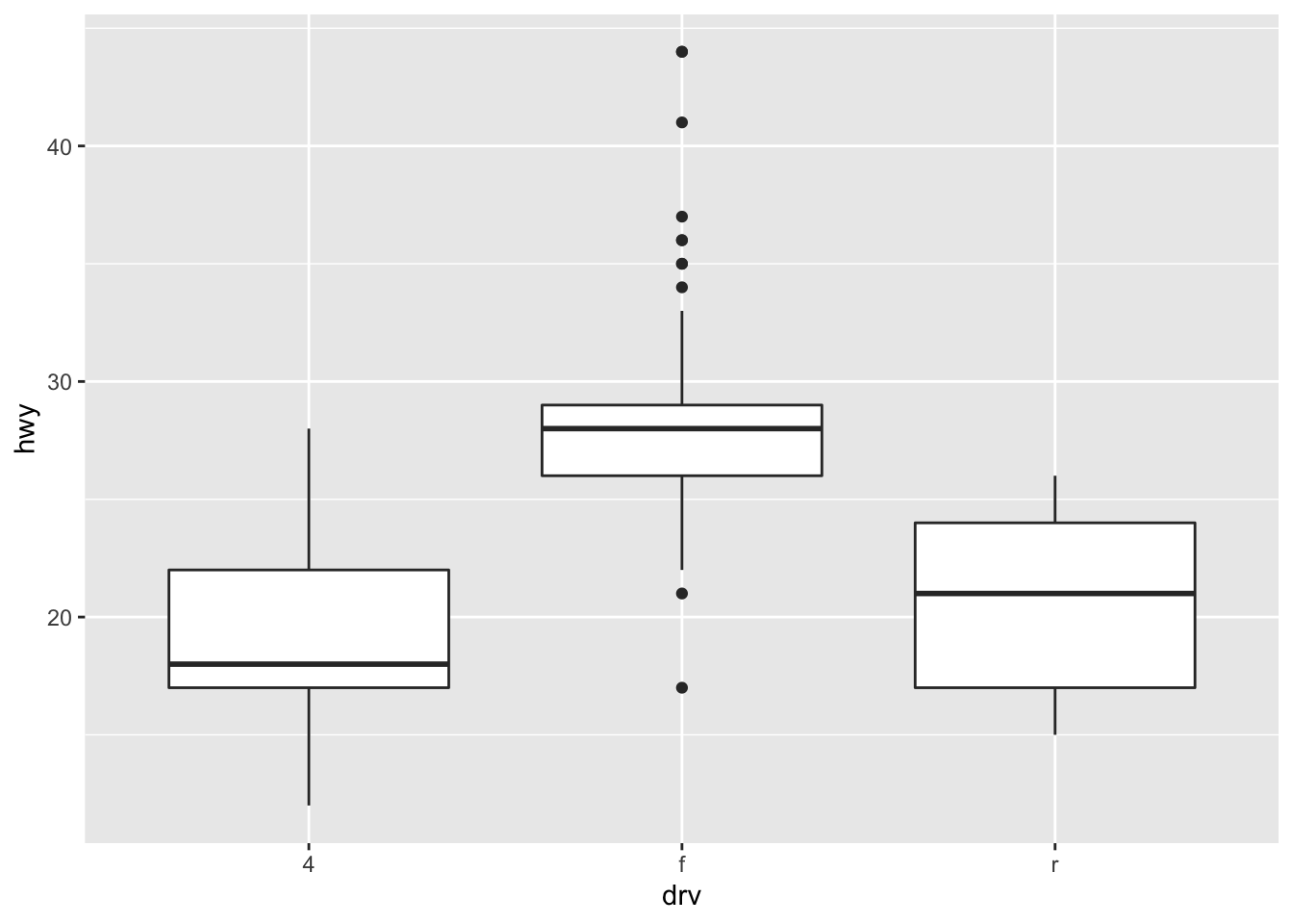
3.9 Coordinate Systems
Lots of other options beyond regular x, y Cartesian that can occasionally be useful
coord_flip() swaps x and y axis
ggplot(data = mpg, mapping = aes(x = class, y = hwy)) +
  geom_boxplot()
ggplot(data = mpg, mapping = aes(x = class, y = hwy)) +
  geom_boxplot() +
  coord_flip()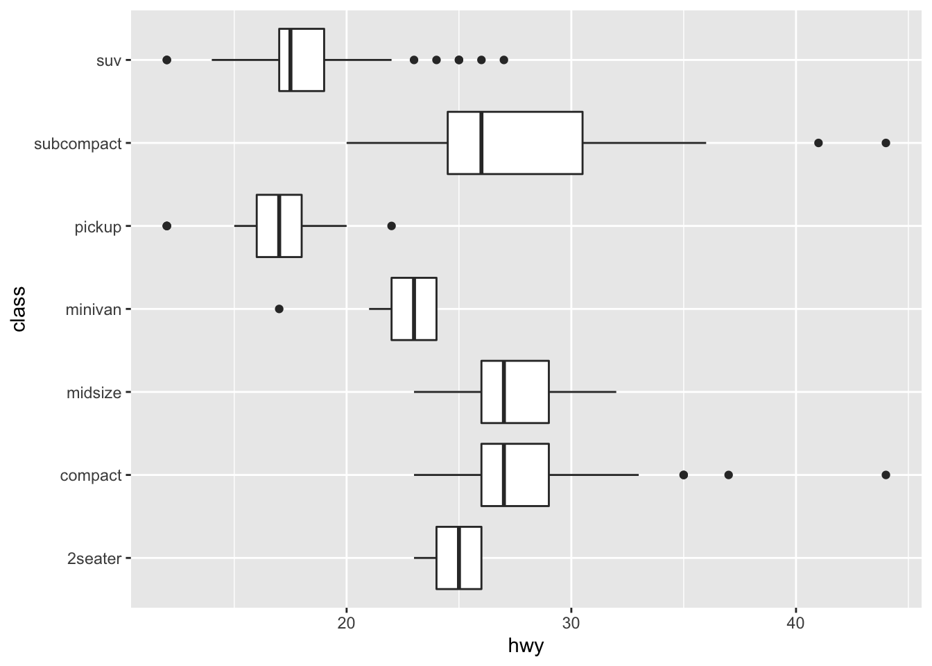
coord_quickmap() sets the aspect ratio correctly for maps
nz <- map_data("nz")

ggplot(nz, aes(long, lat, group = group)) +
  geom_polygon(fill = "white", colour = "black")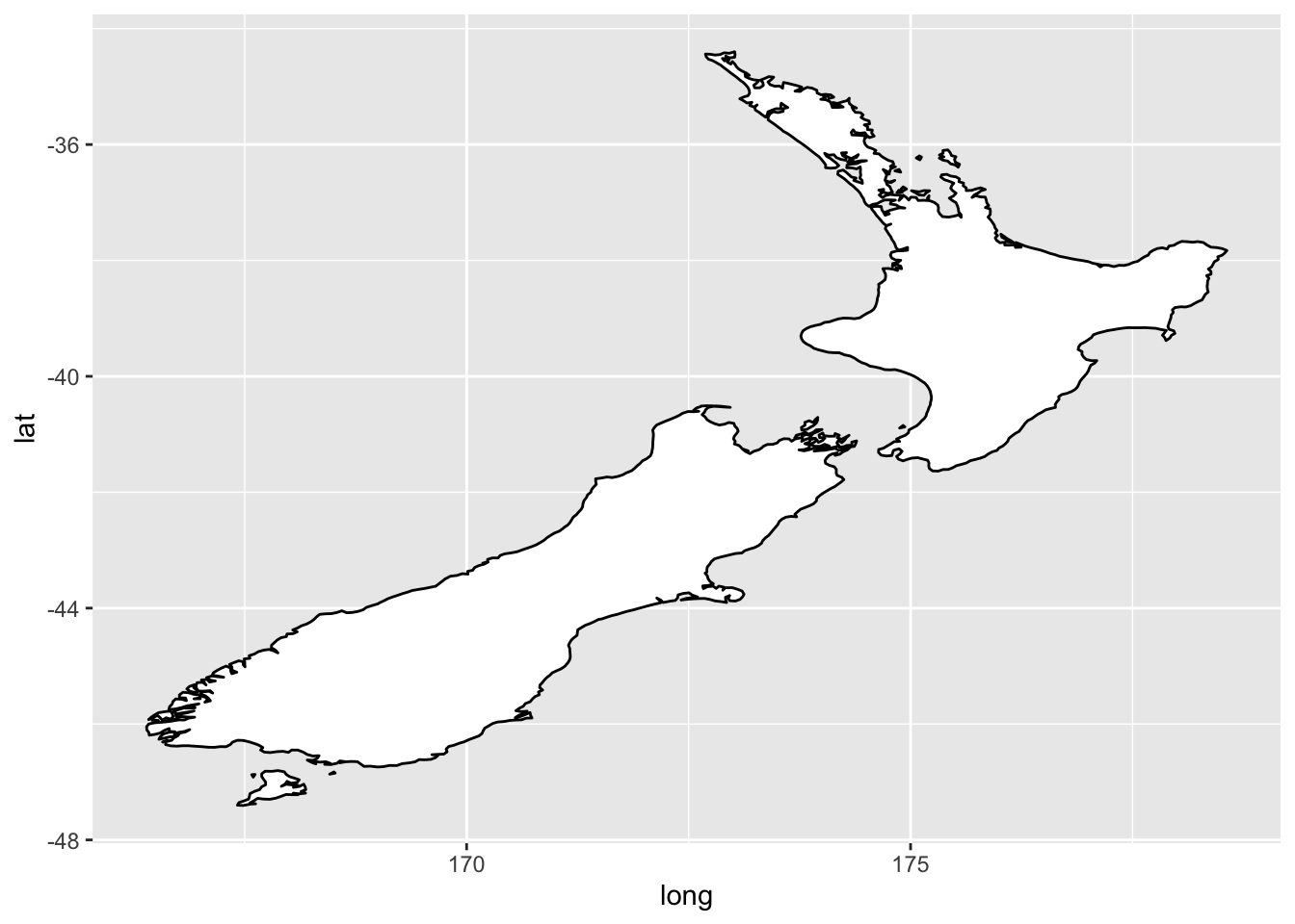
ggplot(nz, aes(long, lat, group = group)) +
  geom_polygon(fill = "white", colour = "black") +
  coord_quickmap()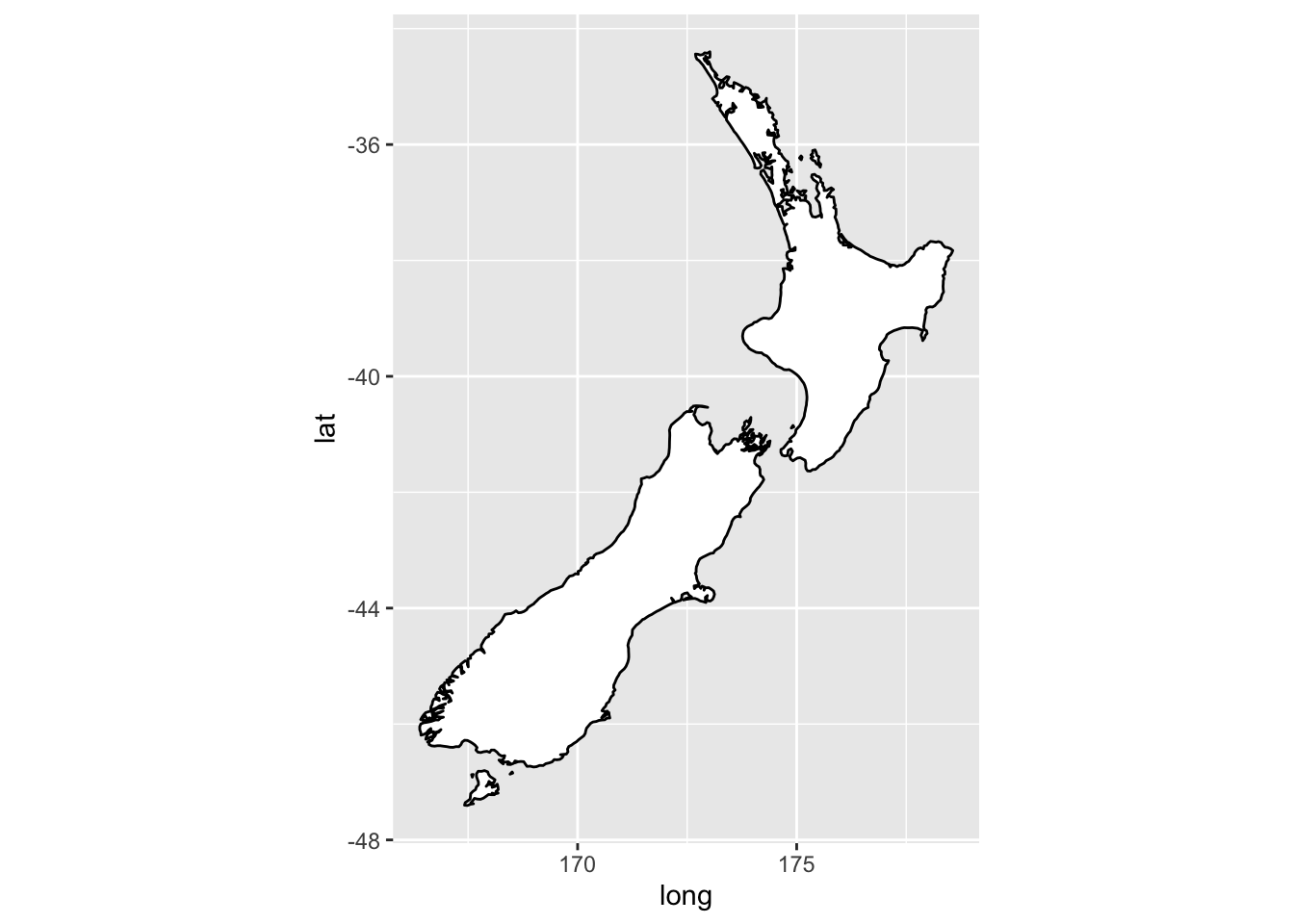
coord_polar() uses polar coordinates
bar <- ggplot(data = diamonds) +
  geom_bar(
    mapping = aes(x = cut, fill = cut),
    show.legend = FALSE,
    width = 1
  ) +
  theme(aspect.ratio = 1) +
  labs(x = NULL, y = NULL)

bar + coord_flip()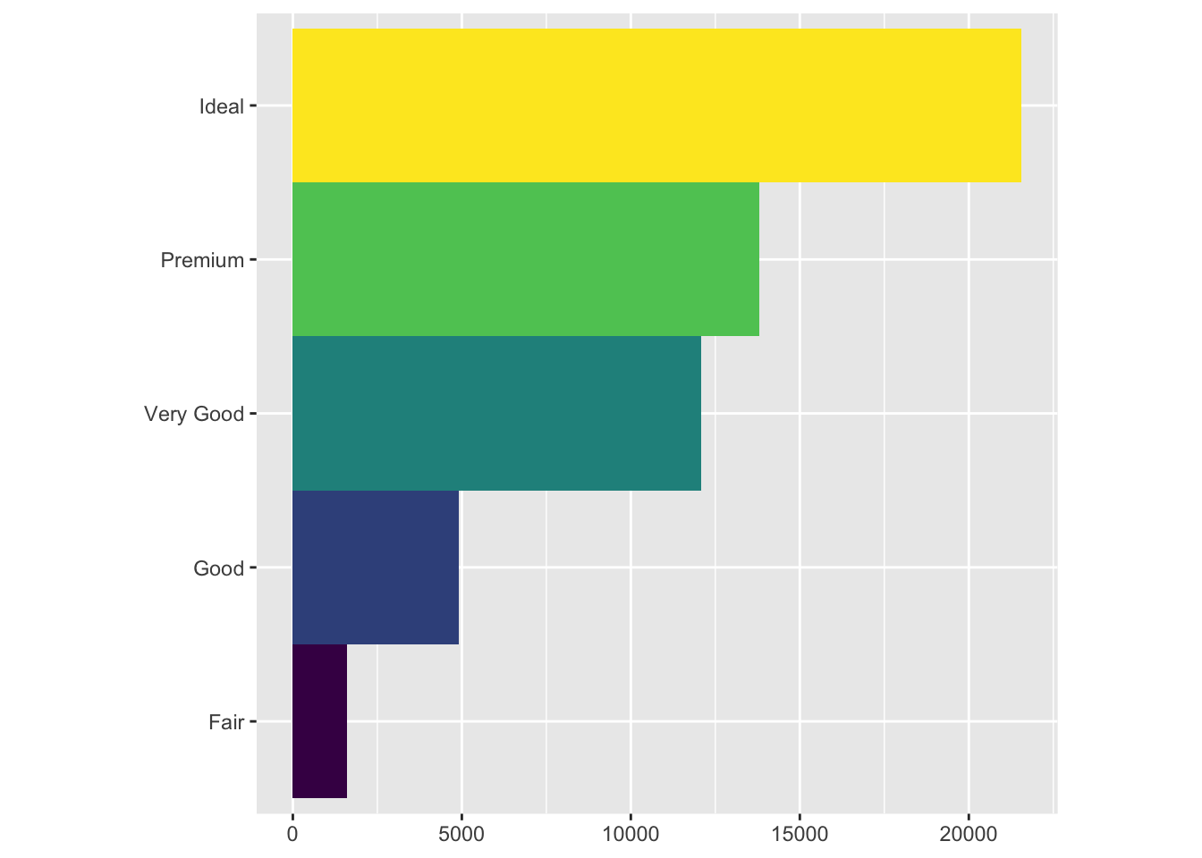
bar + coord_polar()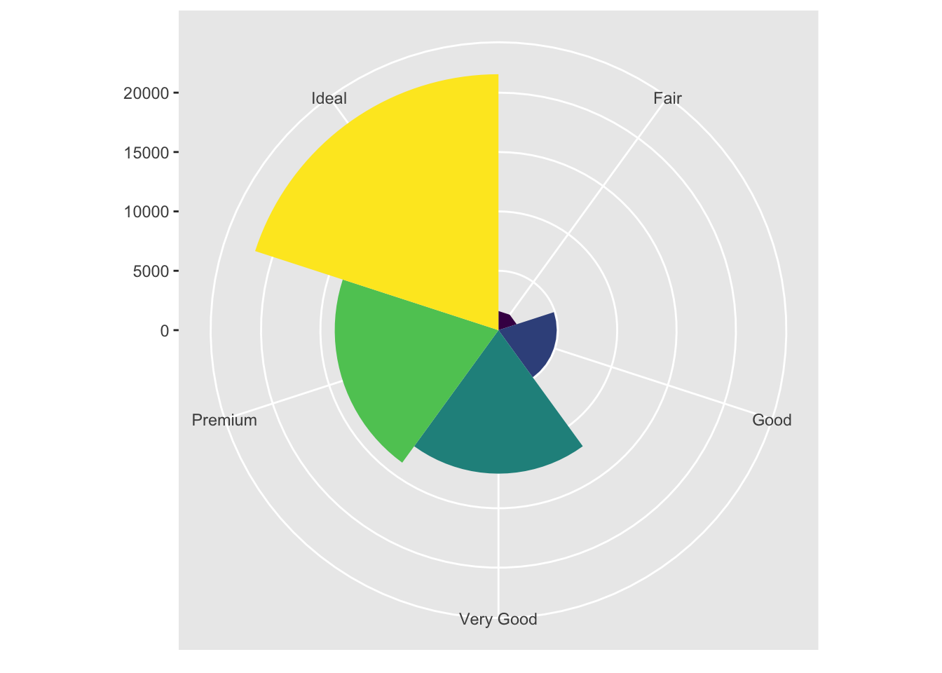
3.9.1 Exercises
- Turn a stacked bar chart into a pie chart using coord_polar()
bar <- ggplot(data = diamonds) +
  geom_bar(
    mapping = aes(x = 1, fill = color),
    width = 1) +
  theme(aspect.ratio = 1) +
  labs(x = NULL, y = NULL)

bar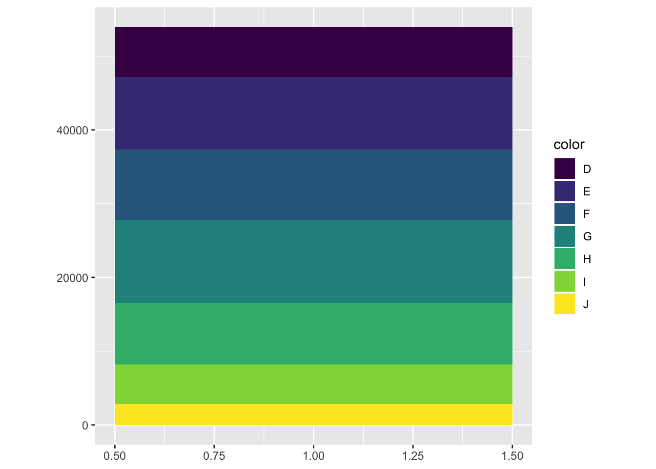
bar + coord_polar(theta = "y")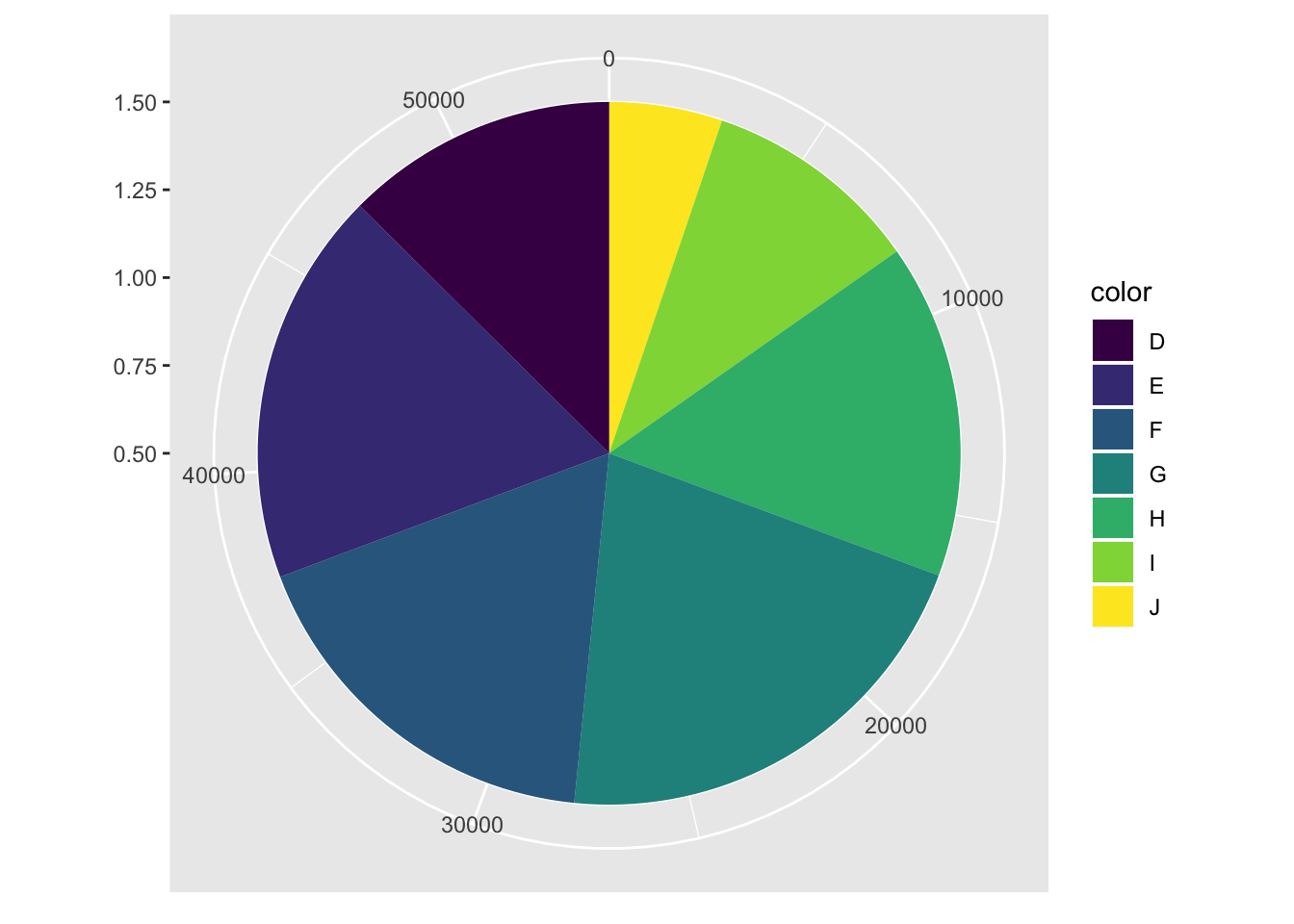
- What does labs() do? Read the documentation.
Good labels are critical for making your plots accessible to a wider audience. Ensure the axis and legend labels display the full variable name. Use the plot title and subtitle to explain the main findings. It’s common to use the caption to provide information about the data source.
- What’s the difference between coord_quickmap() and coord_map()?
coord_map projects a portion of the earth, which is approximately spherical, onto a flat 2D plane using any projection defined by the mapproj package. Map projections do not, in general, preserve straight lines, so this requires considerable computation. coord_quickmap is a quick approximation that does preserve straight lines. It works best for smaller areas closer to the equator.
- What does the plot below tell you about the relationship between city and highway mpg? Why is coord_fixed() important? What does geom_abline() do?
ggplot(data = mpg, mapping = aes(x = cty, y = hwy)) +
  geom_point() +
  geom_abline() +
  coord_fixed()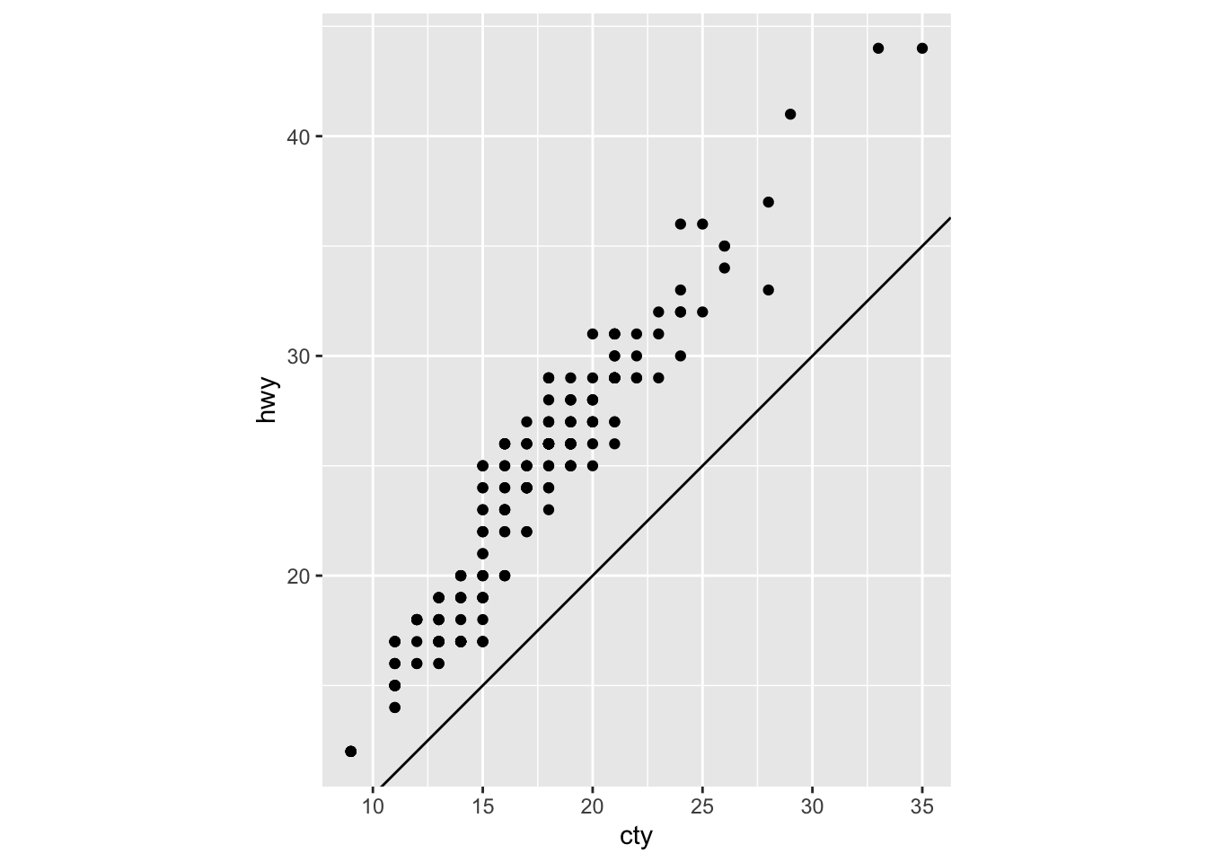
cty and hwy have a positive linear relationship
coord_fixed() sets the aspect ratio, so that the x and y axes have the same scale
geom_abline adds a line with intercept = 0 and slope = 1
3.10 The Layered Grammar of Graphics
Now have a template for any ggplot
ggplot(data = <DATA>) +
  <GEOM_FUNCTION>(
     mapping = aes(<MAPPINGS>),
     stat = <STAT>,
     position = <POSITION>
  ) +
  <COORDINATE_FUNCTION> +
  <FACET_FUNCTION>